5 Senior Living Ad Examples That Book Tours
Five senior living ad examples that book tours on Meta: a caregiver UGC, a community hero, a 24/7-care callout, a family review, and a lunch-and-tour invitation.
Senior living ad examples that book real tours sell peace of mind to the family and dignity to the resident — never fear, and never a body or health transformation. The buyer is usually an adult child quietly carrying the worry of an aging parent, and the winning move is to reframe the whole category from “facility” to “community.” The five fictional ads below each speak to that decision from a different angle, in a different format, so Meta’s delivery can match each to the family it fits. Because this is a sensitive, sometimes housing-regulated niche, every one stays dignity-forward and compliant.
Key takeaways
- The adult child is usually the buyer — speak to their worry and their relief, not just to the senior.
- Reframe facility to community. Show lifestyle, people, and care; never lean on fear or decline.
- Sensitive-niche rules apply. Meta scrutinizes fear-based aging creative, and independent-living ads can fall under the housing special ad category.
- Five distinct angles — dignity, community, care, family relief, and a no-pressure visit — give the auction five family mindsets to find.
What makes a great senior living ad
The audience is a family in a hard moment. An adult child has watched a parent struggle at home and is researching options with a knot of guilt, worry, and hope. They’re not comparing amenities yet — they’re trying to believe their parent could be happy somewhere, and that choosing it doesn’t mean failing them.
Two principles, plus a constraint that defines the niche.
Lead with dignity and relief. The emotional job is to replace the dread of “putting Mom in a home” with the picture of a parent thriving and a family at peace. Warm, residential imagery and reframing language — community, not facility — do that work.
Make the next step tiny. This is a months-long, emotional decision. The ad’s job isn’t to close; it’s to earn a visit. A low-pressure tour or lunch invitation respects the weight of the choice and converts far better than urgency.
The constraint shapes everything: this is a sensitive category. Meta scrutinizes ads that exploit fear about aging or health, body-transformation framing is off the table, and independent-living ads can trigger the housing special ad category. Dignity-forward creative isn’t just compliant — it outperforms. For how other regulated niches navigate this, the healthcare ad examples set and the industry breakdowns here are useful references.
| Ad | Format | Angle | Funnel stage | Best for |
|---|---|---|---|---|
| Caregiver-relief UGC | UGC | Dignity/peace of mind | Cold | Communities reaching adult children |
| Community-not-facility hero | Hero | Us-vs-the-old-way | Cold | Reframing the category |
| 24/7-care reassurance callout | Callout (swapped before/after) | Trust/safety | Cold/warm | Assisted living and memory care |
| Family testimonial | Testimonial | Caregiver relief | Warm | Communities with family reviews |
| Lunch-and-tour invitation | Offer | Low-commitment visit | Warm/retargeting | Booking on-site visits |
1. The caregiver-relief UGC ad
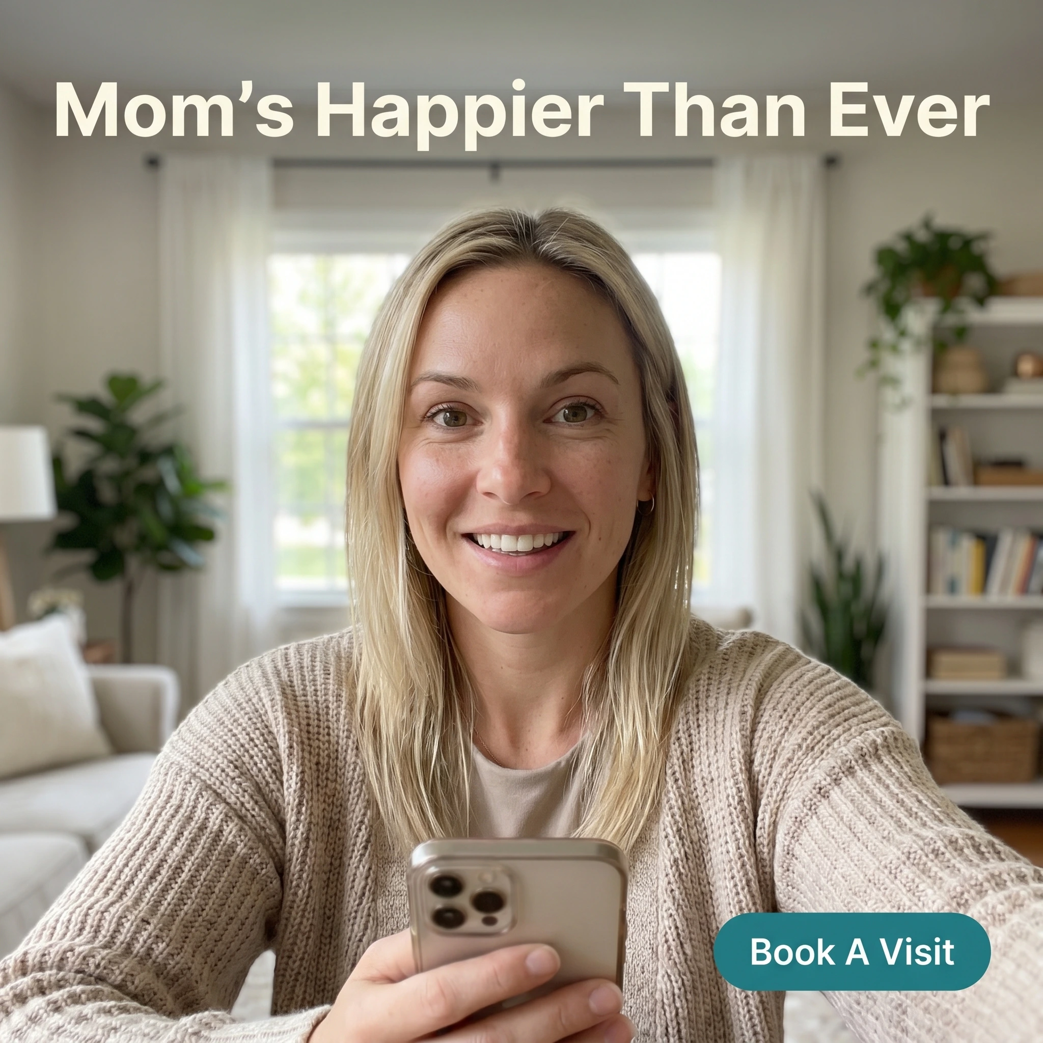
The format & angle. A phone-video still from Maplewood Senior Living: an adult daughter speaking to camera, relieved and warm. Dignity and peace of mind, in the family’s own voice.
Who it targets. Cold adult children early in the search, carrying guilt and uncertainty.
The hook. “Mom’s Happier Than Ever.” The outcome every worried child is hoping to hear is possible.
Why it works. The deepest fear isn’t logistics — it’s that moving a parent means abandoning them. A peer caregiver saying the opposite happened reframes the entire decision from loss to gain. UGC styling makes it a real family’s relief rather than a brochure claim, and keeping the focus on the daughter’s emotion sidesteps any need to stage a resident.
Steal it. Film a real family member sharing the moment they knew it was the right call — unscripted, warm. Headline the parent’s happiness, not the care features. You’re selling permission to feel good about the decision.
2. The community-not-facility hero ad
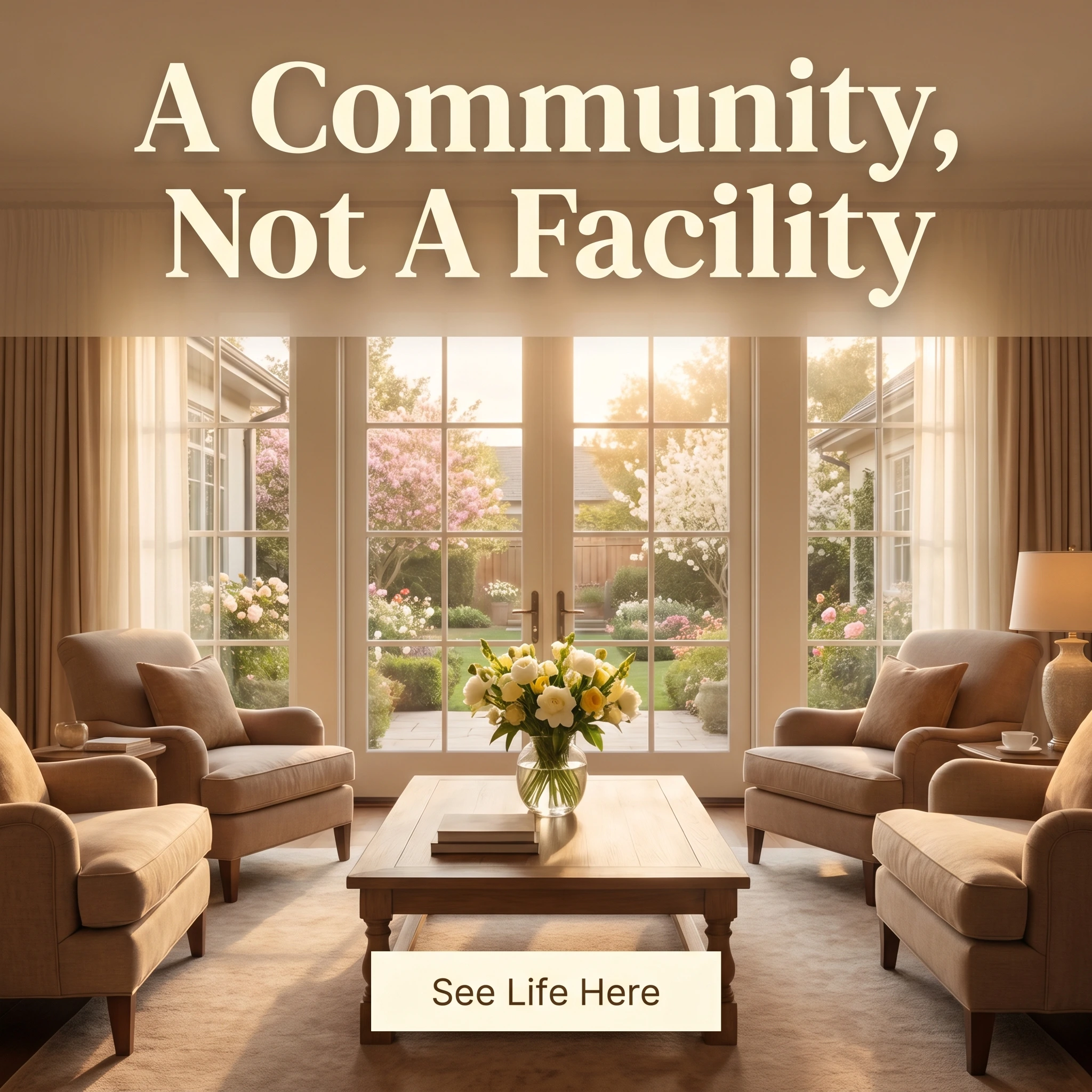
The format & angle. Larkhill Senior Living’s hero: a bright, elegant common room opening onto a garden, no people, nothing clinical. The category, reframed through atmosphere.
Who it targets. Cold families whose mental image of senior living is a sterile institution.
The hook. “A Community, Not A Facility.” A direct rewrite of the dread the word “home” carries.
Why it works. The single biggest objection is the institutional stereotype, and a warm, residential space dismantles it before a word is read. The garden and armchairs signal a life, not a waiting room — which is exactly the reassurance the family needs. An empty, beautiful space invites the viewer to imagine their parent there, comfortably.
Steal it. Photograph your most residential, least clinical space — light, plants, comfortable seating — and headline the reframe. Show the life on offer; the family is desperate to picture it.
3. The 24/7-care reassurance callout ad
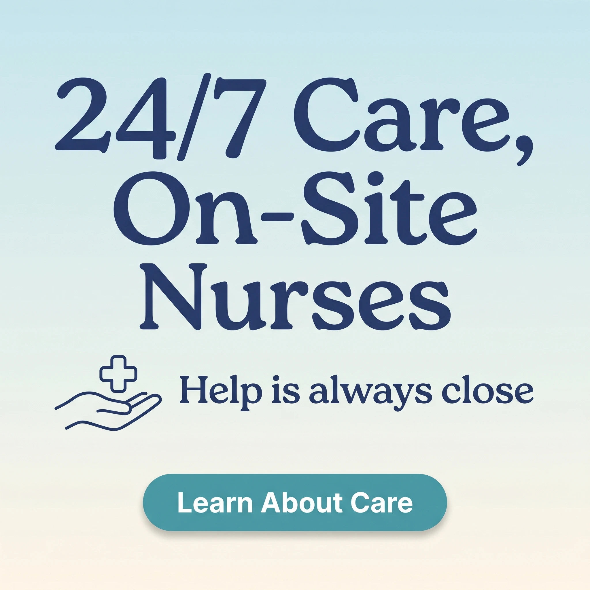
The format & angle. Cedar Commons runs a calm typography callout with gentle icons. This slot would normally be a before/after — swapped because health and body transformations are off-limits in this sensitive niche. The reassurance is stated plainly and positively.
Who it targets. Cold and warm families weighing assisted living or memory care, where safety is the gating concern.
The hook. “24/7 Care, On-Site Nurses.” The fact that lets a family exhale.
Why it works. Once a parent’s safety is at stake, capability becomes the deciding factor, and stating round-the-clock care plainly answers the question keeping the family up at night. The calm, never-alarming design matters as much as the words — reassurance, not fear. With no person in frame and no health “transformation,” it stays firmly inside Meta’s sensitive-category lines.
Steal it. State your real care level calmly and positively — staffing, nurses, response times — over a gentle, uncluttered design. Reassure; never frighten. The fear is already there, and your job is to relieve it, not amplify it.
4. The family testimonial ad
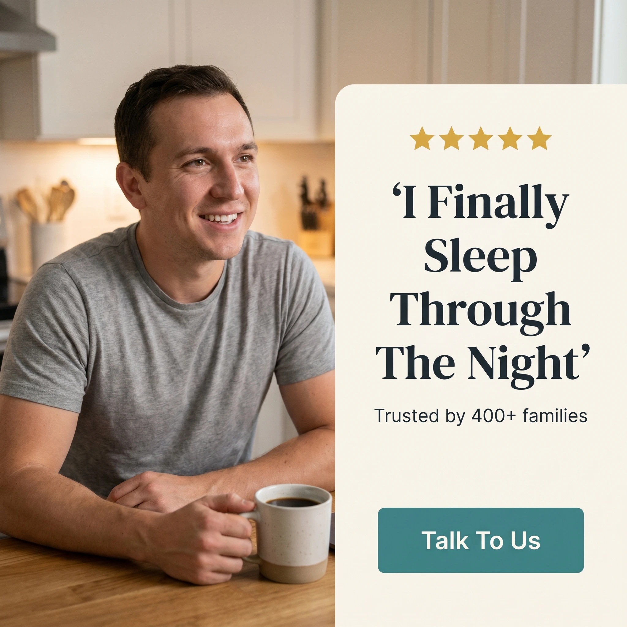
The format & angle. The Birches’ testimonial: a relieved adult son at home beside a quote card, five stars, “trusted by 400+ families.” Caregiver relief, named.
Who it targets. Warm families who’ve toured or inquired but haven’t committed, still weighed down by worry.
The hook. “I Finally Sleep Through The Night.” The caregiver’s own relief, not the resident’s.
Why it works. Adult children carry a constant, exhausting vigilance, and naming their relief — not just the parent’s care — speaks to the person actually making the decision. Another caregiver’s words are the most trusted proof in this category. The families-served count signals an established community with a real track record.
Steal it. Collect quotes from family members about their own peace of mind, not only the resident’s care. Photograph a relatable adult child looking relieved, and add the count of families you serve to turn one story into a pattern.
5. The lunch-and-tour invitation ad

The format & angle. Willowmere Community’s typography invitation: a warm, gentle headline, a no-pressure line, a button. The offer is a visit, not a discount.
Who it targets. Warm and retargeting audiences — families who’ve engaged and need a gentle, concrete next step.
The hook. “Join Us For Lunch And A Tour.” A low-stakes way to experience the community in person.
Why it works. The decision gets made on-site, so the only conversion that matters early is a booked visit. A lunch-and-tour is warm, specific, and commitment-free — it lets the family feel the place rather than read about it. “No pressure, just a visit” removes the fear of a hard sell, which is exactly what a guarded caregiver dreads.
Steal it. Offer a tour or a lunch-and-tour, name “no pressure” explicitly, and make booking effortless. The visit is the product of the ad; everything before it just earns the trust to show up.
A calendar full of tours
A relieved daughter, a sunlit common room, a calm promise of care, a caregiver who finally sleeps, and an open invitation — five senior living ads with no overlap in look or claim, and not a trace of fear in any of them. Meta’s Andromeda retrieval engine rewards exactly this: evaluating far more creative per auction, it sends the safety angle to the memory-care family and the community angle to the independent-living shopper, where five somber near-duplicates would compete for one audience.
The move for a community: launch all five, track which angle books tours rather than cheap clicks, then rebuild from the winner plus two new angles. Keep the lunch-and-tour invitation always-on for warm traffic, declare the housing category where it applies, and structure the test cleanly — ABO versus CBO matters for how you read creative results. Judge everything by cost per booked tour.
Producing that much dignified, on-brand creative is the bottleneck for a community team. Zendux generates on-brand static variants with AI and bulk-launches them across your ad sets, so a single community markets with the polish of a national brand.
Want to generate winning senior living ads? Start using Zendux AI