Airbnb Ad Examples: 5 Ads That Fill Your Calendar
Five Airbnb ad examples for hosts who want more direct bookings — a self-check-in UGC ad, a design hero, a no-fees comparison, a superhost review, and a midweek deal.
Airbnb ads work best when a host stops competing on the platform’s terms and starts driving bookings on their own: a one-of-a-kind stay, booked direct, with the superhost reviews to back it up. The traveler scrolling has seen a hundred beige listings, so the host who shows what makes their place different — and gives a reason to book off-platform — keeps both the guest and the service fee. These five fictional Airbnb ad examples each run a different angle in a different layout — a self-check-in UGC moment, a design-forward hero, a no-fees comparison, a superhost testimonial, and a midweek offer.
Key takeaways
- Lead with what’s unique — the A-frame, the design, the view; a distinctive stay beats a generic “cozy getaway” in a crowded feed.
- Drive the direct booking — an ad that sends guests to your own site skips the platform service fee for both sides.
- Superhost status is proof — years hosting and review counts answer the trust question faster than adjectives.
- Fill the midweek gaps — Sunday-to-Thursday is where most calendars leak; a midweek offer plugs it.
What makes a great Airbnb ad
The host’s quiet anxiety is the open calendar. Platform search alone leaves gaps, and every empty night is gone for good. Ads let a host reach travelers directly — and, just as important, reach them with the listing’s real personality instead of a thumbnail in a sea of results. The first frame should show the thing that makes someone stop: the shape of the cabin, the light in the loft, the view from the tub.
Trust is the second job. Travelers are handing a stranger their weekend, so superhost status and review counts do heavy lifting; they answer “is this host reliable” before the question forms. Pair that proof with a distinctive space and the click gets cheap. Organizing those signals across creatives is the same discipline you see in high-performing Meta ad examples — the strongest accounts run proof and personality as separate, deliberate angles.
Then there’s structure. Prospecting ads, retargeting ads, and offer ads want different budgets and audiences, which is exactly the kind of split ABO vs. CBO creative testing exists to sort out. A unique-stay hero earns the cold click; a no-fees comparison converts the warm shopper; a midweek deal mops up the gaps. The five concepts below cover that range.
| Ad | Format | Angle | Funnel stage | Best for |
|---|---|---|---|---|
| Self-check-in UGC | UGC | Speed/convenience | Cold | Self-managed listings |
| Design-loft hero | Hero | Status/uniqueness | Cold/warm | Design-forward stays |
| No-fees comparison | Comparison | Price/book-direct | Warm | Hosts driving direct bookings |
| Superhost testimonial | Testimonial | Trust/social proof | Warm | Established hosts |
| Midweek escape offer | Offer | Urgency/value | Cold/warm | Filling midweek gaps |
1. The self-check-in UGC ad
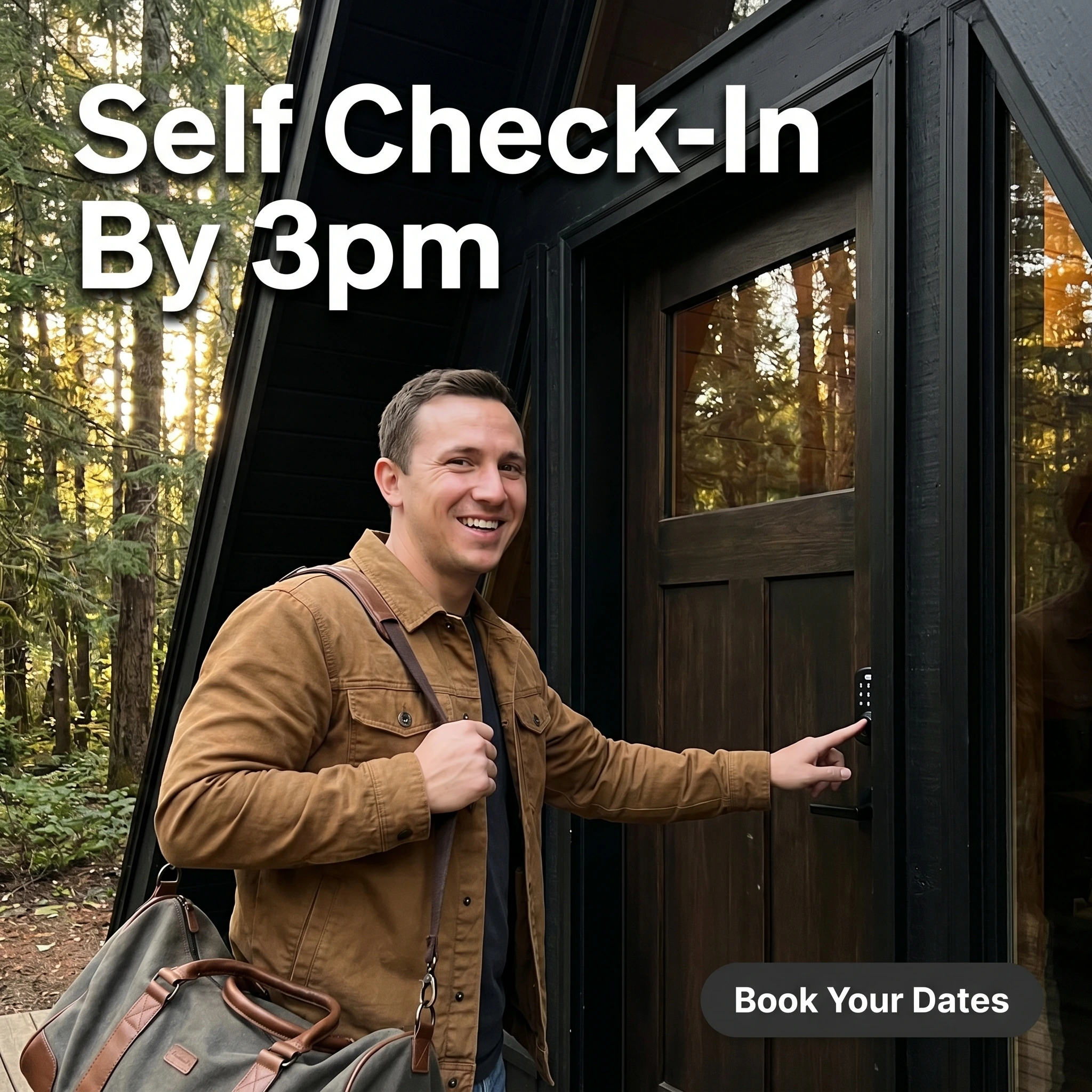
The format & angle. A guest arriving at The Foxglen A-Frame, duffel on his shoulder, tapping the keypad lock, shot like a real check-in moment. Speed and convenience.
Who it targets. Cold travelers who value a frictionless arrival — couples and solo travelers escaping for the weekend.
The hook. “Self Check-In By 3pm.” It promises the smooth, no-waiting arrival travelers quietly worry about.
Why it works. Arrival friction is a real anxiety in short-term rentals — late keys, confusing handoffs, no host in sight. Showing a clean keypad check-in defuses that and signals a well-run, modern listing. The candid framing reads as a real guest, not a brochure, and pairing it with a distinctive A-frame quietly sells the uniqueness too. It’s a prospecting ad that earns the click on convenience and personality at once.
Steal it. Photograph the actual arrival — keypad, door, bag in hand — phone-camera style, and headline the specific, reassuring detail (self check-in, the time, no waiting). Send the click to availability, not a long house manual.
2. The design-loft hero ad

The format & angle. Cloudpine Loft’s signature frame: a sunlit, design-forward interior with forest windows, linen sofa, and a statement light — no people, one focal point. Status and uniqueness.
Who it targets. Cold and warm travelers who choose stays for the experience and the aesthetic, not just a bed.
The hook. “Not Your Average Stay.” A confident claim the image immediately backs up.
Why it works. Design-led travelers screenshot and save spaces that look different, so a striking interior earns saves, shares, and cheap clicks. Leading with the aesthetic separates the listing from the endless cozy-cabin sameness in the feed. The headline gives the eye permission to expect something special, and the image delivers it — the fastest way to stop a scroll in this category.
Steal it. Shoot your most photogenic room at its best light with nothing cluttering the frame, and make a claim the picture can prove. Treat it as a top-of-funnel magnet — its job is saves, shares, and cheap clicks, not the booking itself.
3. The no-fees comparison ad
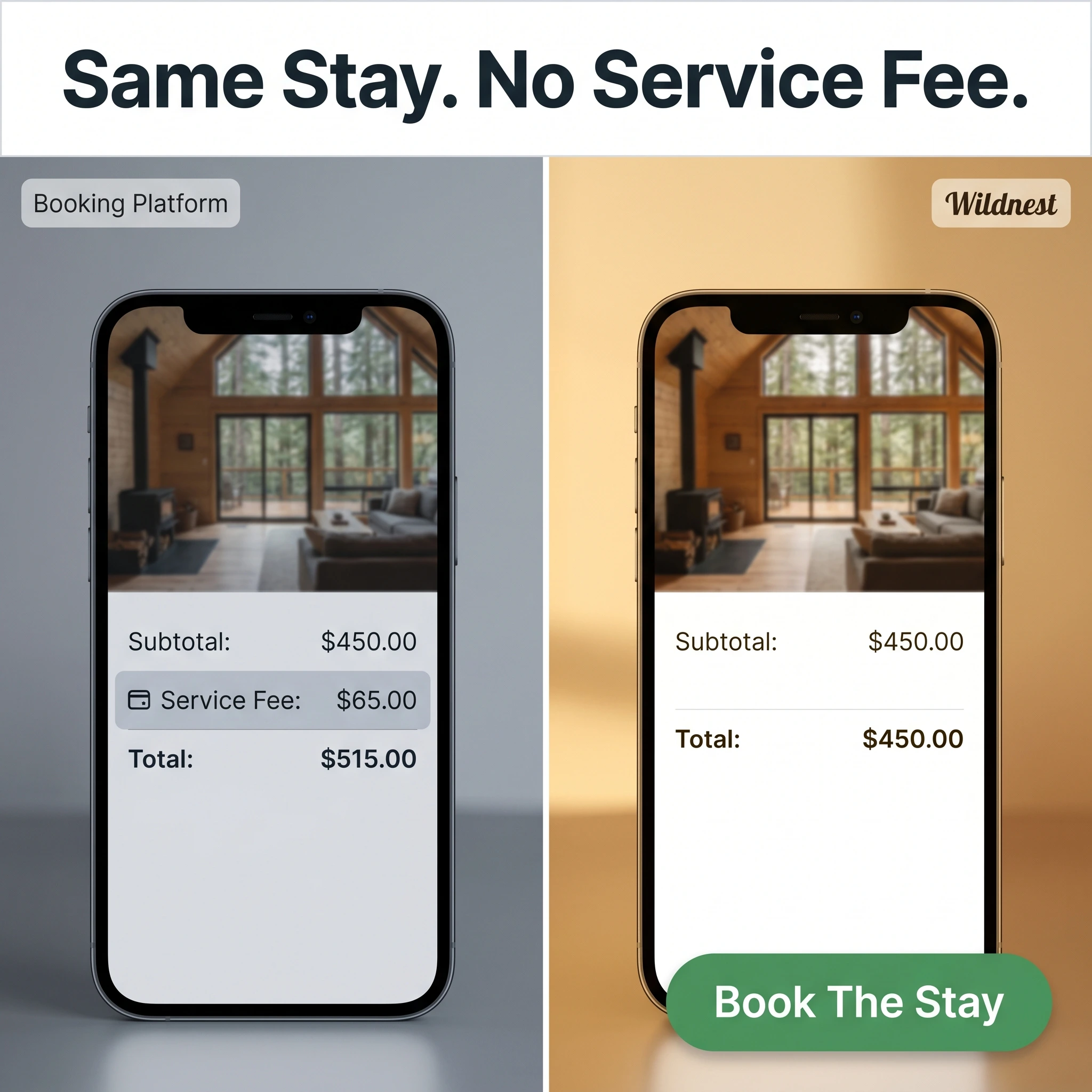
The format & angle. Wildnest Stays’ split: a platform checkout with a highlighted service fee on the left, a direct booking with no extra fee and a lower total on the right. Price and book-direct.
Who it targets. Warm travelers who’ve already found the listing and are about to pay platform fees they don’t love.
The hook. “Same Stay. No Service Fee.” It names the exact friction and removes it.
Why it works. Service fees are the one thing guests universally resent, so showing the same stay without them is an easy yes. The comparison does the math, and “same stay” reassures them they aren’t trading down to book direct. Aimed at warm traffic, it shifts bookings to the host’s own site — keeping the fee for the host and saving it for the guest, a rare win-win that converts.
Steal it. Build an honest side-by-side of the platform total versus your direct total, label both, and retarget people who viewed your listing. Keep it accurate — the trust that makes off-platform booking work is fragile.
4. The superhost testimonial ad
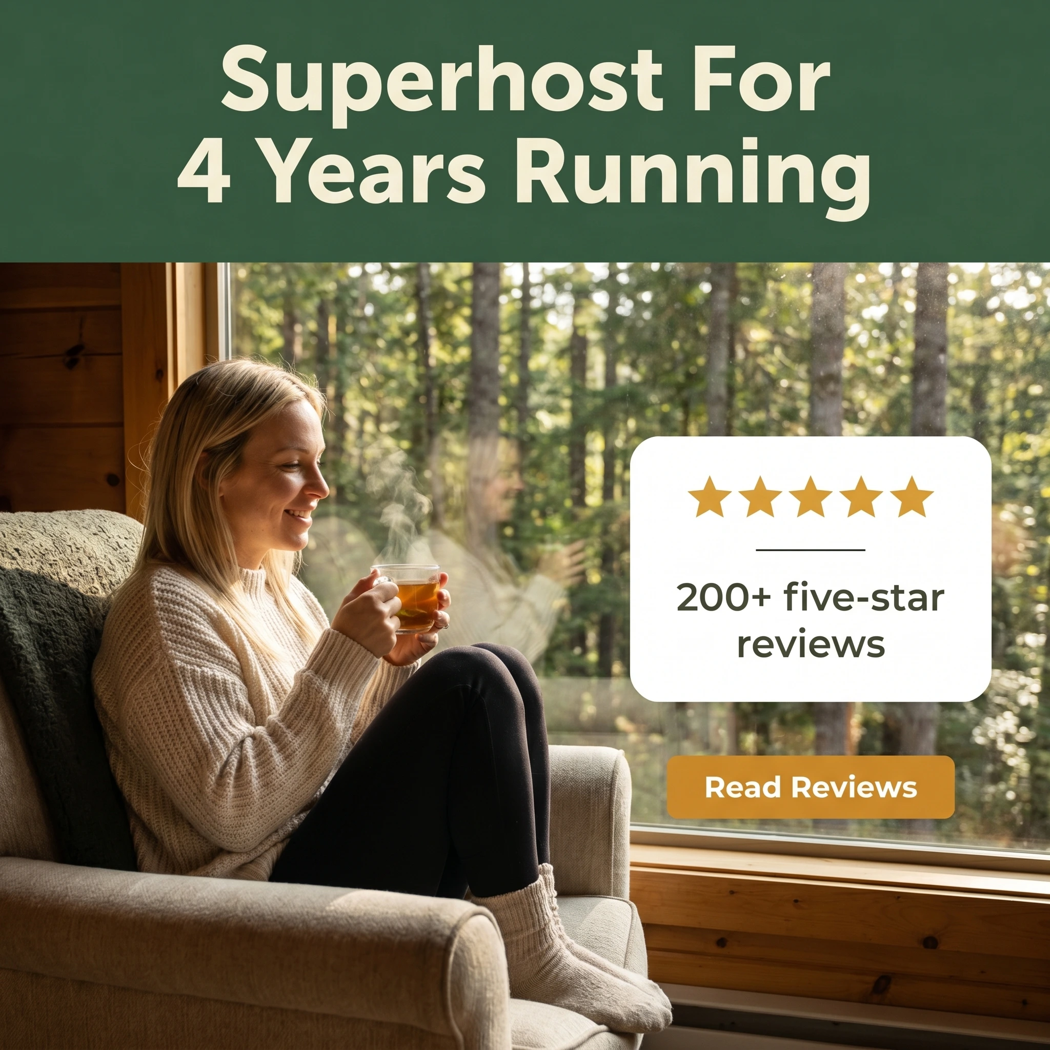
The format & angle. Juniper Hollow pairs a content guest by a cabin window with a review card — five stars and a review count — under a bold status headline. Trust and social proof.
Who it targets. Warm travelers comparing a few stays who need proof the host won’t let them down.
The hook. “Superhost For 4 Years Running.” Longevity plus status answers the reliability question in one line.
Why it works. Booking a stranger’s home is a leap of faith, and superhost status is the platform’s own shorthand for “this host is reliable.” Stacking that with a visible review count and a real guest turns abstract trust into evidence. The status framing — four years running — signals consistency, which matters more to a careful traveler than a single glowing quote.
Steal it. Put your strongest trust signal in the headline (superhost, years hosting, review count), build a clean card with five stars and a real guest photo, and run it to warm audiences and lookalikes of past guests.
5. The midweek escape offer ad
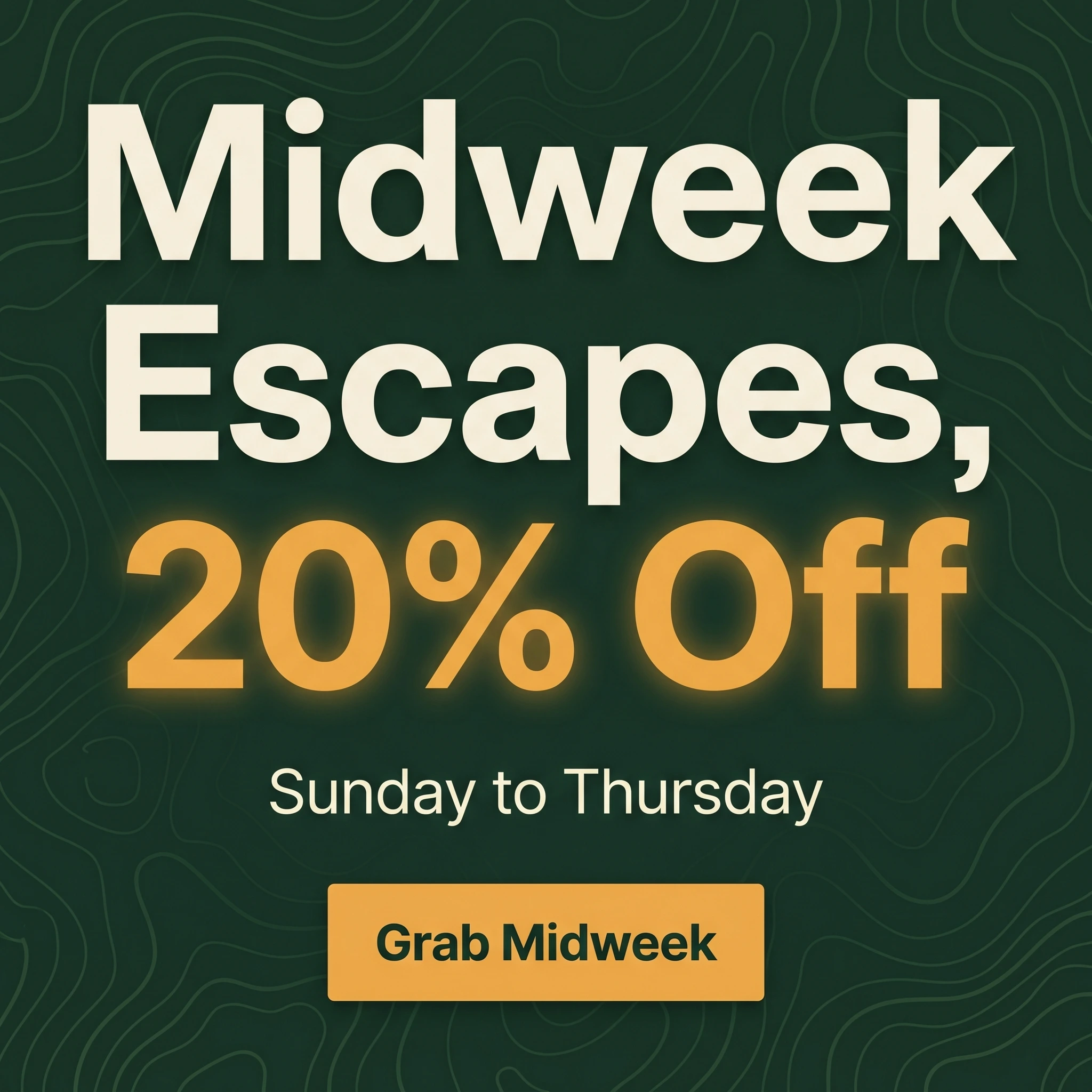
The format & angle. Stillwater Stays’ calendar-filler: typography-led, the discount dominant on deep forest green, no photo competing. Urgency and value.
Who it targets. Cold and warm travelers with flexible schedules — remote workers and couples who can travel off-peak.
The hook. “Midweek Escapes, 20% Off.” A specific discount aimed squarely at the nights that sit empty.
Why it works. A night that goes unbooked is revenue you never get back, so a discount that fills it is cheap insurance, not lost margin. “20% off” beats “midweek specials available,” and the deal is aimed squarely at the flexible traveler — the remote worker or couple who can move their dates. Type-led, it lands as a real deal and converts the price-flexible viewers the unique-stay and trust ads warmed up.
Steal it. Make the discount the biggest element, name the nights it covers, and schedule the ad to retarget recent listing viewers in your feeder market. Rotate the offer so repeat viewers see a fresh reason to book.
Keep the calendar full
Convenience, a one-of-a-kind space, an honest price case, superhost proof, and a midweek deal — five reasons a traveler books your place and skips the beige listing beside it. The design-lover and the bargain-hunter aren’t the same person, and one creative can’t be both, so the set covers what a single ad would miss.
Run the unique-stay and self-check-in ads to prospect, the comparison and superhost testimonial to convert warm viewers, and the midweek offer to plug the gaps. Refresh the featured angle and rate often so a tight feeder-market audience never burns out.
Turning out that much creative is the real job when you host solo. Zendux builds on-brand static variants with AI and launches them to every ad set at once, so a full slate is ready before the next open week. If your place sleeps a crowd, the vacation rental ad examples breakdown pairs with this; for planning bigger trips, see the travel agency ad examples.