5 Coffee Brand Ad Examples That Sell the Bag
Five coffee brand ad examples that move beans on Meta — a home-brew UGC shot, a roast-date hero, a stale-vs-fresh split, a review card, and a $6 first-bag offer.
Coffee brand ad examples that actually move bags share one bet: win the first taste, then let freshness do the reselling. A coffee subscription is among the stickiest purchases in ecommerce, but only after the first cup lands — so the job of a cold ad is to get beans into someone’s grinder, not to close a recurring plan. The five fictional ads below each attack a different reason a drinker hasn’t switched off grocery-shelf coffee, and each uses a different format so Meta’s auction can match them to different people.
Key takeaways
- Freshness is the claim grocery coffee can’t match — a visible roast cue or “roasted to order” beats every flavor adjective on the bag.
- Sell the first bag, not the subscription. A near-sample first-bag price converts cold traffic; the recurring plan is a retargeting job once they’re hooked.
- Sensory beats spec. Steam, a pour, a mug in two hands — coffee is a ritual before it’s a product, and the photo should feel like the viewer’s own morning.
- Five formats reach five drinkers. A home-brew brag, a roast-date hero, a stale-vs-fresh split, a review card, and a price offer find people a single hero shot never would.
What makes a great coffee brand ad
The buyer isn’t “coffee drinkers” — nearly everyone drinks coffee. The buyer is the person mildly unhappy with the bag on their counter: the grocery loyalist who suspects there’s better, the lapsed café regular trying to quit the $6 daily latte, the gift-shopper hunting for the coffee obsessive in their life. Each is triggered by a different cue, which is why one ad can’t carry a coffee brand.
Three principles separate coffee ads that sell from pretty pictures that don’t.
Lead with freshness, because it’s the unfair advantage. Grocery beans sit for months; a roaster that ships within days of roasting owns a claim the shelf physically cannot. Put the roast cue where the eye lands first, not in the caption.
Make it sensory, not technical. Altitude, varietal, and tasting notes belong on the product page. In the feed, the work is making someone crave a cup right now — and craving comes from steam and morning light, not a spec sheet.
Price the first taste like a sample. The margin lives in reorders and subscriptions, but a cold prospect won’t commit to recurring beans from a brand they’ve never tasted. A cheap first bag is acquisition spend; treat it that way. It’s the same first-order math behind most ecommerce ad examples that scale. Before you spend, it’s worth knowing which static layouts consistently perform.
| Ad | Format | Angle | Funnel stage | Best for |
|---|---|---|---|---|
| Sunlit pour-over UGC | UGC | Dream/ritual | Cold | Roasters with a home-brewing crowd |
| Roast-date bag hero | Hero | Freshness/craft | Cold | Single-origin and small-batch brands |
| Stale-vs-fresh split | Before/after | Us-vs-the-old-way | Cold/warm | Brands fighting grocery habit |
| Café-quitter testimonial | Testimonial | Trust/value | Warm | Subscriptions with strong reviews |
| $6 first-bag offer | Offer | Price/low risk | Warm/retargeting | Subscription acquisition pushes |
1. The sunlit pour-over UGC ad
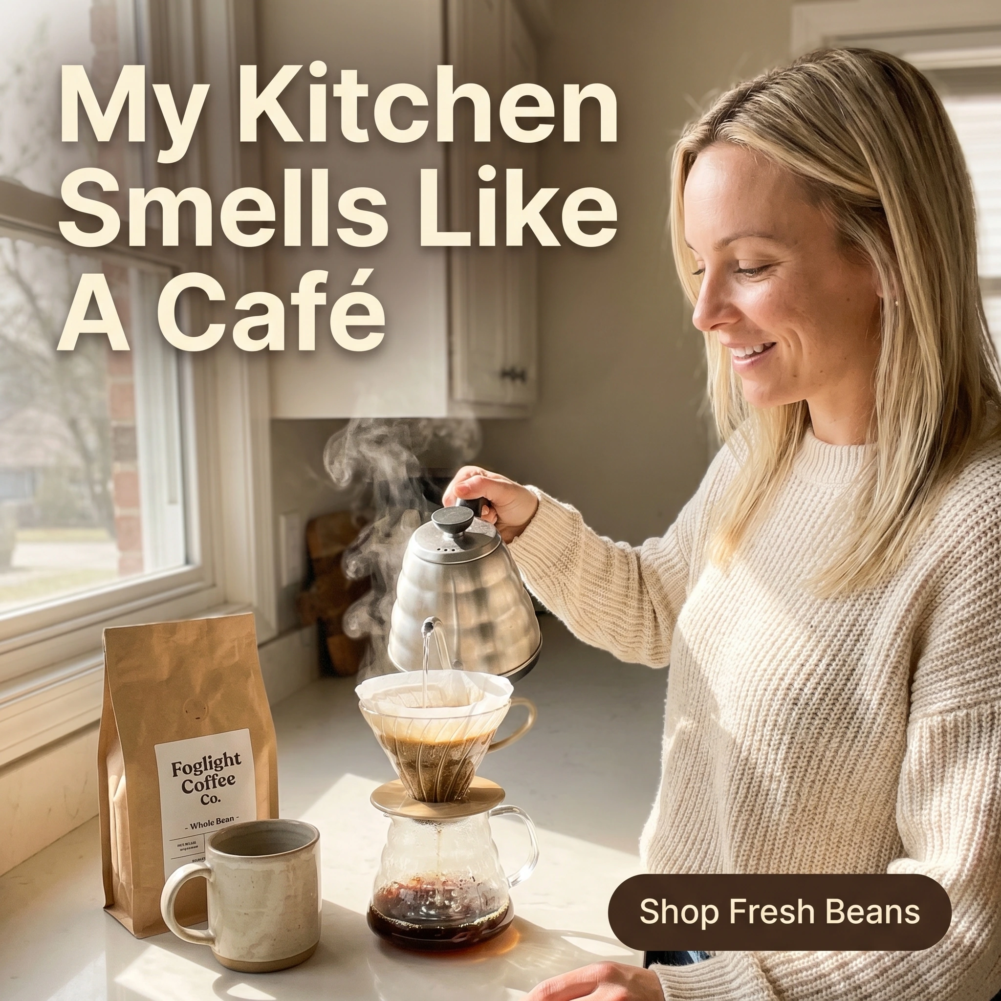
The format & angle. A candid phone shot from Foglight Coffee Co.: someone mid-pour at their own kitchen counter, steam rising, a kraft bag beside the mug. Dream outcome, sold as a daily ritual.
Who it targets. Cold drinkers who already own a kettle or grinder — the home-brewing crowd that’s halfway to caring and just needs better beans.
The hook. “My Kitchen Smells Like A Café.” Not a taste claim — a scene the viewer can smell.
Why it works. UGC styling reads as a friend’s morning, not a brand’s pitch, which is the only register skeptical coffee buyers trust. The ad sells the ritual, not the bag, and the aroma promise is something grocery coffee never delivers. The imperfect handheld feel is the credibility.
Steal it. Film your own morning pour on a phone in real window light — steam, a torn bag, an ordinary mug. Headline the sensory payoff, not the origin. Polish kills this format.
2. The roast-date bag hero ad
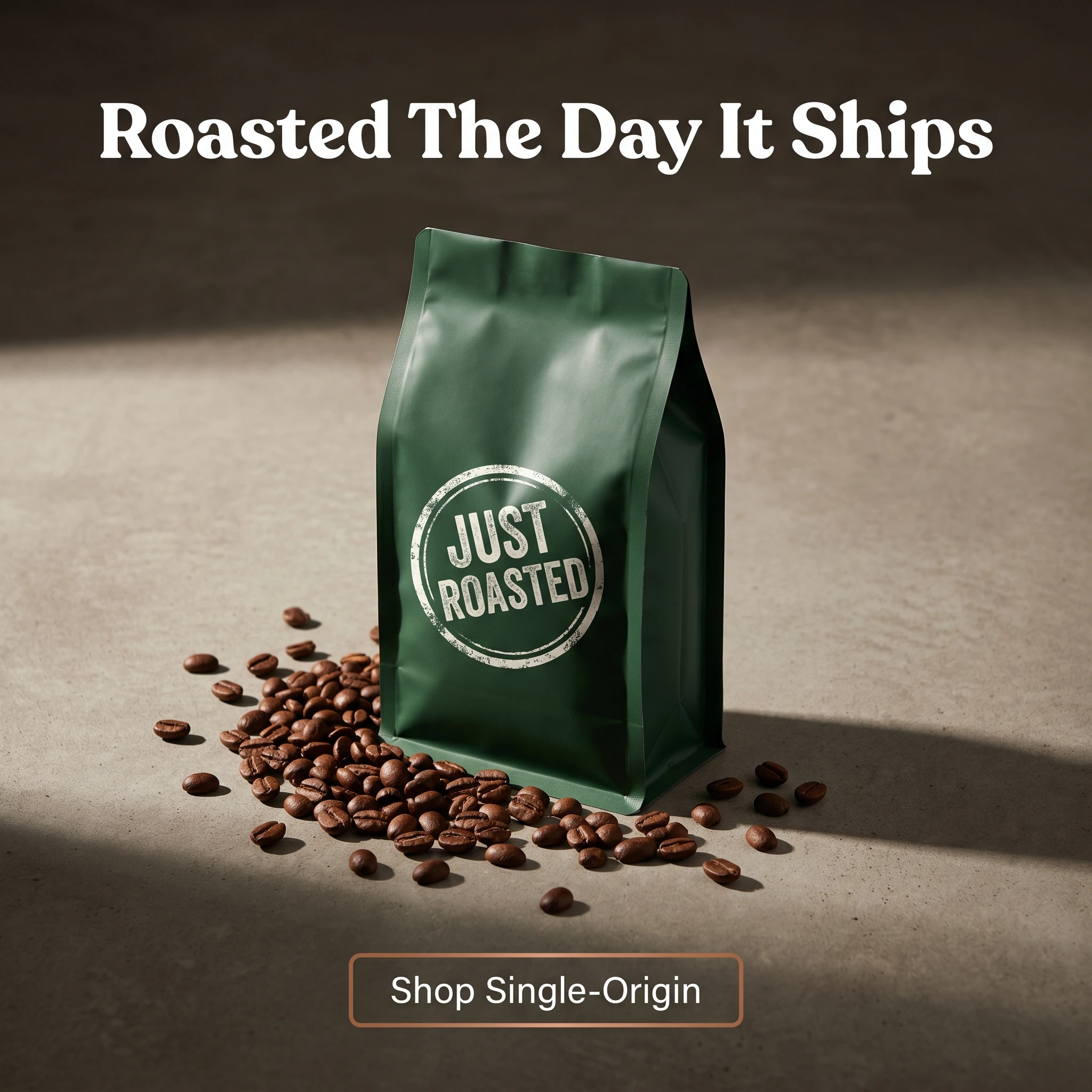
The format & angle. Northbound Coffee Roasters’ bag, shot like a product portrait: matte bag, beans scattered at the base, a bold “just roasted” stamp catching the light. Craft and freshness in one frame.
Who it targets. Cold specialty-curious buyers who already believe fresh is better and are choosing which roaster to trust.
The hook. “Roasted The Day It Ships.” A freshness promise stated as a fact, not a feeling.
Why it works. The hero shot does what a grocery shelf can’t: it makes recency the entire pitch. A clean single-focal-point composition reads instantly at thumbnail size, and the roast stamp turns an abstract claim into something the eye verifies. Premium lighting also pre-qualifies the price point honestly.
Steal it. Shoot your bestselling bag against one strong color with dramatic side light, and put a freshness cue — a stamp, “roasted to order” — on the pack itself. One product, one claim, one focal point.
3. The stale-vs-fresh split ad
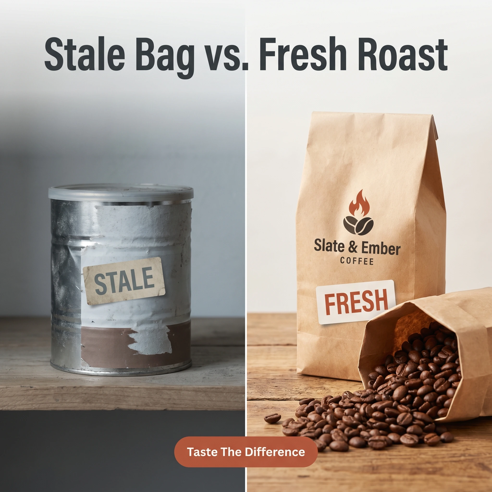
The format & angle. A clean split from Slate & Ember Coffee: a dusty supermarket can on the dim left, a fresh kraft bag spilling beans on the bright right. The before/after the category is built on — old habit versus new standard.
Who it targets. Cold and warm grocery loyalists who’ve never questioned the can in their cupboard.
The hook. “Stale Bag vs. Fresh Roast.” The comparison is the argument; no reading required.
Why it works. Split frames make a claim the viewer reaches on their own, which lands harder than being told. Naming the enemy — months-old grocery beans — reframes the purchase as an upgrade rather than a splurge. The desaturated-versus-warm lighting carries the contrast even before the words register.
Steal it. Stage your bag beside the generic alternative, match the framing, and let lighting do the talking — bright and warm for yours, flat and gray for the old way. Keep both halves uncluttered so the contrast survives feed size.
4. The café-quitter testimonial ad
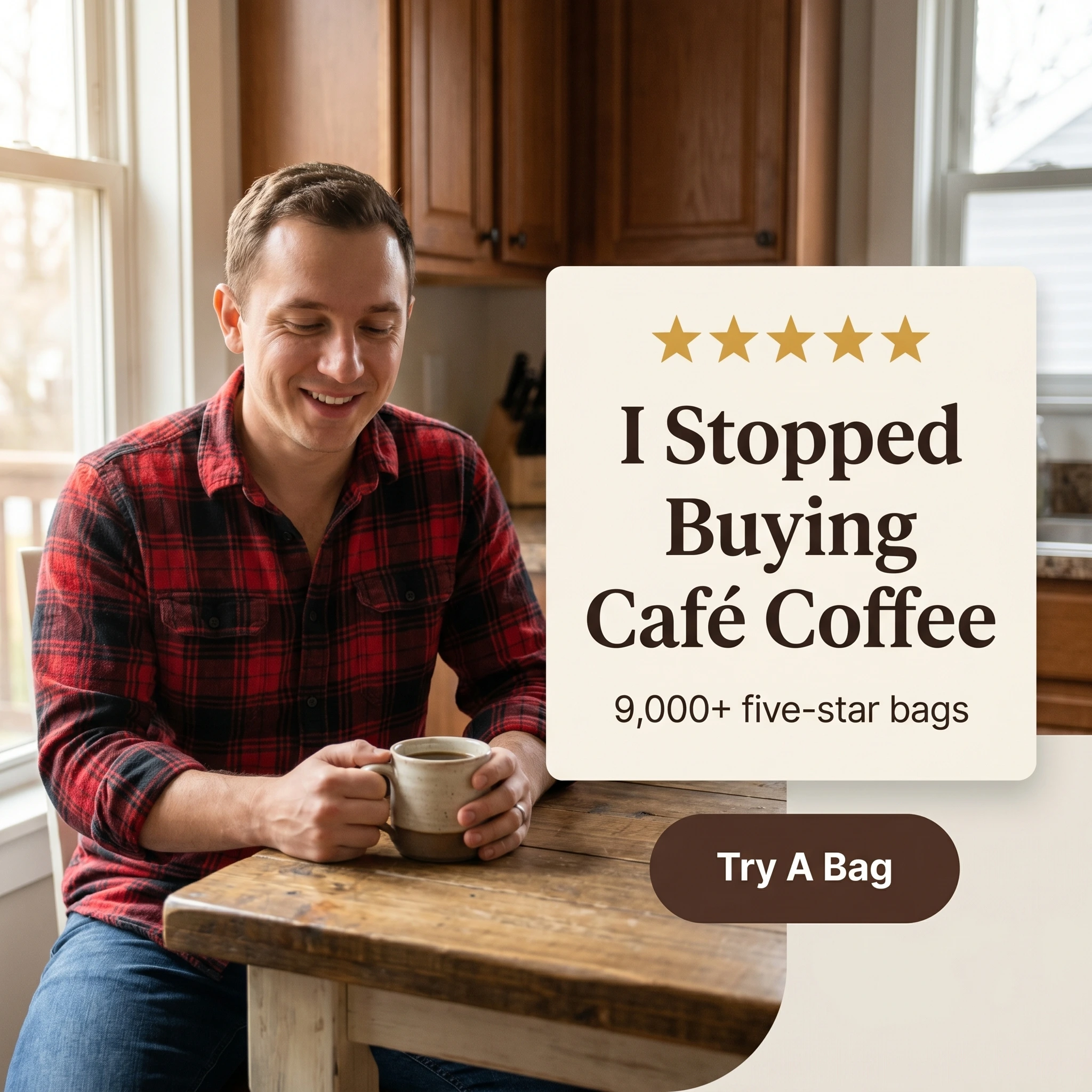
The format & angle. Daybreak Bean Co.’s testimonial card: a relaxed customer cradling a mug at home, a quote card with five stars and “9,000+ five-star bags.” Trust, with a value subtext.
Who it targets. Warm traffic — people who visited the site or watched a video and stalled before the first order.
The hook. “I Stopped Buying Café Coffee.” In the customer’s voice, doing the math the prospect is already doing.
Why it works. At decision stage, the unspoken question is “will this actually replace my coffee shop?” A peer answering yes — while implying the daily-latte savings — resolves both taste doubt and price doubt at once. The review count converts one person’s verdict into a pattern worth joining.
Steal it. Collect quotes about switching — what your coffee replaced — not just “great beans.” Photograph a real customer mid-sip at home, add the star count, and let the savings stay implied.
5. The $6 first-bag offer ad
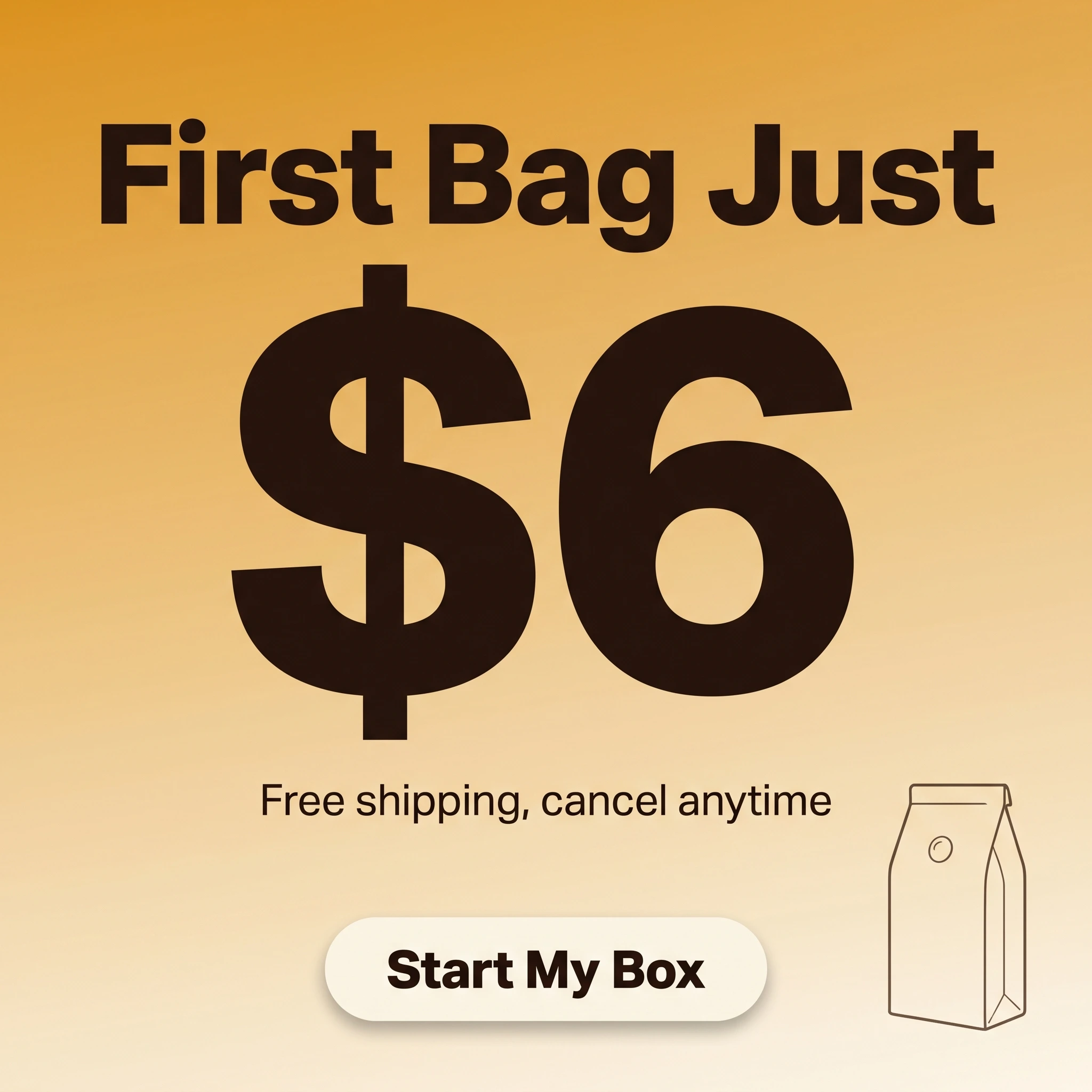
The format & angle. Lumen Coffee Club’s typography offer: a giant “$6” on a warm gradient, a low-friction subscription line, a button. No photo — the deal is the visual.
Who it targets. Warm and retargeting audiences — people who’ve met the brand and need one less reason to say no.
The hook. “First Bag Just $6.” A number small enough to feel like a sample, not a commitment.
Why it works. The first bag is the whole battle for a subscription brand; price it like acquisition and the math works on reorders. “Free shipping, cancel anytime” dissolves the two objections subscriptions inherit — shipping cost and lock-in. Typography-only stands out in a feed full of mugs and beans, including competitors’.
Steal it. Make the price the focal point, name the subscription fear (“cancel anytime”) in the supporting line, and show it only to people who’ve already met your brand. Rotate the background color quarterly — offer ads fatigue faster than any other format.
Keep the grinder full
A pour, a bag, a split, a quote, and a deal — five coffee ads with no overlap in look or claim. That spread is the point: Meta’s Andromeda retrieval engine evaluates far more creative per auction than the old system, so five genuinely different concepts each find the drinkers they fit, where five near-duplicates would only fight over one pocket.
The practical sequence for a roaster: launch all five, watch which angle earns first orders rather than cheap clicks, then build next month from the winner plus two fresh angles. Keep the first-bag offer always-on for warm traffic, and track cost per first order — because the subscription revenue you actually care about starts the moment that first bag ships.
The bottleneck is producing enough distinct creative to feed that system. That gap is what Zendux closes — it spins up on-brand static variants with AI and bulk-launches them across your ad sets, so a small roaster ships a full slate of angles without a design studio on retainer.
Brew up your five coffee angles →
Want to generate winning coffee brand ads? Start using Zendux AI