Shopify Store Ad Examples: 5 Creatives to Copy
Five Shopify store ad examples built for founder-led brands — a packing-bench UGC ad, a kit hero, a desk before/after, a dog-treat testimonial, and a bundle.
The best Shopify store ad examples lean into the thing big brands can’t fake: a real person behind the store. Small catalogs, founder faces, and honest numbers convert on Meta precisely because they don’t look like ads from a conglomerate. Below are five fictional-but-realistic ads for five very different Shopify stores — each a different format, angle, and claim — with breakdowns you can act on this week.
Key takeaways
- Smallness sells: packing-bench photos and order-count milestones out-convert polished brand creative for indie stores.
- The founder is your creator — UGC-style ads shot on a phone in the actual workspace cost nothing and read as real.
- One product story per ad; bundles are the exception, where the set is the story.
- Five distinct concepts beat fifty audiences — with Advantage+ handling targeting, creative diversity is the lever you still control.
What makes a great Shopify store ad
The buyer scrolling past a small store’s ad makes a different calculation than they do with a big brand: not “is this the best product” but “is this store real, and will I get my order?” Every strong indie-store ad answers that trust question while making its pitch — a visible founder, a review count, a milestone, a guarantee.
The second principle is honest specificity. A small store can say things no enterprise brand would: “order #10,000,” “my picky dog,” “made in small batches.” That voice is a competitive weapon, and it photographs well in the square 1:1 frame that anchors feed placements (full sizing details in the Meta static ad specs guide).
These five examples are angled for founder-led stores specifically; for broader DTC formats and scaling plays, the ecommerce ad examples breakdown is the companion piece.
Worth saying plainly: the measurement era changed small-store strategy. Since iOS privacy changes degraded granular tracking, the winning play for stores without data teams is consolidated campaigns, broad targeting, and creative diversity — you hand Meta several genuinely different concepts and let delivery sort out who sees what. That approach is also the cheap one. Five static concepts cost a founder an afternoon with a phone and a design tool, against the four figures a single produced video can run. Expect CPMs roughly in the $10–$30 range for broad U.S. audiences depending on season — Q4 inflates everything, which is one more reason to validate creative in the quiet months.
| Ad | Format | Angle | Funnel stage | Best for |
|---|---|---|---|---|
| Order #10,000 packing UGC | UGC | Founder trust | Cold | Handmade & studio brands |
| Carry-on kit hero | Product hero | Convenience | Cold/warm | Problem-solving products |
| Desk transformation | Before/after | Visible order from chaos | Cold | Organization & setup products |
| Picky-dog testimonial | Testimonial | Social proof | Warm | Consumables with repeat buyers |
| Build-a-bundle offer | Offer | Price/value | Retargeting | AOV and second purchases |
1. The order #10,000 packing-bench ad

The format & angle. Saltgrass Studio, a small-batch ceramics store: the founder at her packing bench surrounded by kraft boxes, holding a wrapped mug. Founder trust, told through a milestone.
Who it targets. Cold traffic — gift buyers and handmade-goods shoppers who default to marketplaces because they don’t trust unknown stores.
The hook. “Packing Order #10,000 Today.” A milestone that proves longevity, demand, and fulfillment in four words.
Why it works. The number does three trust jobs at once: this store has survived (longevity), other people buy here (social proof), and orders actually ship (the indie-store fear). The packing-bench setting shows the operation rather than claiming one. For a viewer hesitant to give a card number to a store they’ve never heard of, this single image retires the objection.
Steal it. Find your store’s most impressive honest number — orders shipped, years running, five-star count — and photograph yourself doing the work that number represents. Phone camera, workspace mess included.
2. The carry-on kit hero ad

The format & angle. Juniper & Jet’s travel toiletry kit: a precise flat lay of refillable bottles and a folded case on saturated teal. Convenience, presented as a system.
Who it targets. Cold and warm frequent flyers and trip planners — high purchase intent the moment a trip is booked.
The hook. “Your Whole Bathroom, Carry-On Sized.” Problem and solution in one phrase; the photo proves it fits.
Why it works. Flat lays are the hero format for kit products because the layout is the value proposition — everything visible, organized, finite. The single saturated background color makes the small store look art-directed without a studio budget, and the claim is concrete enough to survive a skeptical second look. Kit framing also lifts order value: viewers buy the system, not a bottle.
Steal it. Arrange your product’s full contents in a tight grid on one bold color, shoot from directly above, and write the headline as the before-state (“your whole bathroom”) meeting the after-state (“carry-on sized”).
3. The desk transformation ad

The format & angle. Deskfern, a cable-management and desk-organization store: a split frame of the same desk, cluttered then clean. The before/after, applied to a space instead of a person.
Who it targets. Cold remote workers and setup hobbyists — an audience that screenshots desk photos recreationally.
The hook. “Your Desk, After Deskfern.” The brand name sits inside the promise, so remembering one means remembering both.
Why it works. Desk clutter is universally recognizable at thumbnail size, which makes the left half of the frame a mirror and the right half a goal. Transformation ads also pre-answer “what does this actually do?” — the chronic weakness of organization products described in words. The comment behavior this format generates (tags, “I need this”) feeds Meta’s engagement signals at no extra cost.
Steal it. Shoot the identical angle of a genuinely messy setup and its organized after-state — same desk, same light. Put your brand name in the headline’s after-clause and let the image do the rest.
4. The picky-dog testimonial ad
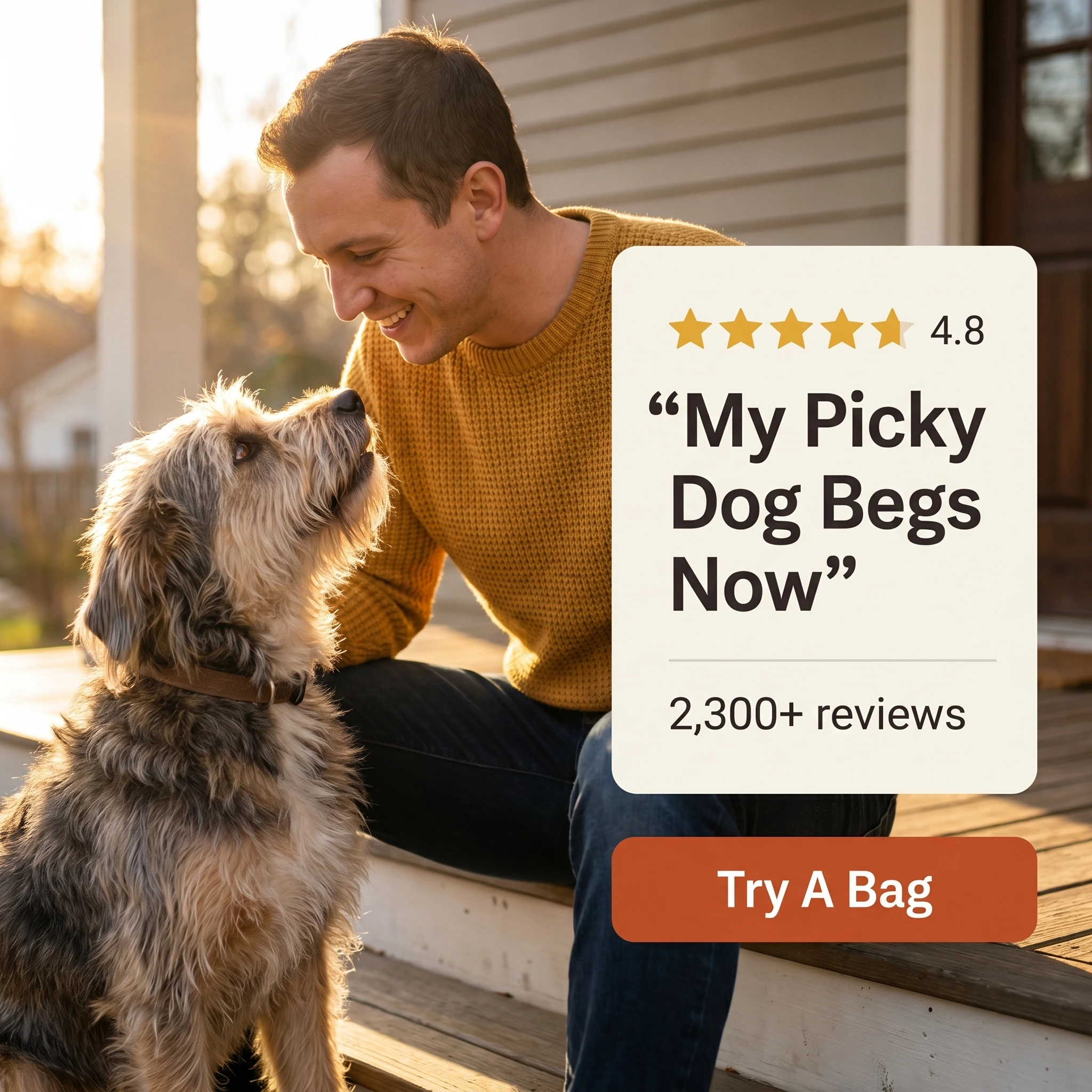
The format & angle. Bandit’s Biscuit Co., a small-batch dog treat store: a customer and his terrier beside a quote card, 4.8 stars, “2,300+ reviews.” Social proof with fur.
Who it targets. Warm traffic — site visitors and engagers who haven’t bought, where doubt (“will my dog even eat these?”) blocks the $24 order.
The hook. “My Picky Dog Begs Now” — the customer’s words, naming the exact pre-purchase fear.
Why it works. Consumable pet products live or die on the picky-eater objection, and only another owner can credibly dismiss it. The dog in frame does what no copy can — pet buyers trust dogs more than people. A 4.8 with thousands of reviews reads more believable than a flat 5.0, an honesty signal worth keeping when you build your own version.
Steal it. Pull the review that names your product’s most common objection and disproves it from experience. Photograph that actual customer (and their actual dog) — composite stock testimonials are obvious and convert accordingly.
5. The build-a-bundle offer ad

The format & angle. Loom & Letter, a stationery store: a typography-dominant promo over a fanned spread of notebooks. Price and choice, structured to raise order value.
Who it targets. Retargeting — cart abandoners and past single-item buyers, the audience where discounts pay for themselves.
The hook. “Bundle Any 3, Save 25%.” The word “any” is the mechanism: choice keeps the browse going, the threshold lifts the cart.
Why it works. Flat sitewide discounts train warm audiences to wait; conditional bundles convert the same urge while protecting margin and lifting AOV in the same move. “Any 3” turns the offer into a small game — assembling the set — which fits how stationery, candle, sock, and similar multi-SKU stores actually get shopped. The typography-led layout signals “deal” instantly without burying the products.
Steal it. Set the bundle quantity just above your average order (most carts hold 2 items? bundle 3), keep the discount conditional, and show this only to people who already know the store.
Test like a store ten times your size
A milestone, a system, a transformation, a testimony, and a deal — five ads no algorithm could mistake for each other. That matters more than it used to. Since Andromeda expanded how much creative Meta can evaluate per auction, a five-concept portfolio reaches pockets of buyers that a single recycled winner never touches. Structure the test cleanly — ABO vs CBO trade-offs here — and let the data pick next week’s direction.
A realistic first week for a store’s first paid push: shoot the UGC and before/after on Monday, build the hero, testimonial, and offer layouts Tuesday, launch Wednesday with equal budgets, and touch nothing for five days. Not reacting to day-two data is the cheapest optimization available to a small account.
The production side is where small stores stall, and it’s what Zendux compresses: AI-generated static variants in your store’s look, bulk-launched across ad sets in one sitting between packing orders.
Create your store’s first ad batch →
Want to generate winning Shopify store ads? Start using Zendux AI