Home Decor Ad Examples: 5 Ads Worth Stealing
Five home decor ad examples that turn a scroll into an add-to-cart — a styled-corner UGC ad, a sculptural lamp hero, a bland-to-styled room, a reviews testimonial, and a free-shipping offer.
Home decor ad examples that actually move product all do one thing first: they sell the room, not the object. A throw pillow on a white background is a SKU; the same pillow on a sun-warmed linen sofa beside a stack of ceramics is a feeling a shopper wants in her own living room — and feelings add to cart. The five mock ads below catch a furnishings shopper at five moments — aspiration, taste, value, trust, and the bland-to-styled transformation — each in a visibly different format.
Key takeaways
- Style the product into a room — lifestyle imagery beats white-background catalog shots for prospecting because shoppers buy the space, not the SKU.
- Decor lives between impulse and considered — paid social closes the cheap accent today and seeds the wishlist that converts later through retargeting.
- Average order value is the real lever — free-shipping thresholds and “shop the look” bundles beat chasing a vanity ROAS.
- A spread of unlike ads serves the impulse buyer, the wishlist saver, and the splurger separately; one recycled hero leaves most of them cold on today’s Meta.
What makes a great home decor ad
The buyer is a shopper styling a room on her phone, mid-scroll and not actively shopping. She juggles an impulse to buy the small thing now against a slower decision on the big thing later, and that split is the whole game. A $34 vase is a same-session purchase if the photo makes her want the moment it lives in; a $1,200 sofa is a saved post she returns to after a few retargeting touches. Your creative serves both — stop the scroll with a styled feeling, then let the catalog close once intent is warm, the same lifestyle-first logic behind the best ecommerce ad examples.
The proof that matters is aesthetic and social. Shoppers hesitate because they can’t picture a piece in their space and don’t know if anyone else loves it. So the two strongest assets in a decor account are a styled room she can project herself into and a visible review count that says other people with her taste already bought.
The economics reward basket size over raw efficiency. Prospecting ROAS for furnishings often sits in the 1.5x–2.5x range and retargeting well above it, but the number that decides profitability is average order value. A free-shipping threshold or a “shop the look” bundle does more for the P&L than squeezing a half-point of return from a single-item order. Keep one idea per ad and let the format carry the angle — the discipline behind the best static ads.
| Ad | Format | Angle | Funnel stage | Best for |
|---|---|---|---|---|
| Loft & Linen styled-corner UGC | UGC | Aspiration / dream room | Cold | Building lifestyle desire |
| Marigold Home lamp hero | Product hero | Taste / status | Cold/warm | Statement-piece SKUs |
| Nook & Vine room transformation | Before/after | Us-vs-the-old-way | Warm | ”Shop the look” sets |
| Saffron & Slate reviews testimonial | Testimonial | Trust / social proof | Warm | High-AOV considered buys |
| Driftwood Studio shipping offer | Offer | Price / value | Cold/warm | Lifting basket size |
1. The Loft & Linen styled-corner UGC ad
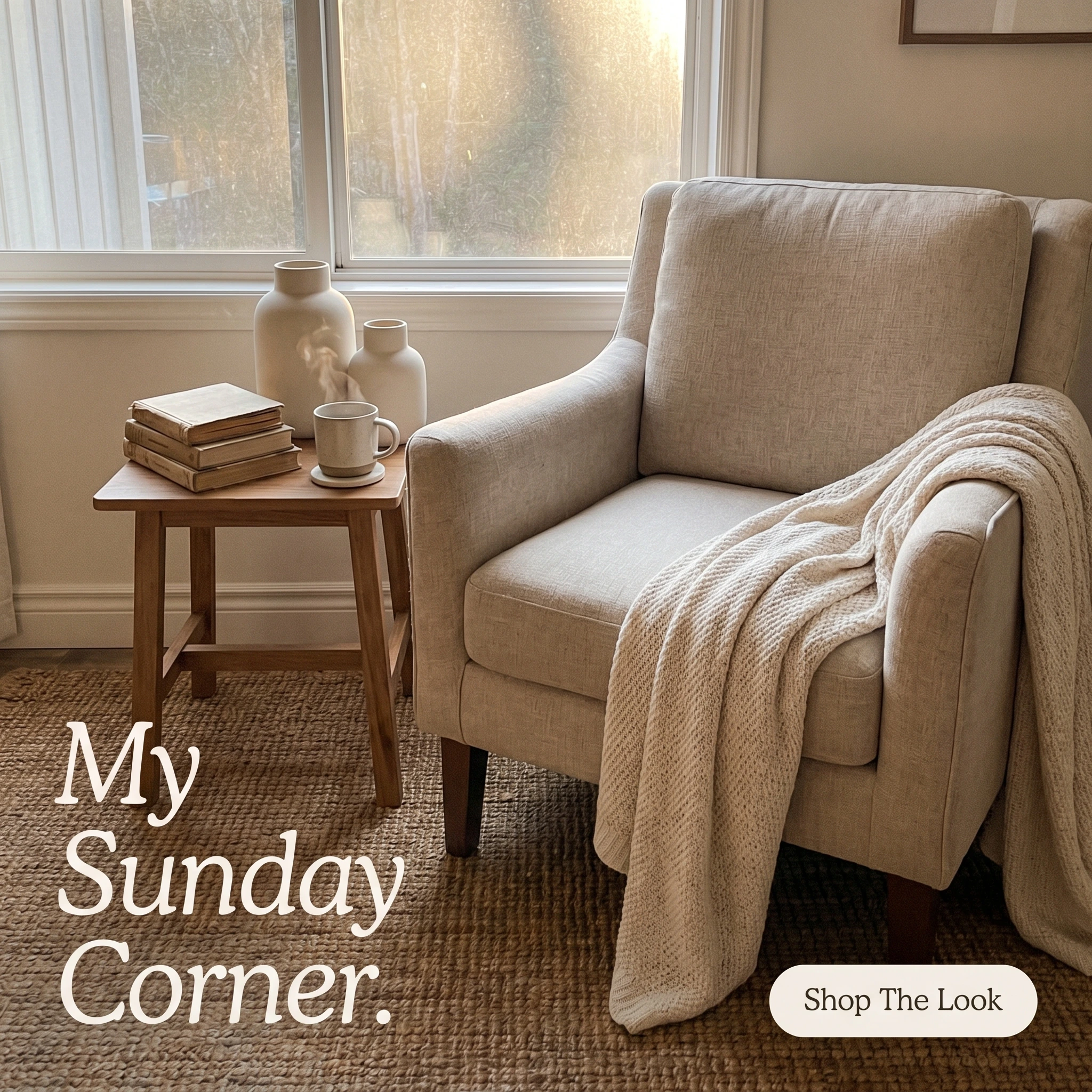
The format & angle. A Loft & Linen reading nook shot like a customer caught the morning light on her phone — linen armchair, woven jute rug, a stack of books and matte ceramics. Pure aspiration: the dream room, not the product grid.
Who it targets. Cold shoppers scrolling Instagram with nothing specific in mind — collecting taste.
The hook. “My Sunday Corner.” First-person and unbranded, it reads like a caption a real person wrote, not a slogan a brand bought.
Why it works. The candid, slightly-imperfect frame is the opposite of a catalog: soft natural light, a blanket thrown askew, the sense that someone actually sits here. That stops a decor scroll, because she isn’t evaluating a chair — she’s wanting a Sunday. “My Sunday Corner” lets her project herself into the space before she’s registered it as an ad, which earns the save and cheap reach.
Steal it. Style one corner of a real room with three or four bestsellers, shoot it on a phone in window light, and resist over-polishing. Caption it in the customer’s voice — a feeling and a time of day, not a product name — and let the products sit in the scene rather than pose.
2. The Marigold Home lamp hero ad
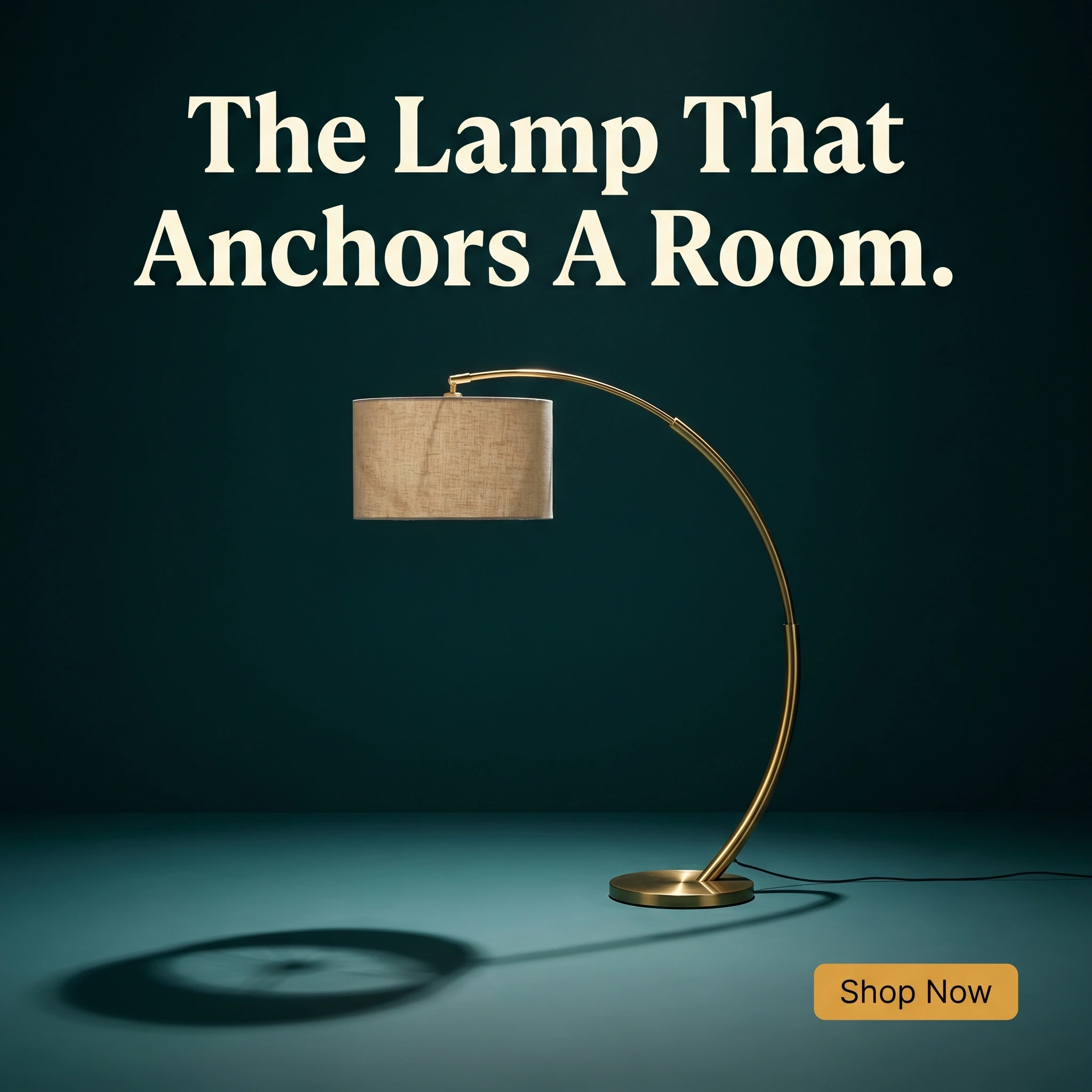
The format & angle. Marigold Home’s statement piece, alone: a sculptural brass arc floor lamp, studio-lit against a saturated teal sweep. Taste and quiet status — one object treated like design, not merchandise.
Who it targets. Cold and warm shoppers with an eye for design, who reward a brand with a point of view.
The hook. “The Lamp That Anchors A Room.” It sells the lamp’s role — the piece everything else arranges itself around — not its wattage.
Why it works. A single sculptural product on bold color is the decor version of a fashion hero: it signals taste before it sells a feature. Shoppers who buy statement lighting aren’t comparing lumens; they’re buying the confidence that this is the right piece, and a gallery-style frame supplies it. The saturated background does double duty — color stops the scroll, and the sweep frames the silhouette at thumbnail size. Naming the lamp’s job (“anchors a room”) flatters her eye instead of reciting a spec.
Steal it. Pick your most sculptural single SKU, light it cleanly against one saturated brand color, and headline what the piece does for a room rather than what it’s made of. Save the specs for the product page; the ad’s only job is to make the shape look inevitable.
3. The Nook & Vine room transformation ad
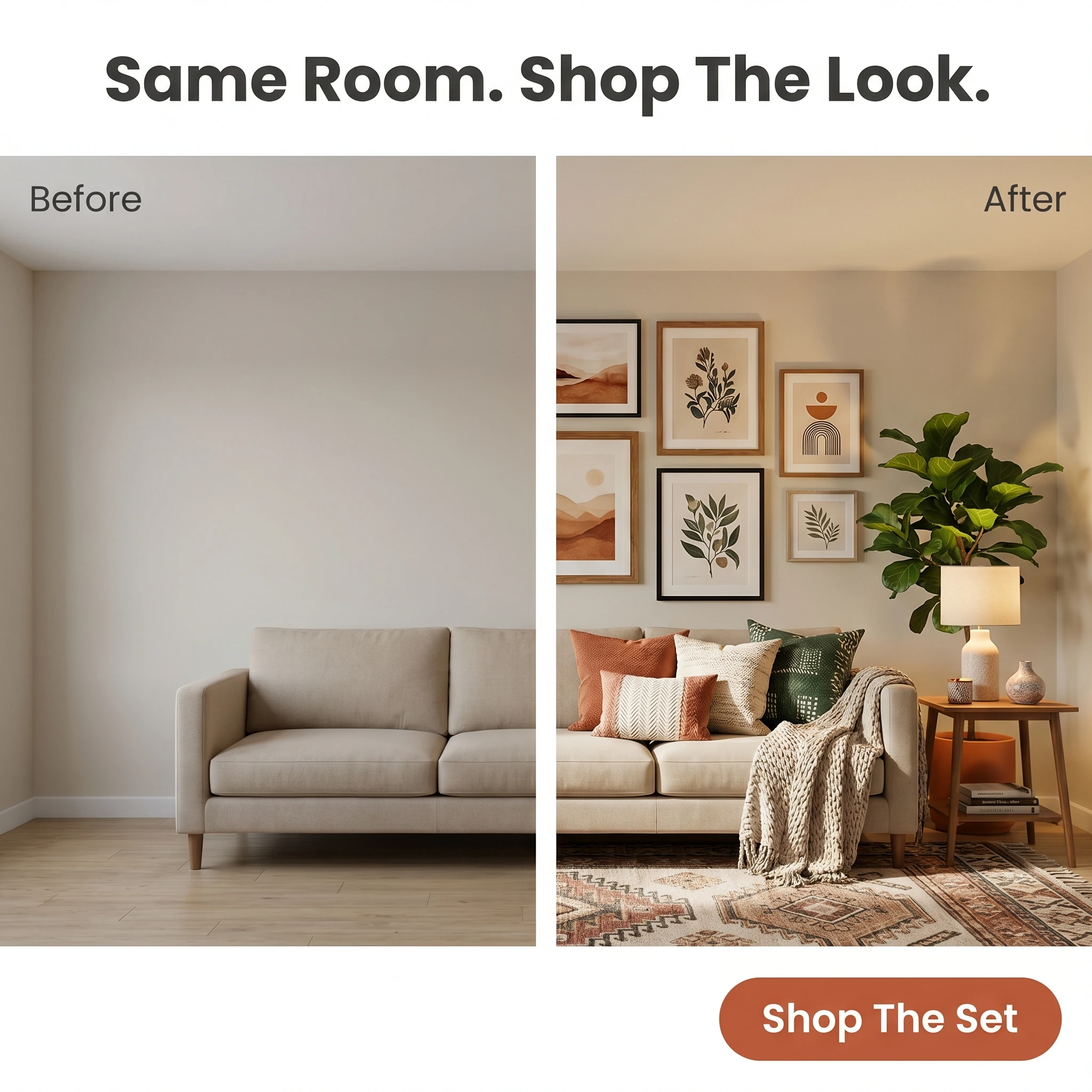
The format & angle. Nook & Vine’s “shop the look” split: a bare, beige rental living room on the left; the identical room layered with a rug, sofa, art, and lighting on the right. The us-vs-the-old-way transformation — empty box to finished space.
Who it targets. Warm shoppers who like the brand’s pieces but can’t picture how they come together — the “I don’t know where to start” decorator.
The hook. “Same Room. Shop The Look.” It promises the whole transformation is buyable as a set, removing the work of assembling it herself.
Why it works. A bland-to-styled split converts the most common decor objection — I can’t visualize it — into a deadline-free demonstration. The left half is every shopper’s actual living room; the right half is the version she’s been scrolling toward. The same walls make the change feel achievable, not staged, and “shop the look” turns a single sofa sale into a multi-item basket, which is where decor margin lives.
Steal it. Photograph one empty room, then style it with a coordinated set of products from the same camera position. Bundle those pieces as a shoppable “look” so the click lands on a basket, not a single SKU — the same lever fashion brands pull in the strongest fashion ecommerce ad examples.
4. The Saffron & Slate reviews testimonial ad
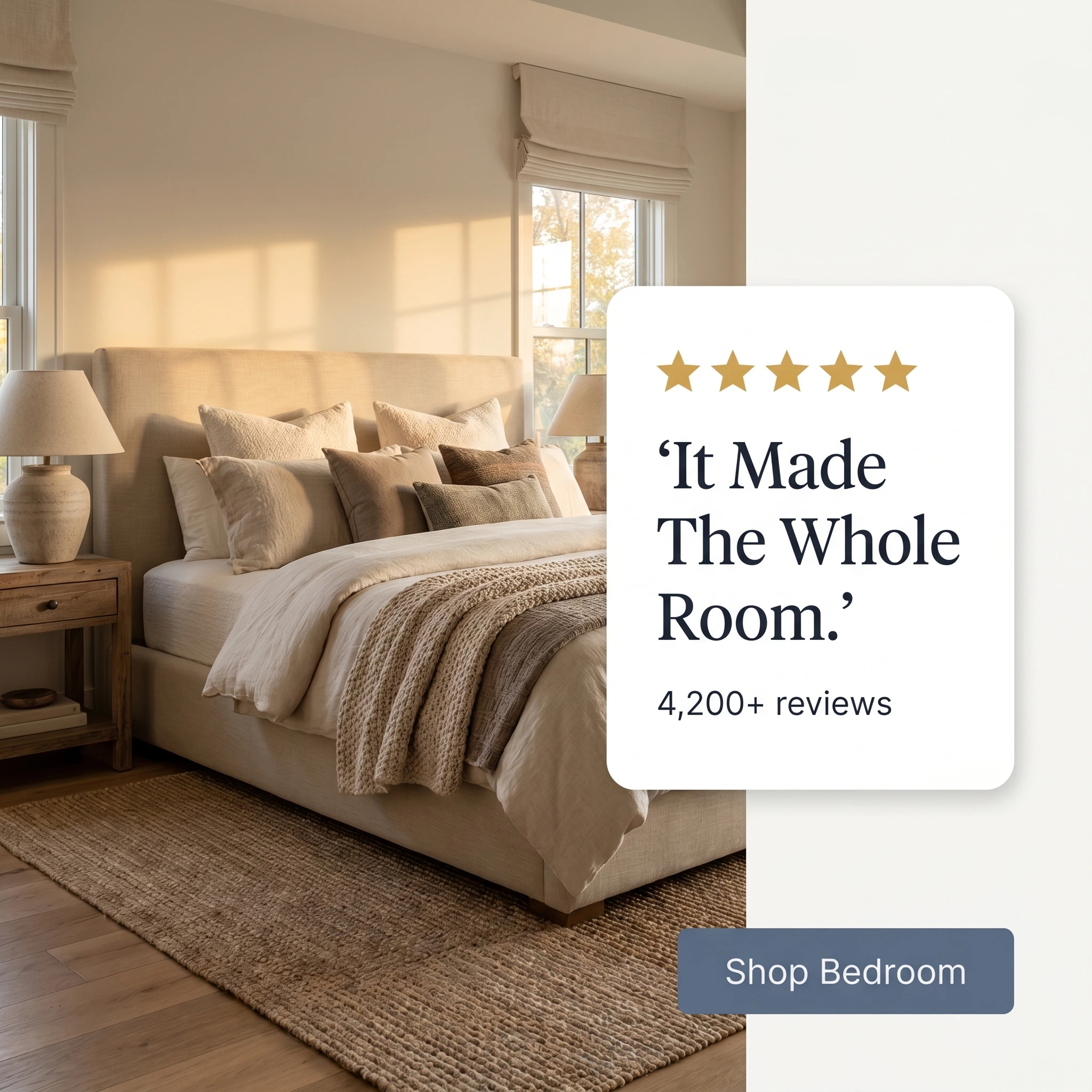
The format & angle. Saffron & Slate: a softly styled bedroom photo beside a quote card, five gold stars, “4,200+ reviews.” Trust, told through other people’s taste.
Who it targets. Warm shoppers weighing a higher-consideration buy — a bed, a large rug, a sofa — where the price makes hesitation fair.
The hook. “It Made The Whole Room.” A customer fragment that credits one piece with transforming a space, the exact outcome a considered buyer is hoping for.
Why it works. A $900 bed is a basket a shopper sleeps on for a week, and a product photo can’t settle whether it’s worth it. A real review paired with a styled result does two jobs: the quote supplies the payoff she wants (“it made the whole room”), and the visible review count turns one opinion into a crowd — the strongest tiebreaker on a high-AOV order. Reusing earned reviews as cold-traffic creative also stretches an asset you’ve already paid for, and Meta’s delivery leans toward ads carrying that proof.
Steal it. Mine your reviews for lines about the effect a piece had on a space, not just product quality, then headline the card with that quote and pin your running total — “4,200+ reviews” — right beneath it. Pair the quote with a real styled photo of that item, not a stock room.
5. The Driftwood Studio shipping offer ad
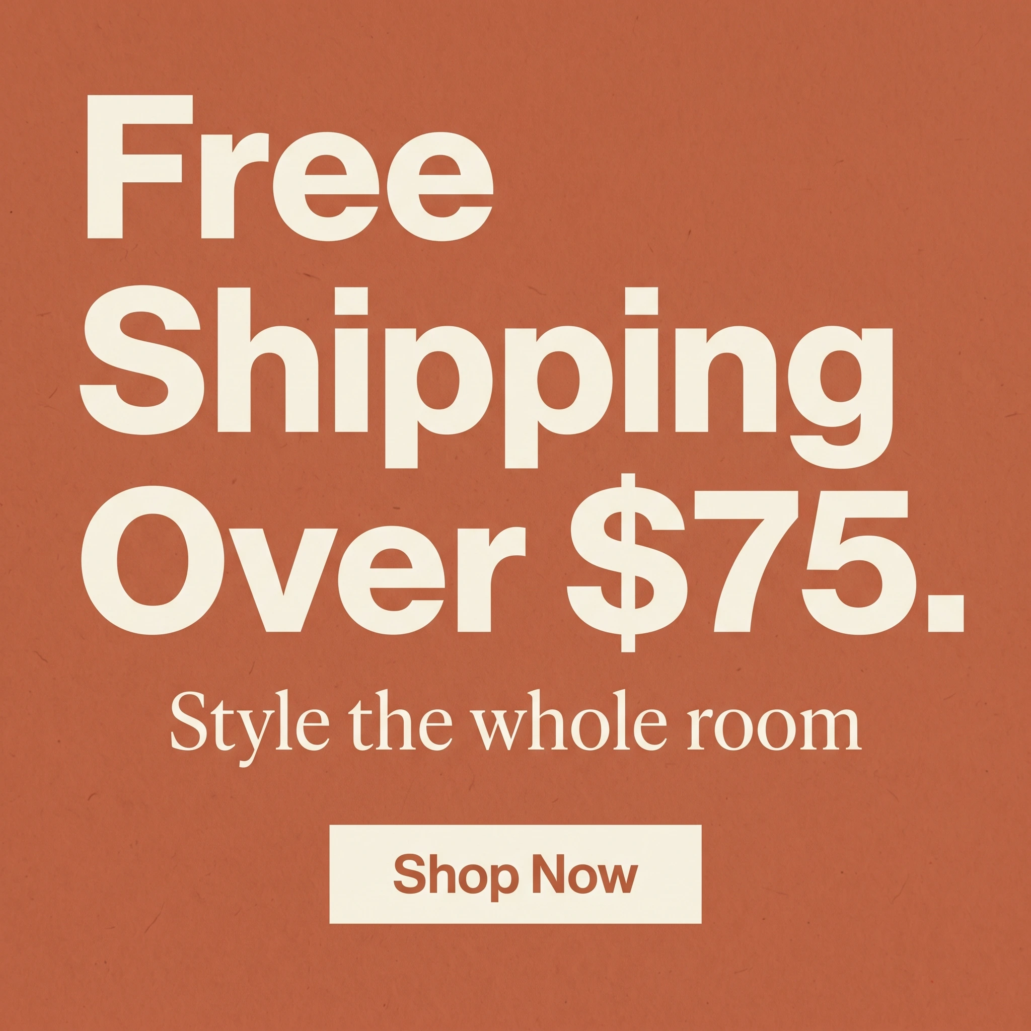
The format & angle. Driftwood Studio’s value play: big type, one threshold, a warm clay background, no product photo. Price and value, framed as a reason to fill the cart rather than a discount that trains shoppers to wait.
Who it targets. Cold and warm shoppers on the fence about a small accent — the order one item short of feeling worth it.
The hook. “Free Shipping Over $75.” A concrete number that reframes the decision from “should I buy this $40 vase” to “what else gets me to $75.”
Why it works. Free-shipping thresholds are the cleanest lever in ecommerce: they lift average order value instead of eroding margin the way a blanket percentage off does. A typography-led promo reads as a store-wide perk, not an agency campaign, and the specific number does the targeting — it nudges the shopper to add a second item rather than abandon the first. Set the bar just above your typical cart and the offer pays for itself. The format rotates easily, too — swap the number without reshooting.
Steal it. Look up your average order value, set the free-shipping bar a notch above it, and build a bold typographic ad around that one number. Skip the product photo so the offer reads instantly, and refresh the creative before ad fatigue erodes it.
Put all five in the feed
A dream corner, a statement piece, a styled transformation, a review, and a shipping offer — five decor ads aimed at five shopper mindsets. Since Meta’s Andromeda overhaul, the auction sifts a far deeper pool of creative per impression and rewards the store that hands it real range, pairing each ad with the segment it converts best. Reskins of one product shot reach most of that audience with nothing pitched at how they shop; five distinct angles cover them. The same portfolio logic shows up across Shopify store ad examples and the broader library of static ad examples.
Run the mix deliberately, then re-skin all five each season as palettes and drops change: holiday tablescapes, spring refreshes, a new rug collection — same five concepts, a quarter of creative from one afternoon. When a concept earns its likes and saves, relaunch it from the existing post, not a fresh upload, so the new season inherits the engagement the old one banked. A faded exterior or a tired wall color is the next thing she’ll fix — the painting company ad examples breakdown covers that adjacent moment.
The strategy was never the hard part; turning out fresh on-brand statics every drop without another shoot is. Zendux closes that gap — static variants in your store’s palette and type, bulk-launched across your ad sets, so creative volume stops gating the calendar.
Want to generate winning home decor ads? Start using Zendux AI