5 Fashion Ecommerce Ad Examples That Sell
Five fashion ecommerce ad examples that beat fit anxiety and the scroll — a try-on UGC ad, a fabric hero, a quality comparison, a fit testimonial, and a sale offer.
Fashion ecommerce ads that actually sell do one job before they do anything else: they kill the two doubts that stop an online clothing purchase — “will it fit?” and “is the quality real?” Pretty photography stops the scroll; believable fit and fabric close the checkout. The five fictional ads below — a relatable try-on, a fabric-quality hero, a fast-fashion comparison, a fit testimonial, and a deadline sale — each take a different angle in a layout that looks nothing like the others.
Key takeaways
- Fit anxiety is the real conversion blocker: creative that shows the garment on a real body and names the size outperforms catalog shots for cold traffic.
- UGC carries believability — candid try-on footage answers drape and movement that a flat-lay can’t.
- Quality has to be shown, not claimed: a stitch close-up or a fabric texture beats the word “premium” every time.
- Run five distinct angles, not five color-ways of one ad — near-duplicate creatives compete for the same shoppers and cap your reach.
What makes a great fashion ecommerce ad
The buyer is scrolling for entertainment, not shopping. Your ad interrupts a feed, so the first frame has to earn a second of attention with either desire (a fabric, a fit, a vibe) or recognition (“that’s exactly the jacket I’ve been looking for”). You get that second or you get scrolled.
Then comes the doubt. Online apparel has a structural trust problem — the shopper can’t touch the cloth or try the size — and returns eat the category’s margin. The creative that converts cold traffic addresses both inside the ad: real movement, a visible size reference, a stitch or weave close-up. This is where UGC earns its keep, because a customer filming herself in your jeans is proof a studio shot can’t fake. The same believability principle drives the broader ecommerce ad examples playbook and the platform-specific Shopify store ad examples breakdown — fashion just raises the stakes on fit.
Format discipline matters more here than in most niches because shoppers judge production value as a quality signal. Shoot for 4:5 and 1:1 first, version to 9:16 for Reels, and keep one focal point per frame — the aspect ratio guide covers the placement math. Below, the five concepts and where each fits.
| Ad | Format | Angle | Funnel stage | Best for |
|---|---|---|---|---|
| Real-jeans try-on UGC | UGC | Relatable desire | Cold | Denim & core basics |
| Worn-in fabric hero | Product hero | Quality/status | Cold/warm | Premium positioning |
| Fast-fashion vs. forever | Comparison | Us-vs-old-way | Warm | Sustainable / quality brands |
| True-to-size testimonial | Testimonial | Trust/fit | Warm | High-return categories |
| Weekend sale offer | Offer | Price/urgency | Cold/warm | Promo & clearance pushes |
1. The real-jeans try-on UGC ad
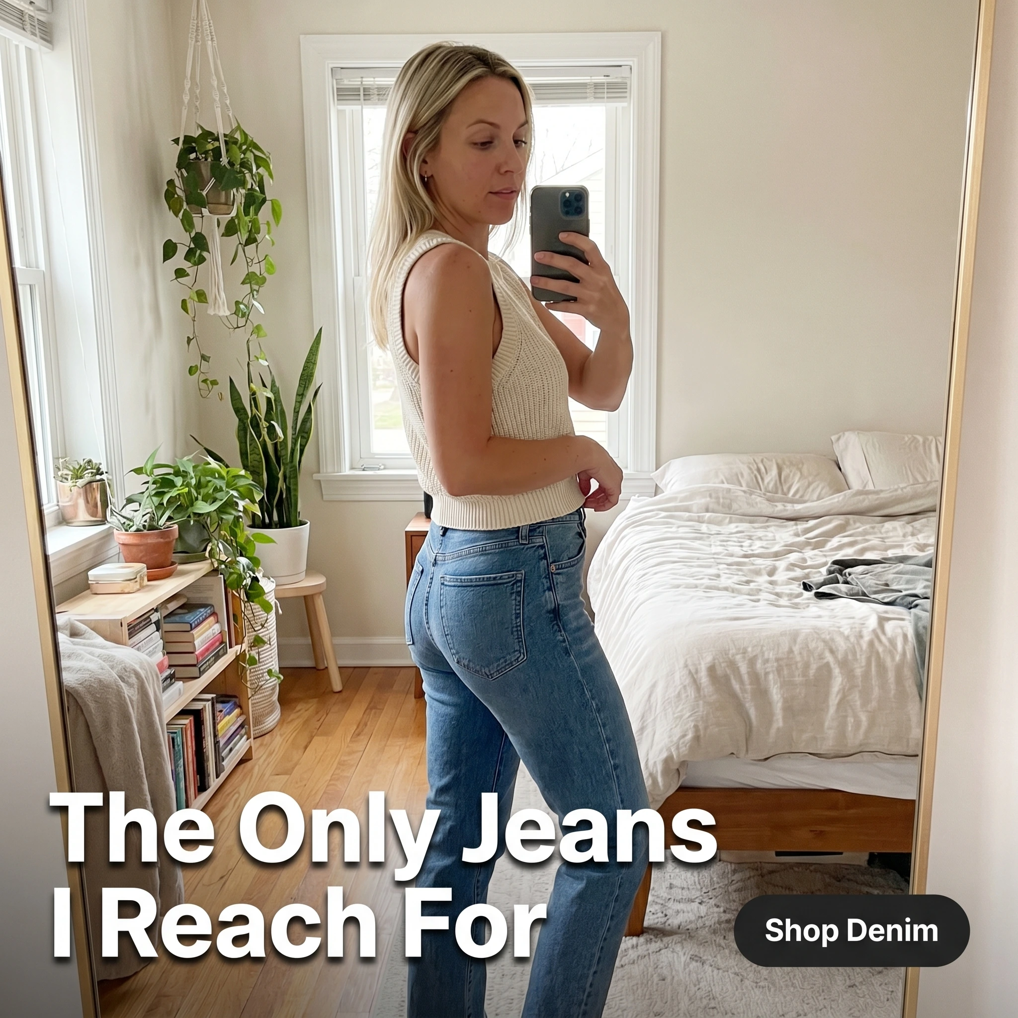
The format & angle. A Lunavera customer in front of her bedroom mirror, phone in hand, turning to show how the denim sits. It looks filmed by a friend, not a brand. Relatable desire over aspiration.
Who it targets. Cold shoppers in the brand’s demo who’ve been burned by online denim before — the people who add to cart and abandon over fit doubt.
The hook. “The Only Jeans I Reach For.” It’s a possession statement, not a sales claim — the way a real person describes a wardrobe staple.
Why it works. A mirror try-on answers the questions a flat-lay can’t: how the rise sits, how the fabric moves, what the fit reads like on a body that isn’t a fit model’s. The candid framing lowers the ad’s guard, so the viewer processes it as a recommendation instead of a pitch. That’s the believability that turns cold denim traffic — a notoriously skeptical audience — into first orders.
Steal it. Send product to three customers in different sizes and ask for a 15-second mirror turn each. Caption the on-image headline as something a person would actually say about the piece, not a tagline.
2. The worn-in fabric hero ad
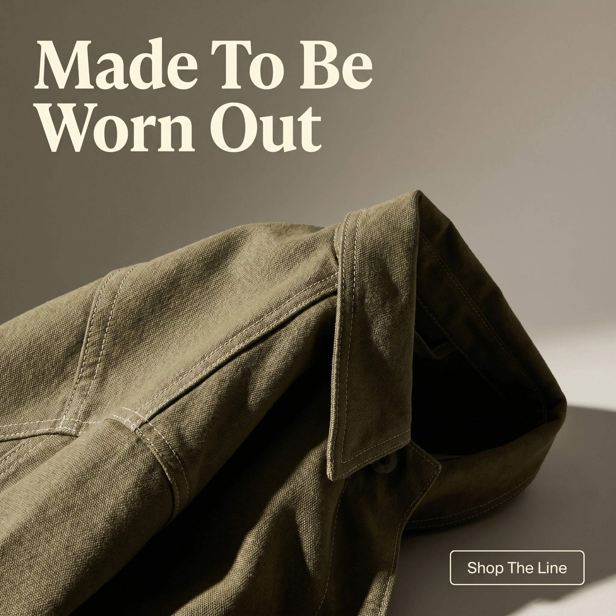
The format & angle. Marrow & Pine’s signature jacket shot as a hero — folded to show the weave, raking light catching the topstitching, deep color against a clean background. Quality and quiet status.
Who it targets. Cold and warm shoppers who pay for durability and craft over trend — the anti-fast-fashion buyer.
The hook. “Made To Be Worn Out.” A double meaning: worn often, and worn until it wears out — a quality promise disguised as a line.
Why it works. Premium positioning fails when brands say “premium” instead of showing it. A texture close-up lets the fabric do the arguing — visible weave and clean stitching read as quality before a single adjective. The single-focal-point hero also signals confidence: a brand that zooms in on its own construction is telling you it can survive the inspection.
Steal it. Shoot your best-constructed piece in hard side light to throw the texture into relief. Headline the longevity, not the look — durability is the claim flat-lays usually leave on the table.
3. The fast-fashion-vs-forever ad
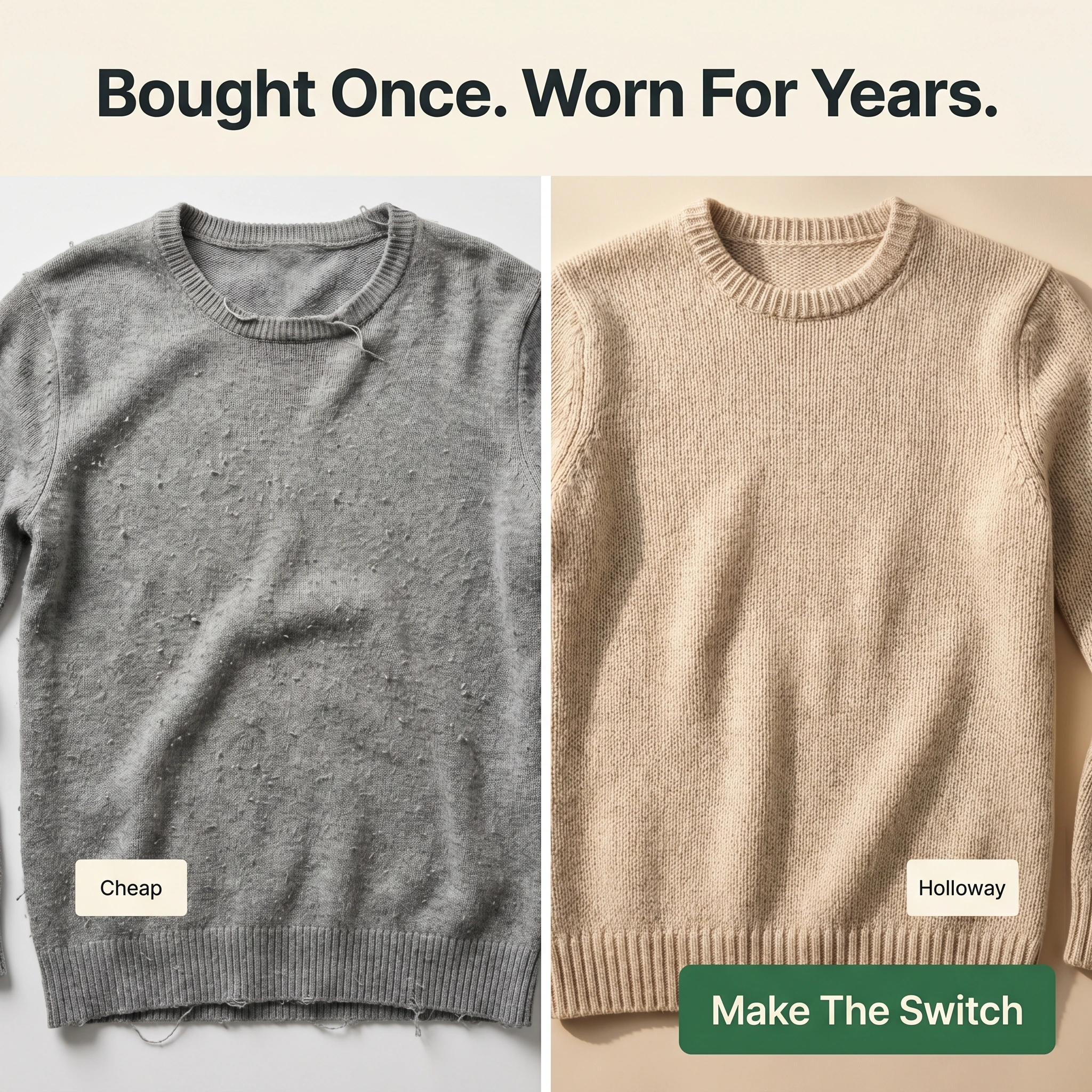
The format & angle. A Holloway & Co. split frame: left, a pilled, misshapen budget sweater after a few washes; right, the brand’s knit looking intact. Us-versus-the-old-way.
Who it targets. Warm shoppers — site visitors and email subscribers — who are value-conscious but tired of replacing cheap clothes.
The hook. “Bought Once. Worn For Years.” Reframes a higher price as a lower cost-per-wear without saying “investment.”
Why it works. The comparison format weaponizes a feeling every shopper has had — the disappointment of a garment that died in a season. Showing the failure mode on the left makes the right side feel like relief, not upsell. It reframes price as math: pay more once or pay less repeatedly. That argument lands hardest on warm audiences who already like the brand but balk at the price.
Steal it. Photograph a genuinely worn-out competitor-tier garment beside your equivalent, same crop, same light. Let the visual carry the contrast; keep the headline to the cost-per-wear idea in plain words.
4. The true-to-size testimonial ad
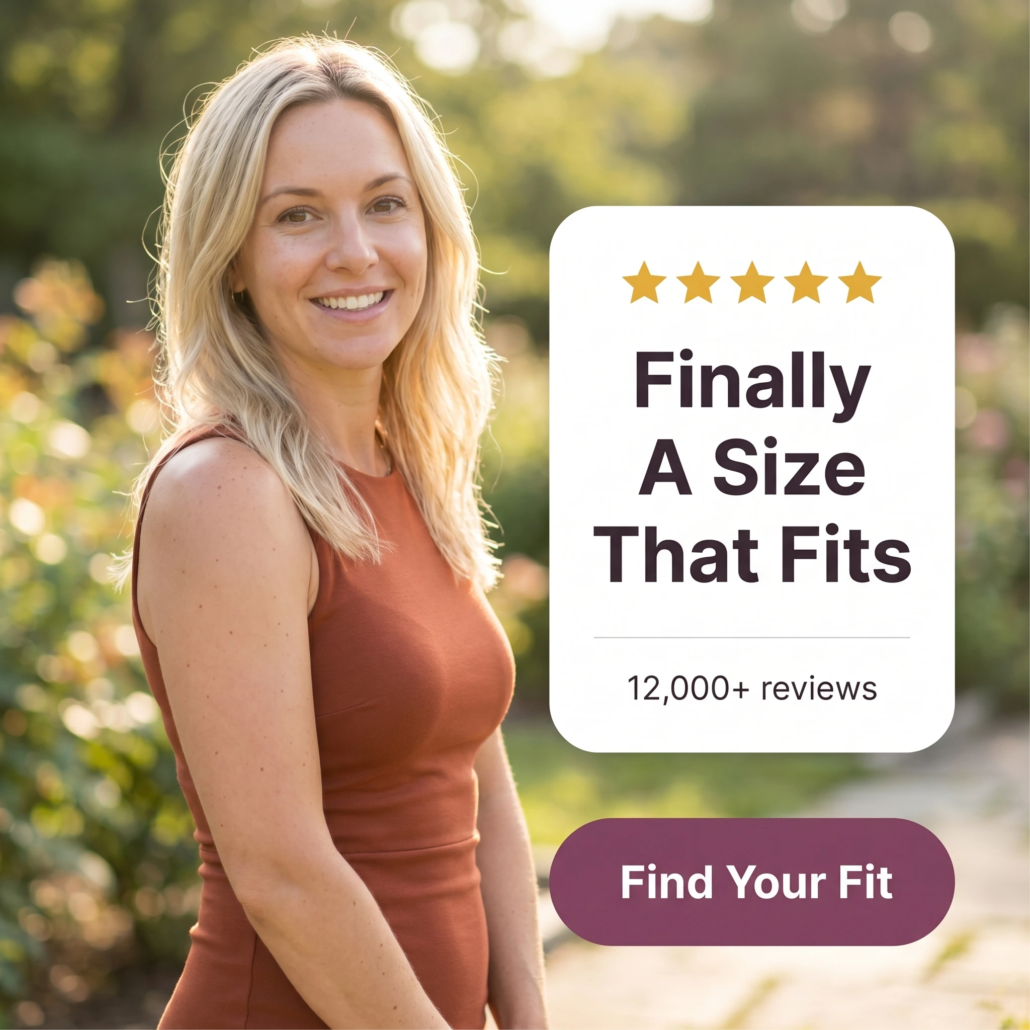
The format & angle. Veska Studio pairs a real customer photo with a review card — five stars, “12,000+ reviews,” and a fit-specific quote. Trust, aimed straight at sizing fear.
Who it targets. Warm shoppers stalled at the size question — the cart-abandoners who like the piece but don’t trust the sizing.
The hook. “Finally A Size That Fits.” It names the exact frustration of online apparel and credits the brand with ending it.
Why it works. At the fit-doubt stage, shoppers aren’t evaluating style anymore — they’re evaluating risk. A fit-specific testimonial, backed by a visible review count, converts one person’s relief into social proof that the sizing is reliable. The review volume matters as much as the quote: it signals a distribution of satisfied buyers, not a cherry-picked rave. Fewer wrong-size orders also means fewer returns chewing through margin.
Steal it. Mine your reviews for fit language — “true to size,” “fits like it’s tailored” — and build the card around the most specific one, with your live review count beneath it.
5. The weekend sale offer ad

The format & angle. Sundera’s seasonal push: typography-led, the discount dominant, a hard deadline, a confident color block — no model, no product. Price and urgency.
Who it targets. Cold and warm shoppers who need a reason to buy now instead of bookmarking — bargain-aware and deadline-driven.
The hook. “Everything 30% Off Til Sunday.” A round discount plus a named day; the deadline is checkable, which makes it move people.
Why it works. A typography-only promo reads as a store sale, not an agency campaign, and that plainness is the point — shoppers trust a clear deal more than a slick one. The dominant discount answers the only question this buyer has, and the specific deadline beats “limited time” because it’s real and close. It’s the lowest-friction concept in the set and the one that monetizes the audience the other four warmed up.
Steal it. Anchor the discount as the largest element, name the actual end day, and run it against retargeting audiences the brand-building ads already touched. Rotate the creative before fatigue sets in.
Run the whole set, not one bestseller
Five concepts, five jobs: the try-on earns belief, the hero sells craft, the comparison reframes price, the testimonial settles fit, the sale closes the cart. That spread matters under current Meta delivery — its Andromeda retrieval engine widened how many creatives the auction can weigh and personalize, so genuinely different ads each find their own pocket of shoppers while near-duplicates fight over one.
Sequence them by temperature: heros and try-ons to prospect cold, the comparison and testimonial for retargeting, the sale for the warmest carts. Then rotate often, because apparel audiences chew through creative faster than most and ad fatigue shows up early as rising frequency and sliding returns.
Turning out that many on-brand concepts each season is the real constraint, and the one Zendux lifts: describe the brand once, spin up on-brand static variants with AI, and push them live across ad sets in a single sitting.