5 Kitchen Remodeling Ad Examples That Convert
Five kitchen remodeling ad examples that turn Pinterest dreamers into booked design consults — a candid reveal UGC, a pinned-kitchen hero, a dated-90s before/after, an on-budget testimonial, and a free 3D-design offer.
Kitchen remodeling ad examples that actually book consults all sell the same thing first: the finished kitchen the homeowner already pictures when they close their eyes. Spec sheets, cabinet brands, and quartz grades come later, on the landing page. At the feed level you are selling a daydream and the confidence that you will deliver it on time and on budget. The five concepts below — a candid reveal, a dream hero, a transformation, a trust testimonial, and a no-risk offer — each chase a different slice of that five-figure decision in a visibly different format.
Key takeaways
- Meta seeds the dream and earns the consult for a months-long, $25k–$80k decision; it is a pipeline builder, not an instant-lead channel.
- The portfolio is the proof: finished-kitchen photography and real before/afters do the persuading that no adjective can.
- On-time, on-budget is the deciding fear — name the timeline and let on-schedule reviews answer the homeowner’s dread of a stalled, over-budget job.
- Financing reframes the price — a monthly figure widens the audience that will book a consult on a five-figure project.
- A varied lineup fills the design calendar — island dreamer, resale-driven seller, and budget-anxious comparer each click a different concept; one repeated “winner” forfeits the rest under Meta’s delivery.
What makes a great kitchen remodeling ad
The buyer is a homeowner who has been collecting kitchen photos for months. The trigger is usually one of three: a dated 90s kitchen they have finally stopped tolerating, a move that makes resale value urgent, or a lifestyle upgrade — they want the open-concept island where the family actually gathers. None of these are emergencies. The decision unfolds over weeks of browsing, screenshotting, and quietly pricing, which is exactly the mindset Meta reaches better than search.
The proof that matters is visual and verifiable. A homeowner cannot judge your framing or your cabinet installs, so they judge two things they can see: your finished portfolio and your reputation for finishing. A wall of beautiful completed kitchens answers the taste question. On-time, on-budget reviews and clean before/afters answer the deeper fear — the half-demolished kitchen that drags on for three months while the family eats takeout. Pin each ad to one claim the homeowner could verify — a finished room, a dated build year, an on-schedule review — the discipline that lifts the best static ads above wallpaper.
The economics reward patience. A finished-kitchen hero can push your Meta CPM toward the upper end of the $12–$30 renovation range, and a booked consult looks pricey — until one becomes a $50k contract. The catch is the cycle: a consult rarely closes that week, so the win comes from retargeting browsers over time. Price every campaign in cost-per-consult, never cost-per-click. Bathroom remodels run on a faster, smaller-ticket clock; the bathroom remodeling ad examples breakdown covers that quicker-turnaround playbook.
| Ad | Format | Angle | Funnel stage | Best for |
|---|---|---|---|---|
| Island-reveal UGC | UGC | Status/lifestyle | Cold | Open-concept and island specialists |
| Pinned-kitchen hero | Service hero | Dream outcome | Cold | Design-led firms with a strong portfolio |
| 1990s-to-bright split | Before/after | Us-vs-the-old-way | Warm | Markets full of dated original kitchens |
| On-budget testimonial | Testimonial | Trust/credibility | Warm | Firms with on-schedule reviews |
| Free 3D-design offer | Offer | Price/value | Cold/warm | Filling the design-consult calendar |
1. The island-reveal UGC ad
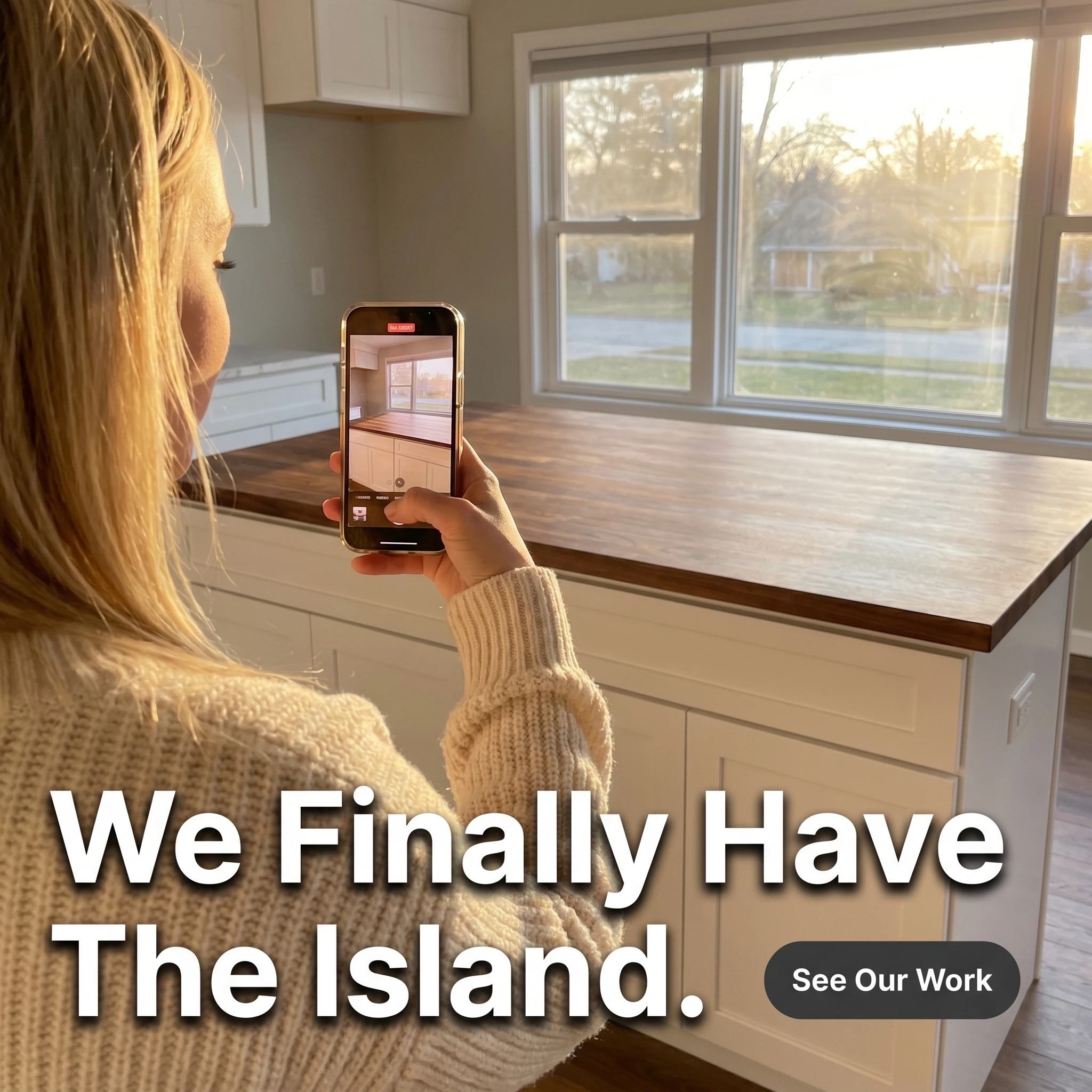
The format & angle. Copperleaf Kitchens, shot like a homeowner’s own reveal video: a woman holding her phone up to pan across a freshly finished island, late-afternoon kitchen light, slightly imperfect framing. Status and lifestyle, in the buyer’s own voice.
Who it targets. Cold homeowners who want the open-concept island life — the gathering spot where the family ends up — more than they want any particular countertop.
The hook. “We Finally Have The Island.” The word “finally” carries years of wanting, and “we” makes it about the household, not the hardware.
Why it works. UGC-style creative borrows the credibility of a friend’s post, which is why it stops the scroll where a polished hero might get filed as an ad. The reveal frames the kitchen as a lived-in win rather than a product, and the island — the social and emotional center of the open-concept dream — does the aspirational lifting. “Finally” turns a renovation into an arrival, which is exactly how status-driven buyers narrate the purchase to themselves and their friends. It also models the exact organic content your happiest clients already post.
Steal it. Ask a recent client to film a 15-second phone pan of their favorite finished feature on reveal day, and caption it in their own words. Run it as a static frame or a short clip; the un-produced look is the point — do not over-polish it.
2. The pinned-kitchen hero ad

The format & angle. Henley & Stone’s portfolio hero: a finished bright-white kitchen with a marble waterfall island, brass fixtures, and morning light, shot like an interiors magazine cover. Pure dream outcome — the kitchen they have already saved to a board.
Who it targets. Cold homeowners deep in the browsing phase, the ones with a Pinterest board titled “someday kitchen.”
The hook. “The Kitchen You Keep Pinning.” It names the behavior the buyer is already doing and tells them it is buildable, by you.
Why it works. Dream-outcome creative works here because the buyer is not shopping for cabinetry — she is shopping for a feeling she has rehearsed for months. A flawless finished kitchen is both the aspiration and the proof of competence in one frame; it says “we make exactly this” without a single adjective. Naming the pinning habit creates a small jolt of recognition that stops the scroll, and the magazine-grade styling quietly signals the price tier so the wrong-budget clicks self-select out.
Steal it. Photograph your single best finished kitchen at golden hour with a real photographer, not a phone. Headline the buyer’s behavior or fantasy — what they would call this kitchen — and save the cabinet brand for the consult.
3. The 1990s-to-bright split ad
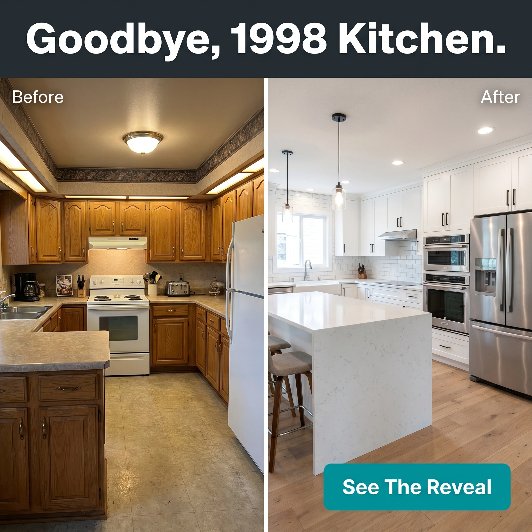
The format & angle. Marble & Maple Co.’s signature transformation: dated honey-oak cabinets, laminate counters, and a soffit on the left; an open, bright, island-centered kitchen on the right. The trade’s most persuasive native format — us versus the old way.
Who it targets. Warm homeowners living in a kitchen that looks like the left half — original to a 90s build, and finally intolerable.
The hook. “Goodbye, 1998 Kitchen.” The year is the hook; every viewer instantly dates their own oak cabinets and winces.
Why it works. A kitchen remodel is a want that homeowners defer for years, and the split frame converts deferral into resolve by making the old kitchen look like the eyesore they have learned to ignore. The right half does double duty: it shows the dream and it pre-sells your workmanship — clean sightlines, level uppers, tidy tile say more about your crew than any badge. Best of all, the before is free; you already demolished it.
Steal it. Shoot every job’s before and after from the same tripod spot and make it a crew habit. Put the home’s real build decade in the headline — specificity is what lands the recognition.
4. The on-budget testimonial ad

The format & angle. Northridge Cabinetry: a homeowner leaning on his new island beside a quote card, five gold stars, “300+ five-star reviews.” Trust, told as the absence of a nightmare.
Who it targets. Warm audiences — consult requesters and site visitors comparing two or three remodelers before they commit five figures.
The hook. “On Budget, On Schedule, No Surprises” — a review fragment that names the exact three things a kitchen buyer is terrified of.
Why it works. A homeowner weighing three quotes can’t grade your joinery; they grade whether past clients came through intact. The deepest fear in a kitchen remodel is the project that balloons past budget and drags weeks past the date while the family lives out of a microwave. A review that explicitly retires that fear is stickier than any “quality you can trust” line. The visible review count turns one customer into a pattern and puts your hard-earned reputation to work as reach.
Steal it. Comb your reviews for the line where a client says “budget,” “on schedule,” or “no surprises,” put it on the card with your live five-star total beneath, and photograph that client at the island you built.
5. The free 3D-design offer ad

The format & angle. Larkspur Kitchens’ lead magnet: big type, one irresistible no-risk offer, a soft sage-and-cream palette, a small render thumbnail in the corner. Price and value, with the price set to zero at the top of the funnel.
Who it targets. Cold and warm homeowners who love the idea but are not ready to call a contractor — a free design lowers the entry cost to almost nothing.
The hook. “Free 3D Kitchen Design.” Concrete, valuable, and zero-commitment — it trades a daydream for a rendering, not a sales call.
Why it works. The leap from “I want a new kitchen” to “I’ll invite a contractor over” is huge, and a free 3D design is the foot-in-the-door that shrinks it. The homeowner gets to see her own room rendered before any pressure, and you get a high-intent lead plus a consultation that surfaces real scope and budget. The typography-led layout reads as a genuine studio offer rather than an agency campaign, and “3D” beats “free estimate” because it promises something she actually wants to look at. For more on why a single clear offer outperforms a clever one, see how to write Facebook ad copy at scale.
Steal it. If you run design software, offer the render free in exchange for a consult booking, cap the slots honestly, and lead with the deliverable the homeowner wants to hold — the picture of her own kitchen, not a quote.
Put all five in the showroom
A reveal, a dream, a transformation, a reassurance, and an offer — five kitchen remodeling ads aimed at five different points in a long, deliberate decision. Since the Andromeda overhaul, Meta sifts a far deeper pool of creative for every slot, rewarding the advertiser who hands it five distinct kitchens to match against five buyers, not one ad straining to court them all. General contractors and design-build firms face the same dynamics across project types; the construction ad examples breakdown covers the broader build-trade patterns.
Run the cycle deliberately: lead cold audiences with the UGC reveal and the hero, retarget engaged browsers with the before/after and the free-design offer, and serve the on-budget testimonial to consult requesters comparing you against two competitors. Same five concepts, sequenced to the buyer’s journey rather than fired all at once — and rotated before ad fatigue flattens the winners. When a proven kitchen ad returns next season, relaunch it from the same post ID so its likes and comments ride along instead of resetting to zero.
For most design-build firms the bottleneck isn’t strategy — it’s the hours to keep five on-brand concepts in rotation. Zendux removes it: AI-generated static variants in your studio’s look, bulk-launched across ad sets in minutes.
Fill your design calendar with better creative →
Want to generate winning kitchen remodeling ads? Start using Zendux AI