5 Yoga Studio Ad Examples That Fill the Schedule
Five yoga studio ad examples that fill classes: a post-class UGC, a sunlit studio hero, a flexibility-myth callout, a back-relief review, and a 30-day offer.
Yoga studio ad examples that fill classes sell calm and belonging, not flexibility or physique — both because that’s what brings nervous newcomers through the door, and because Meta’s personal-health policies restrict body-focused framing. The person you most want to reach isn’t an experienced yogi; it’s someone stressed, a little stiff, and quietly convinced they’re “not a yoga person.” The five fictional ads below each dissolve that belief from a different angle, in a different format, so Meta can route each to the people it reassures.
Key takeaways
- Sell the feeling, not the pose. Calm, stress relief, and an hour to yourself convert the stressed beginner; advanced postures scare them off.
- Kill the flexibility myth. “You don’t need to touch your toes” removes the single most common excuse — flexibility is the result, not the requirement.
- Lead newcomers, not yogis. Approachable imagery and beginner class names signal a room built for exactly where they are.
- Five distinct angles — calm, sanctuary, reassurance, relief, and an intro pass — give the auction five newcomer types to find.
What makes a great yoga studio ad
The growth audience for a studio is the stressed desk-worker, the new parent, the person whose doctor said “try yoga for your back.” They’re not shopping for a workout; they’re shopping for relief and a little peace, and they carry two specific fears: that they’re too inflexible and that they’ll embarrass themselves.
Two principles, plus a constraint.
Lead with the feeling. Yoga’s real product is how you feel after — calmer, looser, lighter. Ads that promise that internal payoff outperform ads that showcase what the body can do, because the buyer wants the former and is intimidated by the latter.
Make beginners feel expected. The nervous newcomer needs proof the room won’t judge them. Beginner-named classes, ordinary people on mats, and explicit “no experience needed” language do that work — the studio that looks welcoming wins the click.
The constraint is compliance, and it’s gentler here than in weight-focused fitness but still real. Meta restricts body-transformation framing and clinical promises, so claims stay experiential — “leave calmer,” “my back feels better” — and the usual before/after slot becomes a flexibility-myth callout. For the broader category, the fitness ad examples set covers studios and classes, and the high-performing examples here are worth a look before you brief creative.
| Ad | Format | Angle | Funnel stage | Best for |
|---|---|---|---|---|
| Post-class calm UGC | UGC | Dream/stress relief | Cold | Studios near offices and commuters |
| Sunlit sanctuary hero | Hero | Escape/self-care | Cold | Boutique studios selling atmosphere |
| Flexibility-myth callout | Callout (swapped before/after) | Reassurance/us-vs-the-old-way | Cold | Beginner-program acquisition |
| Back-relief testimonial | Testimonial | Functional trust | Warm | Studios with strong reviews |
| 30-day intro offer | Offer | Price/low risk | Warm/retargeting | Converting trials to members |
1. The post-class calm UGC ad
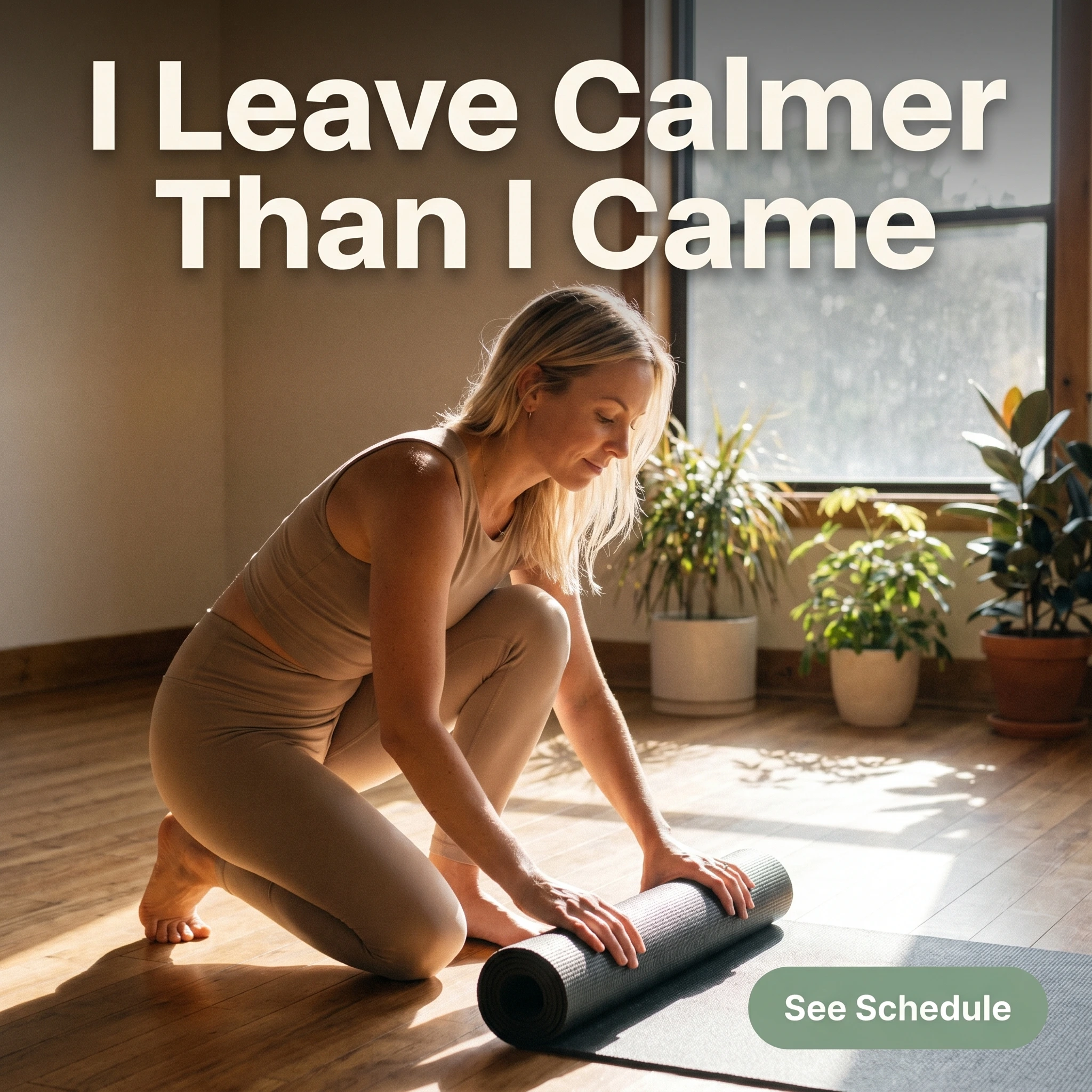
The format & angle. A candid phone shot from Stillwater Yoga: someone calmly rolling up their mat after class, sunlit studio behind them. The dream outcome is internal — stress, gone.
Who it targets. Cold prospects under daily stress — office workers, parents, anyone whose week needs a release valve more than a workout.
The hook. “I Leave Calmer Than I Came.” The before/after of a mood, not a body.
Why it works. Yoga’s true draw is regulation, not exercise, and naming the calm sells the actual benefit. UGC styling makes it read as a real student’s experience, and the relaxed, ordinary subject signals an unintimidating room. Nothing about flexibility or physique — just the feeling the buyer is chasing.
Steal it. Photograph a real student mid-pack-up, serene and unposed, in natural studio light. Headline the emotional payoff. The stressed scroller recognizes that exhale instantly.
2. The sunlit sanctuary hero ad
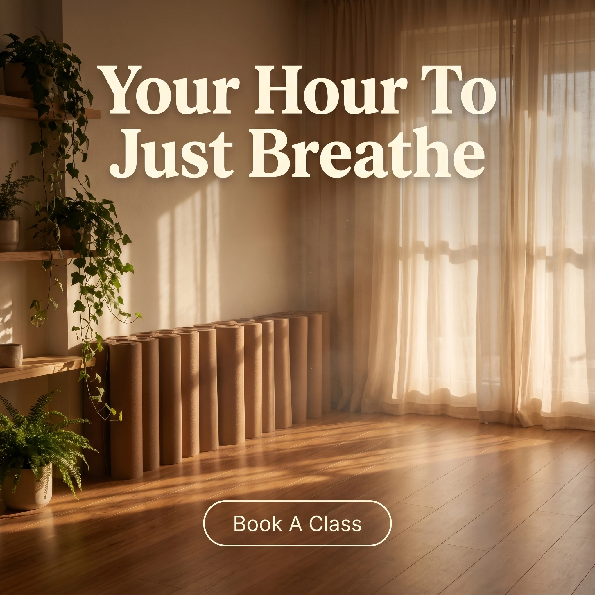
The format & angle. Lotus & Linden’s empty studio at golden hour: wood floors, rolled mats, plants, light through sheer curtains. Self-care, sold as a place.
Who it targets. Cold boutique-minded prospects choosing a studio on atmosphere as much as schedule.
The hook. “Your Hour To Just Breathe.” Permission to claim an hour for themselves.
Why it works. Boutique studios sell a sanctuary, not a service, and the empty sunlit room lets the viewer imagine themselves into it — an open loop a crowded class photo would close. The calm composition stands out in a feed of high-energy fitness ads, and the absence of bodies sidesteps every personal-health policy concern while still selling the experience.
Steal it. Shoot your space empty at the prettiest light of day — warm, soft, uncluttered. Headline the escape, not the workout. The room is the product; let it breathe in the frame.
3. The flexibility-myth callout ad
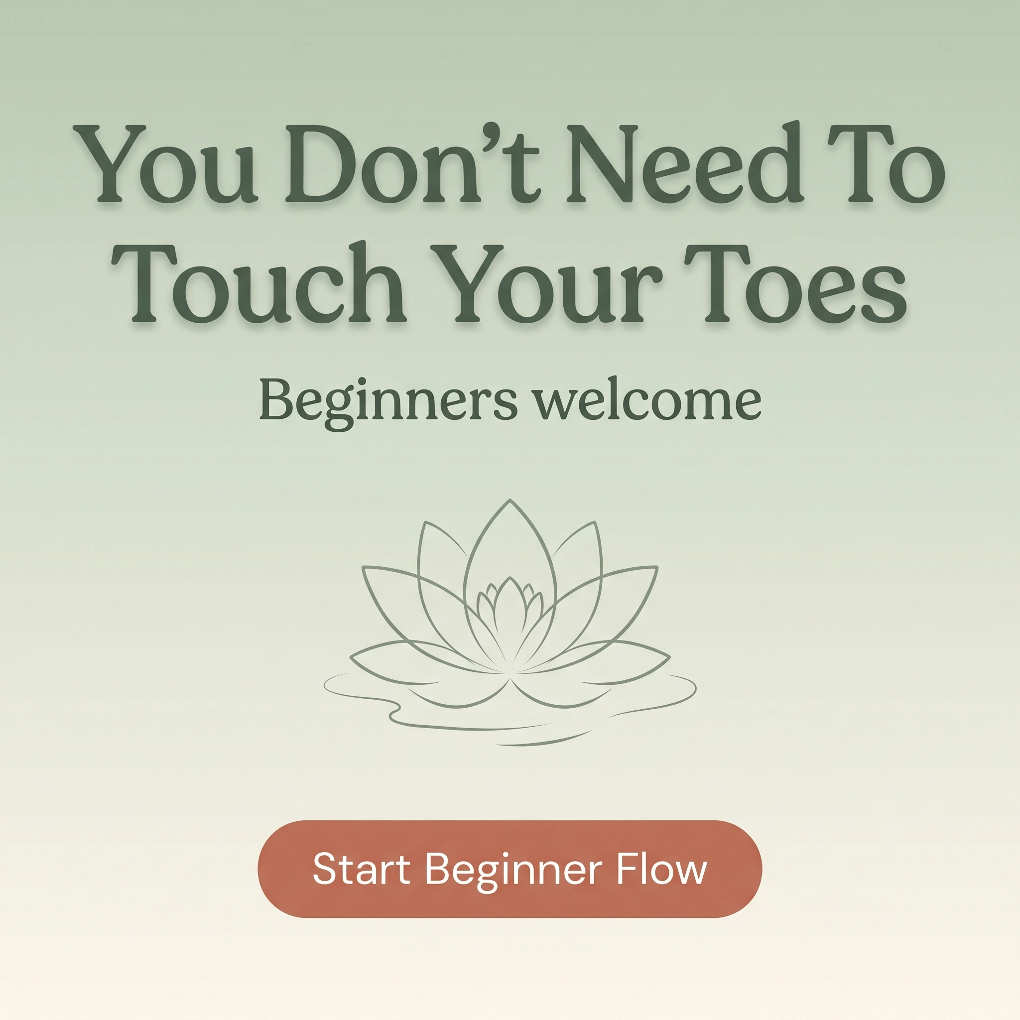
The format & angle. Quietude Yoga runs a typography callout on a calm background with a simple motif. This slot is normally a before/after — swapped because body-transformation framing violates Meta’s personal-health policies. The transformation it promises is a belief change, not a body one.
Who it targets. Cold prospects whose entire objection is “I’m not flexible enough for yoga.”
The hook. “You Don’t Need To Touch Your Toes.” The myth, named and dismantled.
Why it works. The flexibility excuse keeps more people out of yoga than price or schedule combined, and stating the truth — flexibility is the result, not the requirement — removes it in one line. “Beginners welcome” underneath confirms the room is built for them. Typography-only is clean, calm, and policy-proof with no body in frame.
Steal it. Put your prospects’ exact excuse in the headline and refute it. Keep the design calm and uncluttered, add “beginners welcome,” and send the click to a true beginner class — then deliver on the promise in the room.
4. The back-relief testimonial ad
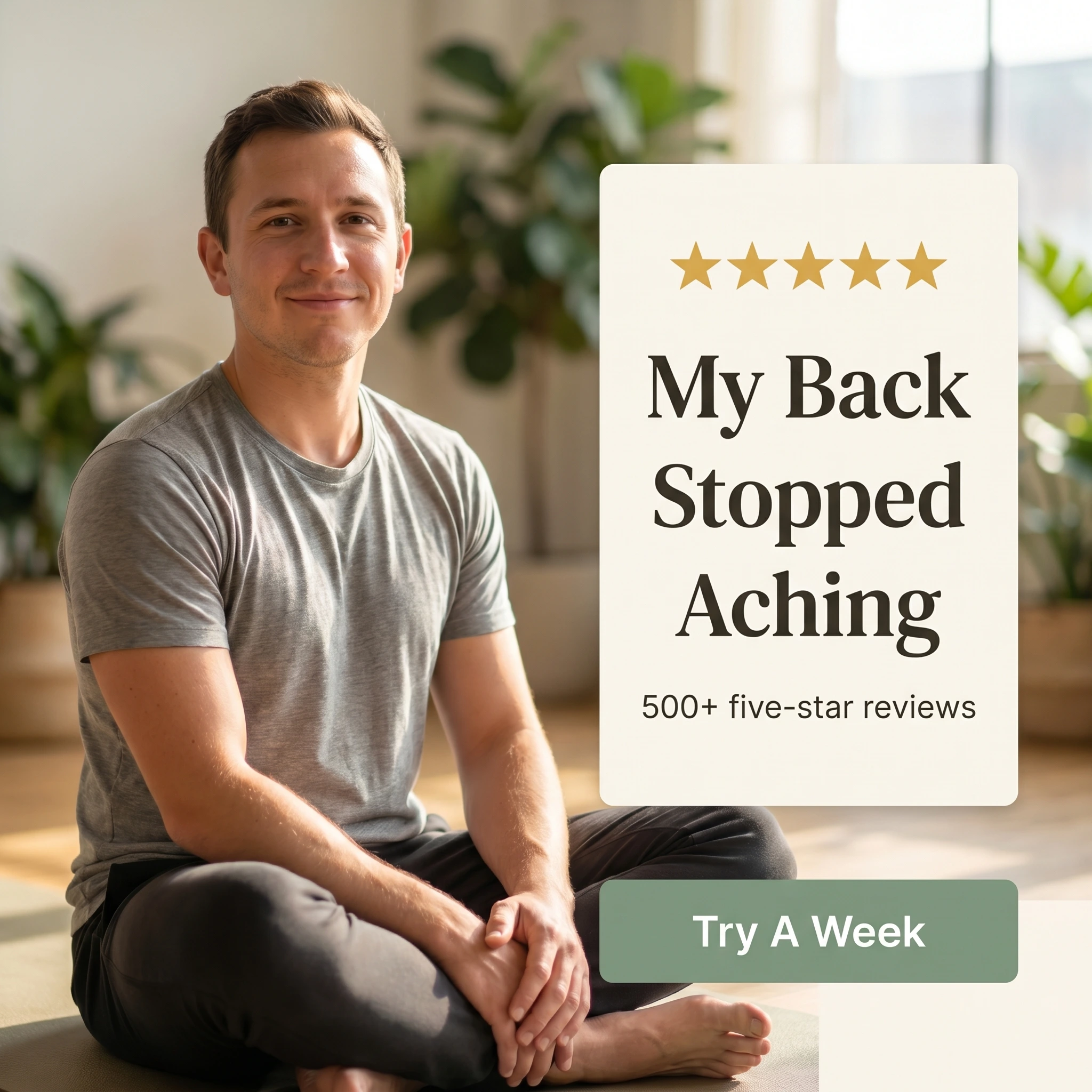
The format & angle. Verdant Yoga Studio’s testimonial: a relaxed student seated easily on a mat beside a quote card, five stars, “500+ five-star reviews.” Functional trust — a real, everyday benefit.
Who it targets. Warm prospects, especially desk-bound and skeptical men who think yoga isn’t “for them” but have nagging back or hip tension.
The hook. “My Back Stopped Aching.” A modest, functional claim anyone with a desk job believes.
Why it works. Functional relief is yoga’s most persuasive — and most compliant — proof point; it’s specific, believable, and free of physique framing. Casting an ordinary man broadens the audience past the studio stereotype. The review count turns one person’s relief into social proof, and the modest claim stays well inside Meta’s health-policy lines.
Steal it. Collect quotes about everyday function — sleep, back, stress — not appearance. Photograph a relatable student at ease, add the review count, and keep the claim modest enough to be unarguable.
5. The 30-day intro offer ad
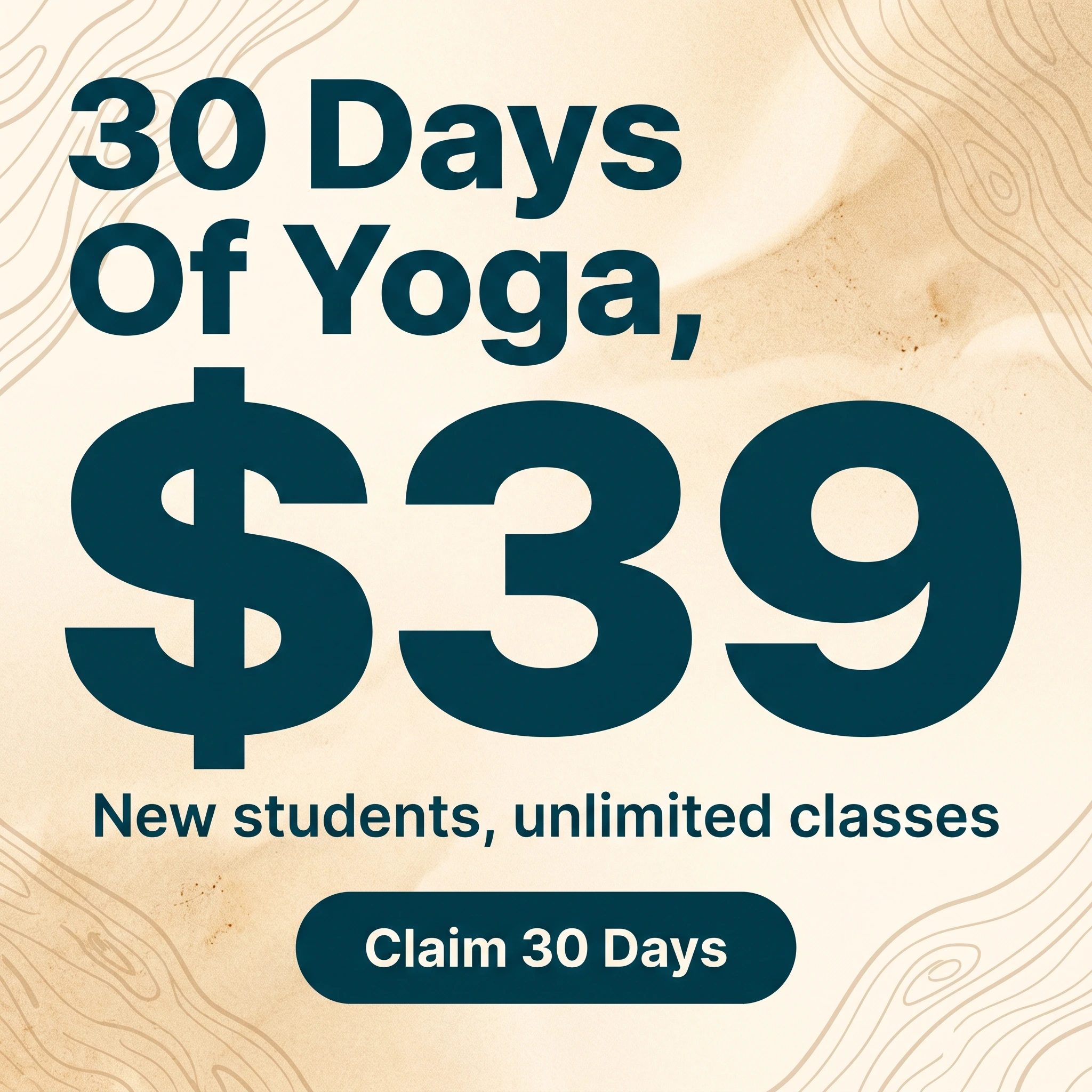
The format & angle. Driftwood Yoga’s typography offer: a warm calm background, a big “$39,” an unlimited-classes line, a button. The deal is the visual.
Who it targets. Warm and retargeting audiences — people who’ve met the studio and need a low-risk way to build the habit.
The hook. “30 Days Of Yoga, $39.” Enough time to actually form the habit, at a price that’s nearly free.
Why it works. Yoga sticks over multiple visits, not one, so an unlimited intro month is the offer that converts a curious newcomer into a member — they get time to find their teacher and style. A flat low price removes the per-class hesitation, and the calm typography fits the brand while standing out among busy fitness promos.
Steal it. Offer unlimited classes for a flat intro price over enough days to build a habit, and aim it at warm traffic. Track conversions to membership at the end of the month — that’s where an intro pass pays off. Rotate the look when results dip; offers fatigue faster than any other format.
Make regulars, not one-time drop-ins
A calm exhale, a sunlit room, a myth busted, a sore back eased, and an intro month — five studio ads with nothing in common but the quiet. Meta’s delivery favors that range: it now weighs far more creative per auction, sending the calm angle to the stressed and the flexibility angle to the nervous, where five gentle variations on one idea would pool into a single audience.
The play for a studio: launch all five, watch which angle books intro passes that convert to memberships — not just cheap clicks — then rebuild next month from the winner plus two new angles. Keep the intro offer always-on for warm traffic and rotate the rest, since a studio’s local audience is small and frequency climbs fast.
Producing that much distinct creative is the bottleneck for an owner who also teaches. Zendux generates on-brand static variants with AI and bulk-launches them across your ad sets, so a single studio tests at the pace of a multi-location brand.
Want to generate winning yoga studio ads? Start using Zendux AI