Beauty Brand Ad Examples: 5 Ads That Convert
Five beauty brand ad examples that turn scrollers into buyers — a quick-application UGC ad, a lipstick hero, an inclusive shade grid, a long-wear review, and a kit bundle offer.
Beauty brand ads convert when they make the result feel achievable on the viewer’s own face — a real swipe, the exact shade, a finish that lasts, not an airbrushed promise. Makeup is bought on the look and the confidence it gives, so the ad has to show the product doing its job on someone who reads as real. These five fictional beauty brand ad examples each run a different angle in a different layout — a quick-application UGC moment, a lipstick hero, an inclusive shade grid, a long-wear testimonial, and a kit-bundle offer. One note up front: Meta restricts before-and-after framing and “fix your flaw” language for personal-attribute categories, so these lean on shades, finish, and results-adjacent proof.
Key takeaways
- Show the product in use — a real application or swatch beats a polished model shot for trust and clicks.
- Shade range is a selling point — an inclusive lineup signals “there’s a match for me,” which converts browsers.
- Prove the claim, don’t airbrush it — long-wear or buildable finish shown honestly outperforms retouching.
- Stay compliant — skip before/after face transformations and “flaw” framing; lead with shades, finish, and reviews.
What makes a great beauty brand ad
The buyer is imagining the product on themselves, so the fastest conversion path is showing it on someone who looks like a real customer. A heavily retouched model creates distance — “that’s not my face, my lighting, my life.” A creator-style swipe in a car mirror collapses that distance and reads as a recommendation. The look has to feel reachable, not aspirational to the point of disbelief.
Shade and finish do the rest of the selling. A shopper’s first silent question is “is there a match for me,” and an inclusive lineup answers it before they even click. The second is “will it actually look and last like that,” which is where honest finish demos and reviews matter. Writing shade names, finish claims, and CTAs that stay sharp across dozens of products is its own discipline, covered in how to write Facebook ad copy, headlines, and CTAs at scale.
Compliance shapes the creative more than in most niches. Meta limits before/after face transformations and any framing that implies a flaw to fix, so the strongest beauty ads route around it with shades, texture, and customer voice. Beauty audiences also fatigue fast on a hot product, which makes refreshing creative faster part of the job. The five below cover the spread.
| Ad | Format | Angle | Funnel stage | Best for |
|---|---|---|---|---|
| Quick-swipe UGC | UGC | Speed/convenience | Cold | Everyday makeup |
| Signature-red hero | Hero | Dream/the look | Cold/warm | Hero color products |
| Inclusive shade grid | Shade grid | Inclusivity/range | Cold/warm | Wide-shade-range lines |
| Long-wear testimonial | Testimonial | Trust/proof | Warm | Long-wear claims |
| Build-a-kit offer | Offer | Price/value | Cold/warm | Bundles & restocks |
1. The quick-swipe UGC ad
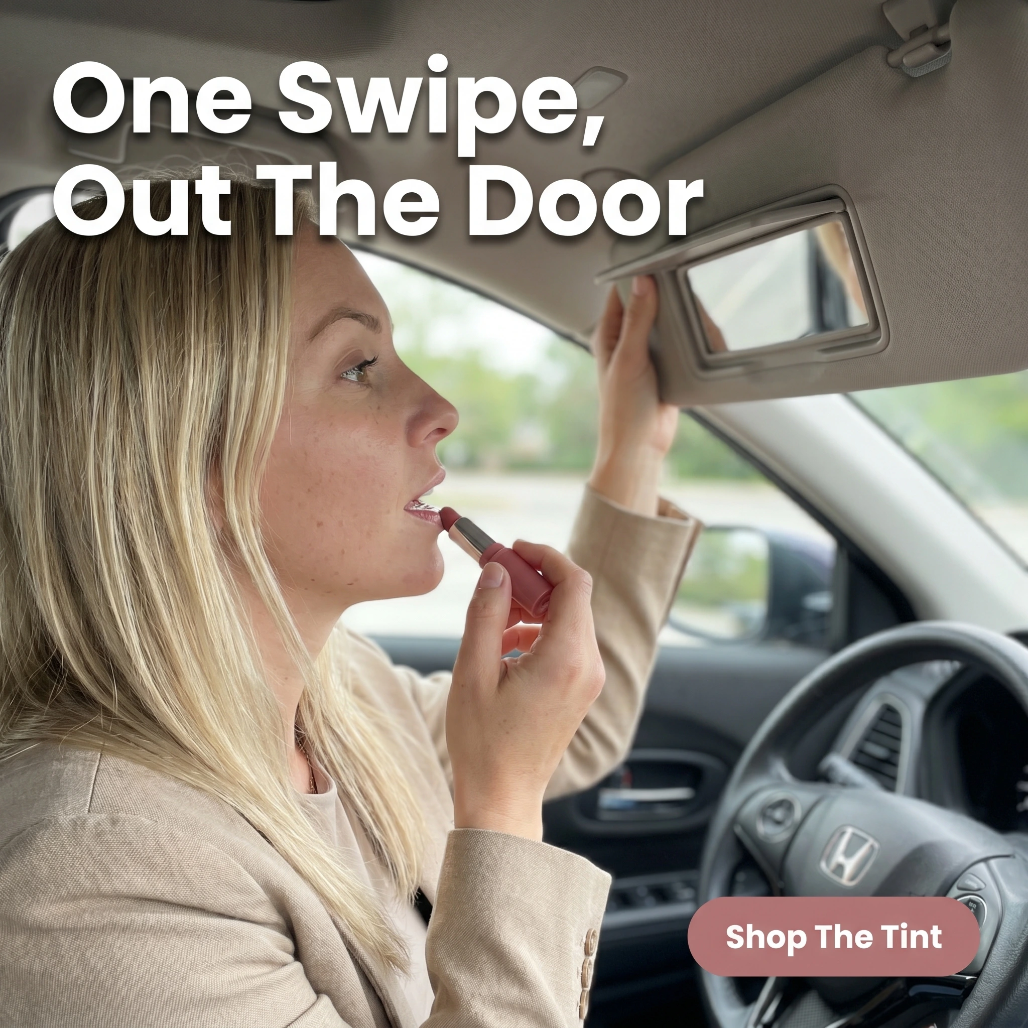
The format & angle. A Bloomé customer swiping on a tinted lip balm in a car visor mirror, shot like a real on-the-go moment. Speed and convenience.
Who it targets. Cold shoppers who want an easy, low-effort product that fits a busy morning.
The hook. “One Swipe, Out The Door.” It sells the benefit busy buyers actually want — a polished look in seconds.
Why it works. The car-mirror setting reads as a genuine customer, not a campaign, which earns trust and a cheap click. Showing the application in a real context proves the product is as quick and forgiving as claimed. The convenience angle widens the audience beyond makeup enthusiasts to anyone who wants to look pulled together fast.
Steal it. Film or shoot a real, unpolished application in everyday light — car, desk, bathroom — and headline the speed or ease, not the pigment. Send the click straight to the hero product page.
2. The signature-red hero ad
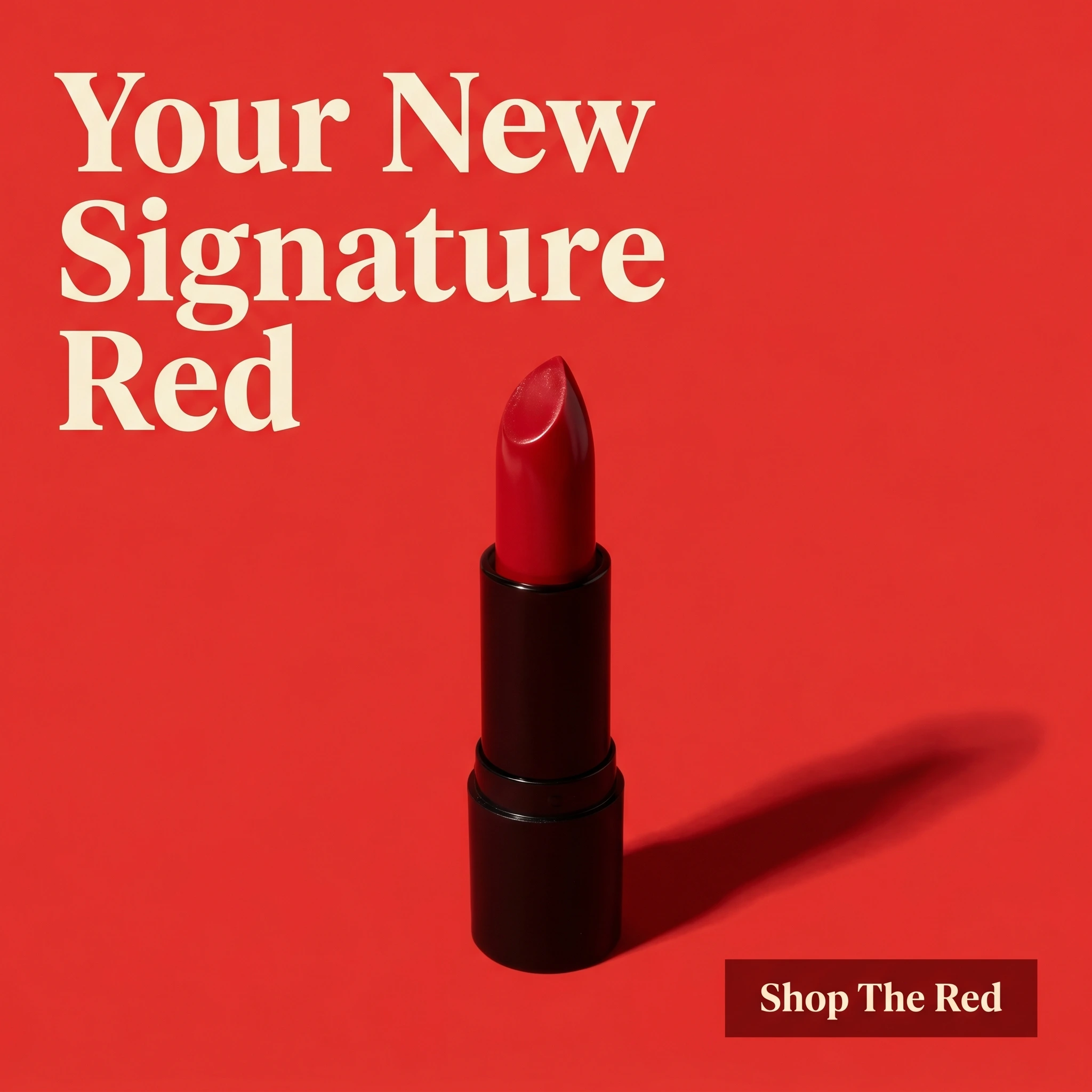
The format & angle. Mira Cosmetics’ product hero: a single luxe lipstick bullet against a saturated poppy-red ground, dramatic light, no people, one focal point. Dream and the look.
Who it targets. Cold and warm shoppers hunting for a standout shade — the “I want the perfect red” searcher.
The hook. “Your New Signature Red.” It frames one product as a personal staple, which raises perceived value.
Why it works. A bold monochrome hero is a thumb-stopper in a busy feed — the color does the work before any text registers. Calling it a “signature” shade invites the shopper to claim it as theirs, which converts better than a feature list. It’s a prospecting ad that doubles as a brand statement, pulling cold shoppers the kit deal can monetize down the funnel.
Steal it. Shoot your hero shade in a single strong color world, lit to make the texture pop, with nothing competing. Name it as an identity piece — “signature,” “everyday,” “the one” — rather than describing the formula.
3. The inclusive shade grid ad
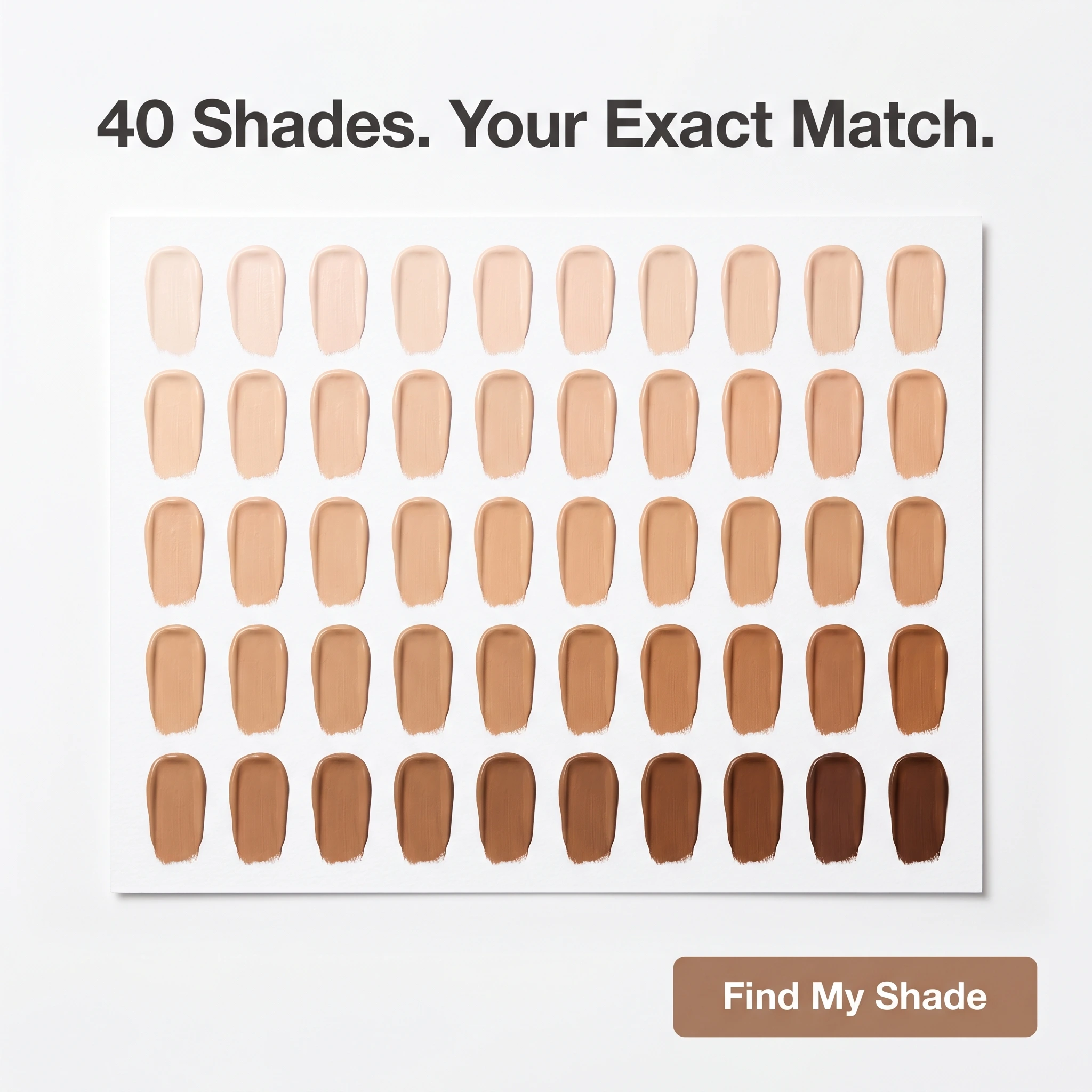
The format & angle. Halo Beauty Co.’s range proof: a clean grid of 40 foundation swatches spanning fair to deep, no faces. Inclusivity and range. This slot swaps the before/after format — restricted for personal-attribute categories — for a shade grid that proves results-adjacent value without a face transformation.
Who it targets. Cold and warm shoppers, especially those underserved by narrow shade ranges, asking “will they have my match.”
The hook. “40 Shades. Your Exact Match.” It answers the inclusivity question and makes a personal promise in one line.
Why it works. A visible, organized range is instant proof — no model needed — and it converts the shoppers competitors lose by carrying eight shades. The grid is scannable at thumbnail size, and “your exact match” turns a feature into a personal benefit. It also sidesteps Meta’s face-transformation limits by selling range instead of a made-over face.
Steal it. Lay out your full shade range as a clean, evenly lit grid and headline the count plus the personal payoff. Pair it with a shade-finder link so the click has somewhere useful to land.
4. The long-wear testimonial ad

The format & angle. Nuvé Beauty pairs a customer in polished event makeup with a review card — five stars and a review count. Trust and proof.
Who it targets. Warm shoppers who’ve seen the product and need proof the wear claim holds up.
The hook. “Lasted Through The Wedding.” A specific, relatable endurance test beats “long-wearing formula.”
Why it works. “Long-lasting” is the most doubted claim in makeup, so a customer naming a brutal real-world test — a full wedding day — is the proof skeptics need. The visible review count shows it’s consistent, and the customer’s voice carries credibility the brand can’t claim itself. It converts the warm shopper who liked the shade but worried it’d wear off by noon.
Steal it. Find the review that names a tough wear scenario, build a card around the verbatim quote with a real customer photo and your live review count, and run it to people who engaged with the product but didn’t buy.
5. The build-a-kit offer ad
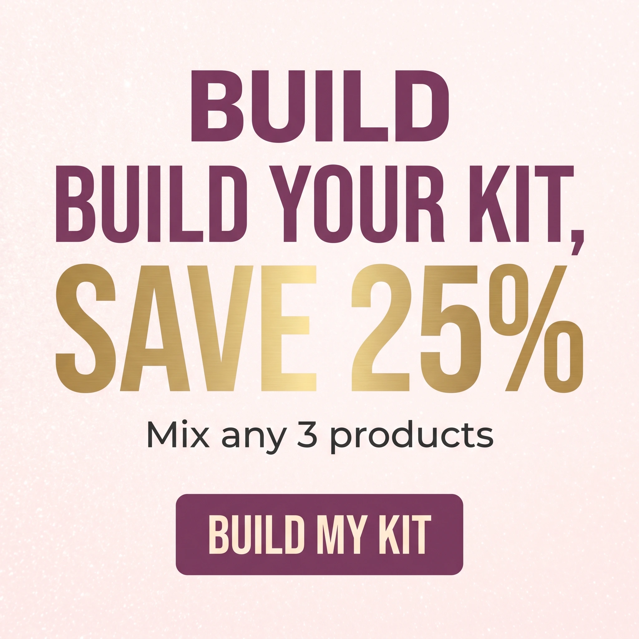
The format & angle. Stellar Cosmetics’ value play: typography-led, the savings dominant on soft blush, no product competing. Price and value.
Who it targets. Cold and warm shoppers open to buying more than one item for a better price.
The hook. “Build Your Kit, Save 25%.” A bundle incentive that lifts cart size without a blanket discount.
Why it works. A build-your-own bundle lifts average order value better than slashing one product’s price — shoppers self-select what they want while the discount nudges a bigger basket. “Save 25%” gives the undecided a reason to commit now instead of later. The all-type treatment reads as a real promotion, and it closes the audience the UGC and hero warmed up.
Steal it. Make the savings and the “mix any 3” rule the biggest elements, skip the product clutter, and retarget recent site visitors and past buyers due for a restock. Rotate the bundle so repeat viewers see a fresh reason.
Stock the shelf with distinct ads
Convenience, the dream look, an inclusive range, a long-wear rave, and a kit deal — five reasons a shopper adds to cart. Near-identical ads compete for the same pocket of the audience; five genuinely different concepts let the everyday buyer find the quick-swipe UGC and the shade-hunter find the grid.
Run the UGC and hero to prospect, the shade grid and testimonial to convert warm browsers, and the kit offer to lift average order value. Refresh shades and creators often so a tight retargeting audience never burns out — and keep every concept inside Meta’s personal-attribute rules.
Producing that much compliant creative is the real constraint for a growing beauty line. Zendux generates on-brand static creatives with AI and launches them across ad sets in bulk, so a full slate is ready for the next drop. Selling treatment products too? The skincare ad examples breakdown is the natural next read; for apparel-side ideas, see the fashion ecommerce ad examples.