5 Furniture Store Ad Examples That Sell Rooms
Five furniture store ad examples that sell rooms: a styled-room UGC, a statement-sofa hero, an empty-to-styled before/after, a delivery review, and a 0% offer.
Furniture store ad examples that actually sell sofas do one thing catalog photos don’t: they sell the finished room, then remove the price and delivery frictions that stall the purchase. Furniture is a high-ticket, considered buy — taste gets the click, but logistics and cost close the sale. The five fictional ads below each work a different lever, in a different format, so Meta’s delivery can match each to a different shopper. Together they cover the full journey from “ooh, that room” to “approved, delivered Thursday.”
Key takeaways
- Sell the room, not the product on white. Styled spaces and before/after transformations beat catalog cutouts because the buyer is picturing their home.
- Logistics close the sale. Financing and free delivery/setup remove the real reasons a furniture purchase stalls.
- Run statement pieces and full rooms separately — one sells desire, the other sells the hero product; don’t cram both into one ad.
- Five distinct angles — a done room, a statement sofa, a transformation, delivery proof, and a financing offer — give the auction five shopper types to find.
What makes a great furniture store ad
The buyer is mid-project: they’ve moved, renovated, or finally admitted the hand-me-down couch has to go. They want their space to feel finished, and they’re stuck on two things — whether it’ll look right, and whether they can swing the cost and the hassle of getting it home.
Two principles, plus a closing lever.
Show the outcome, in context. A sofa on a white background is a spec; a sofa in a warm, styled living room is a daydream. Lifestyle and before/after imagery let the buyer project the piece into their own home, which is the entire emotional purchase.
Make it look effortless to own. Once desire is there, the blockers are practical: cost and logistics. Visible financing and free delivery-and-setup remove them, converting the shopper who loves the look but balks at the price tag or the moving truck.
The closing lever is the offer. Because furniture is considered and expensive, a deadline deal — or financing — is what turns a long deliberation into a decision. The same first-screen, scroll-stopping logic drives most ecommerce ad examples; for the layout fundamentals, the 10 static layouts worth stealing are a good starting point.
| Ad | Format | Angle | Funnel stage | Best for |
|---|---|---|---|---|
| Done-room UGC | UGC | Dream/lifestyle | Cold | Stores selling whole-room style |
| Statement-sofa hero | Hero | Status/desire | Cold | Brands with a signature piece |
| Empty-to-styled before/after | Before/after | Transformation | Cold/warm | Stores selling the full look |
| Delivery-and-setup testimonial | Testimonial | Trust/service | Warm | Stores competing on service |
| 0%-financing offer | Offer | Price/value | Warm/retargeting | Closing high-ticket carts |
1. The done-room UGC ad
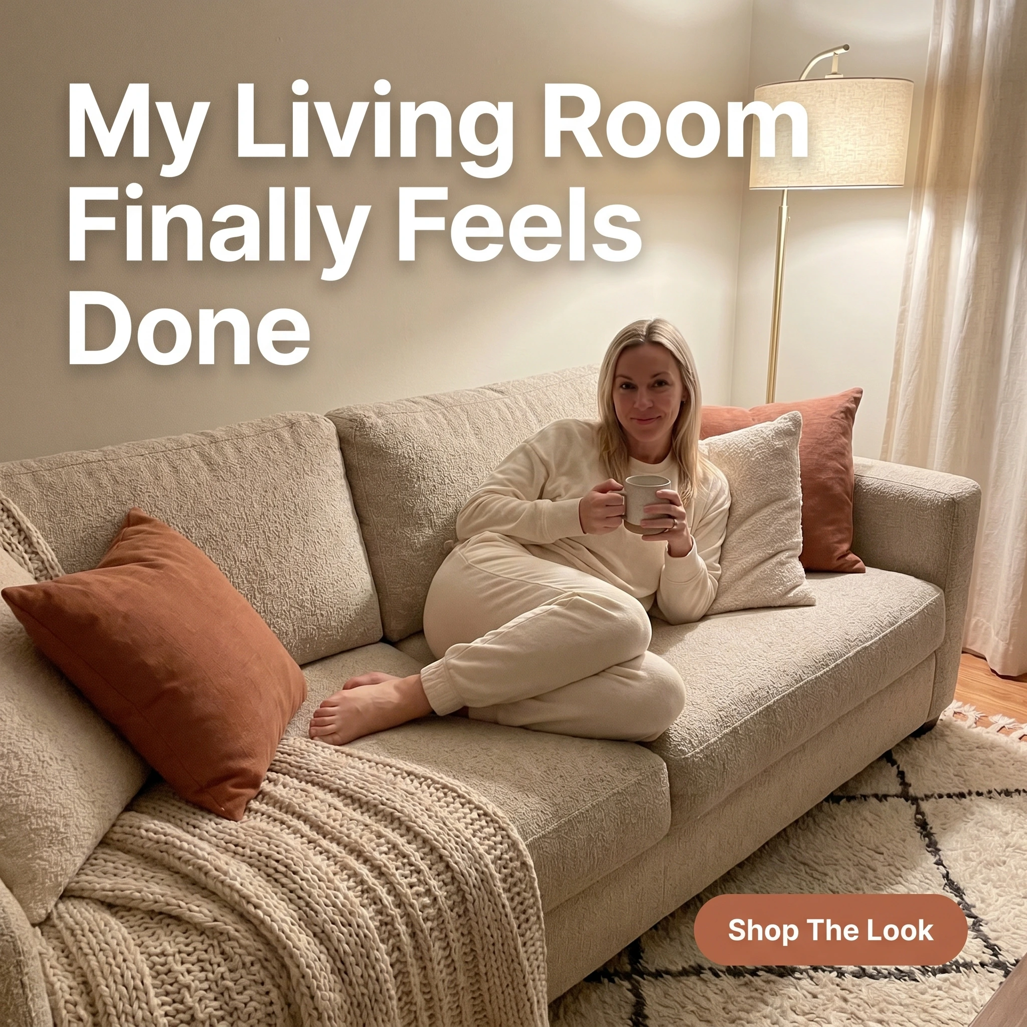
The format & angle. A phone shot from Loomhouse Furniture: a customer curled up contentedly on a new sofa in a warmly styled living room. The dream outcome — a finished space.
Who it targets. Cold shoppers mid-project who want their home to feel complete, not just functional.
The hook. “My Living Room Finally Feels Done.” The relief of a space that’s finally right.
Why it works. UGC styling reads as a real customer’s home, not a showroom, which makes the room feel attainable rather than aspirational-out-of-reach. The word “done” speaks to the actual emotional goal — not more stuff, but a finished space. Showing the piece in a lived-in room helps the buyer picture it in theirs.
Steal it. Style a real room and photograph it casually, like a happy customer would — soft lamp light, a person relaxed in the scene. Headline the feeling of completion, and link straight to a “shop the look” collection.
2. The statement-sofa hero ad
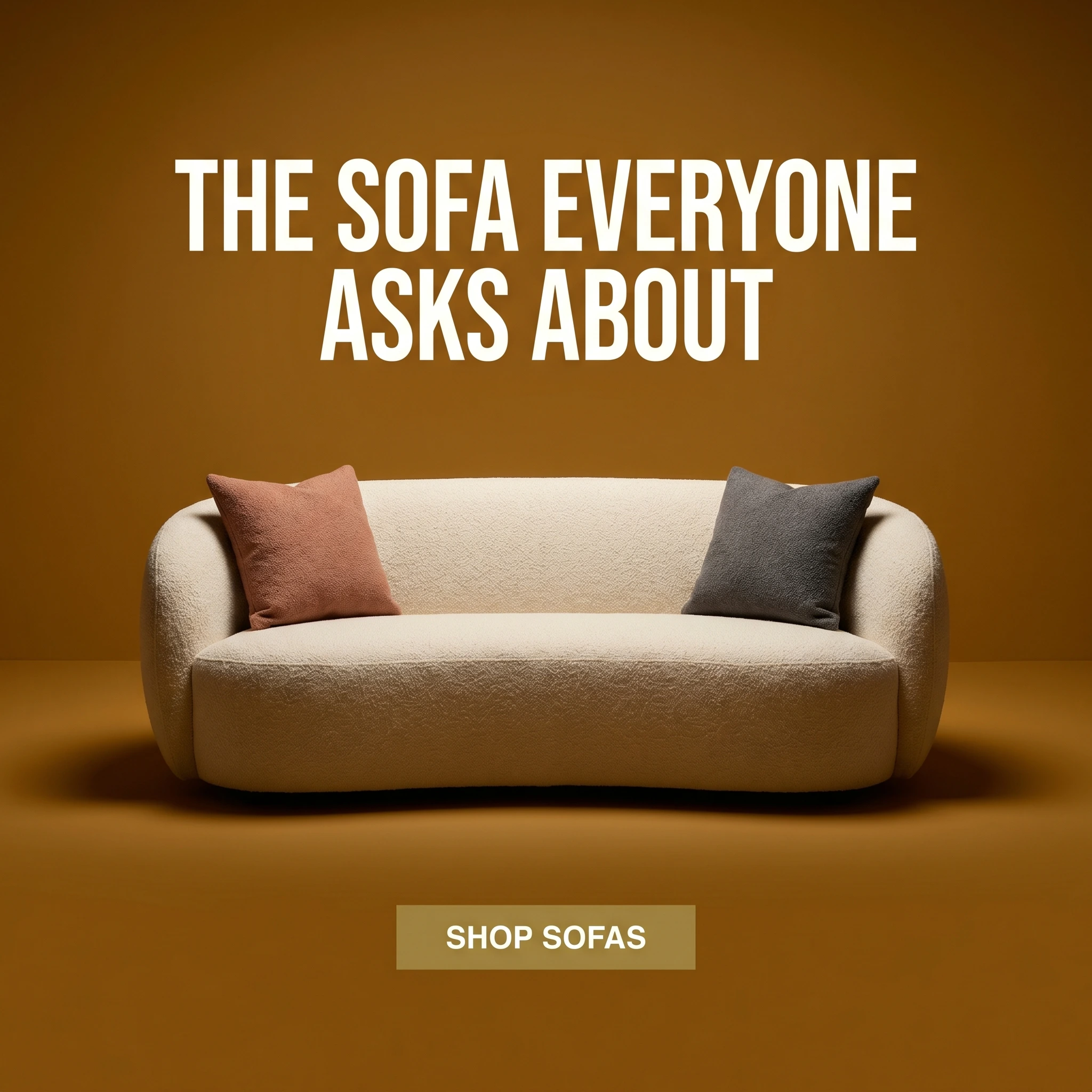
The format & angle. Studio Mara’s hero: a striking boucle sofa styled on a bold ochre backdrop, studio-lit, one focal point. Desire, concentrated on a single piece.
Who it targets. Cold shoppers drawn to a signature look — the people who buy around a hero piece.
The hook. “The Sofa Everyone Asks About.” Status and social proof in one line.
Why it works. A clean hero shot makes one beautiful object the entire message, which reads instantly at thumbnail size and stops the scroll. The “everyone asks about” framing adds social currency — the buyer pictures the compliments, not just the cushions. The bold backdrop makes a single product feel like a brand, not a SKU.
Steal it. Shoot your best-selling or most distinctive piece against one strong, on-brand color with clean studio light. Headline the social payoff, not the materials. One product, one color, one focal point.
3. The empty-to-styled before/after ad
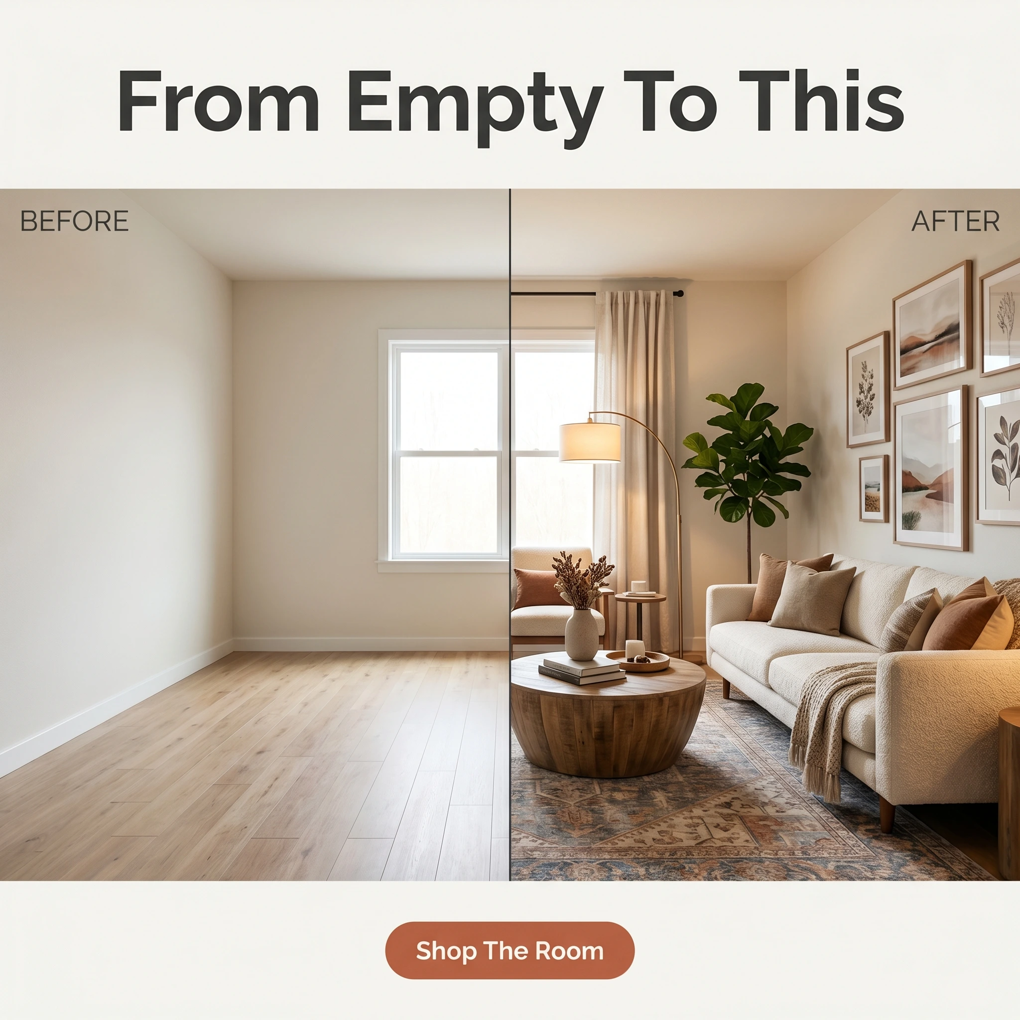
The format & angle. Timberline Furniture’s split: a bare, empty room on the left, the same room fully styled on the right. The transformation furniture is built to deliver.
Who it targets. Cold and warm shoppers staring at an empty or half-furnished room, unsure how to pull it together.
The hook. “From Empty To This.” The before/after that does the imagining for them.
Why it works. Empty rooms are paralyzing, and a split frame solves the buyer’s hardest problem — visualizing the finished result — without any effort on their part. It also sells the full look rather than one item, raising basket size. The transformation is purely a room, so it’s a clean, compliant use of the format with real persuasive punch.
Steal it. Photograph a room before and after you furnish it, matched framing, and headline the leap. Link to the complete room as a shoppable bundle so the visualized result is one click from the cart.
4. The delivery-and-setup testimonial ad
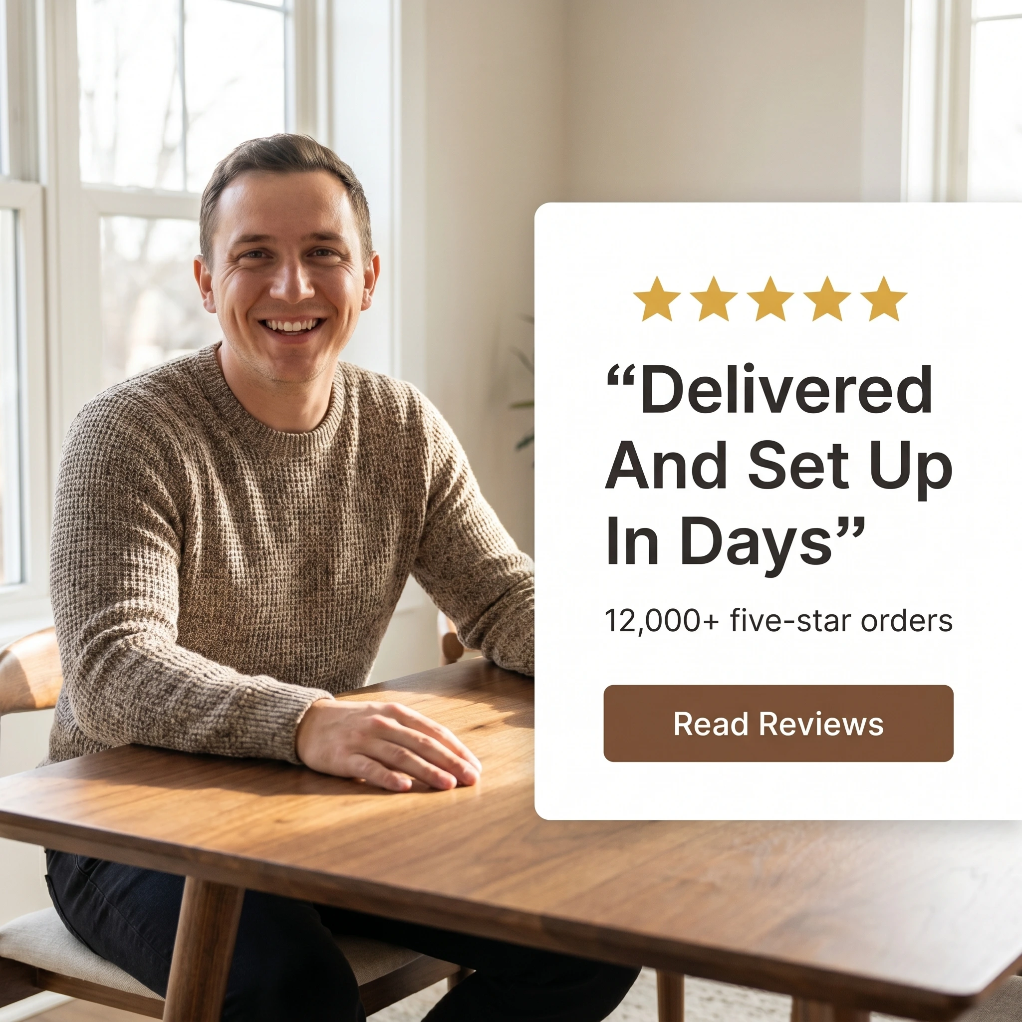
The format & angle. Oakhaus’s testimonial: a satisfied customer beside a new dining table, a quote card, five stars, “12,000+ five-star orders.” Trust, focused on service.
Who it targets. Warm shoppers who love a piece but worry about the part after checkout — delivery times, damage, assembly headaches.
The hook. “Delivered And Set Up In Days.” The logistics fear, resolved.
Why it works. With furniture, the anxiety isn’t only the product — it’s the dread of a six-week wait, a scratched tabletop, or a flat-pack nightmare. A customer confirming fast, handled delivery removes the post-purchase fear that kills high-ticket carts. The large order count signals a store that ships at scale and gets it right.
Steal it. Pull a review that praises delivery or setup, not just the product, and pair it with your order or review count. Photograph a real customer with the delivered piece in their home — proof it arrived and looks right.
5. The 0%-financing offer ad

The format & angle. Restwell’s typography offer: a bold “0%” on warm navy, a free-delivery line, a button. The two frictions, removed in one frame.
Who it targets. Warm and retargeting audiences — shoppers who’ve viewed pieces and are weighing the cost.
The hook. “0% Financing. Free Delivery.” Price and logistics objections, handled together.
Why it works. Financing widens the buyer pool more than a discount does, because it reframes a $1,500 sofa as a manageable monthly number — the real barrier on high-ticket goods. Stacking free delivery removes the second hesitation. Typography-only puts the offer front and center and ships fast, which matters when it’s your always-on retargeting closer.
Steal it. Lead with the financing terms and free delivery as the headline, keep the qualifying detail small, and show it to people who’ve already browsed. Rotate the creative when results soften — and mind your aspect ratios across placements so the offer stays legible in feed and stories alike.
Sell the whole room
A done room, a statement sofa, an empty-to-styled split, a delivery promise, and a financing offer — five furniture ads with no overlap in look or claim. That range is what Meta’s auction rewards now: it evaluates far more creative per impression than it used to, sending the transformation ad to the empty-room shopper and the financing ad to the price-conscious one, where five styled-room near-duplicates would crowd a single audience.
The move for a store: launch all five, watch which angle drives actual purchases — not just cheap clicks — then rebuild from the winner plus two new angles. Keep the financing offer always-on for retargeting, since furniture’s long consideration window means most sales close after several visits. Judge everything by return on ad spend and average order value, not click cost.
Producing fresh, on-brand creative across a full catalog is the bottleneck for most stores. Zendux generates on-brand static variants with AI and bulk-launches them across your ad sets, so a single showroom tests with the creative firepower of a national retailer.
Want to generate winning furniture store ads? Start using Zendux AI