5 Mobile App Ad Examples That Drive Installs
Five mobile app ad examples that drive installs: a pain-relief UGC ad, a sleep-app hero, a language before/after, a testimonial, and a free-premium offer.
An install costs you money whether or not it sticks, so the mobile app ad examples that actually drive installs waste nothing: one outcome, one screen showing the app deliver it. Feature lists don’t get taps; a clear “here’s what changes for you” does. The five fictional apps below — across budgeting, sleep, language, meal planning, and focus — cover the angles that turn cold scrollers into installs, each in a visibly different format and each matched to a believable store page.
Key takeaways
- One outcome per ad. “Fall asleep in 10 minutes” installs; “the all-in-one wellness app” doesn’t.
- Show the interface in context — a phone mockup with a benefit headline beats a pasted store screenshot every time.
- Match the ad to the store page. A consistent benefit, look, and rating across the handoff protects your install rate.
- Five distinct concepts give Advantage+ App Campaigns five user pockets to find, which is how you lower cost per install under Meta’s current delivery.
What makes these mobile app ad examples drive installs
The buyer is mid-scroll, not searching for your app, with a vague problem your app happens to solve. You have a half-second to connect their problem to your outcome, and a tap costs you money whether or not it converts — so every element has to earn its place.
Three principles follow. First, the headline is the outcome, quantified where possible: a number (“10 minutes,” “in half”) reads as a real claim, not marketing. Second, the visual is the interface, framed so it’s legible at thumbnail size — users want to see what they’re installing. Third, continuity wins the install: the ad and the App Store page should share a benefit and a look, because a jarring handoff is where cheap clicks die without converting.
A creative-volume note shapes the whole brief. App campaigns fatigue fast and Advantage+ App Campaigns reward fresh, distinct inputs, so the teams with the lowest cost per install are the ones testing many concepts every week, not polishing one. And because install creative runs heavily in Reels and Stories, build for 9:16 as well as the square feed so a single concept covers every placement.
| Ad | App category | Format | Angle | Best for |
|---|---|---|---|---|
| Overdraft-relief UGC | Budgeting | UGC | Pain-point relief | Fintech and money apps |
| 10-minute sleep hero | Sleep / wellness | Product hero | Dream outcome | Subscription wellness apps |
| Hola-to-fluent split | Language | Before/after | Progress / us-vs-old | Learning and habit apps |
| Grocery-bill testimonial | Meal planning | Testimonial | Trust / social proof | Utility apps with reviews |
| Free-premium offer | Focus / productivity | Offer | Price / value | Freemium trial conversion |
1. The overdraft-relief UGC ad
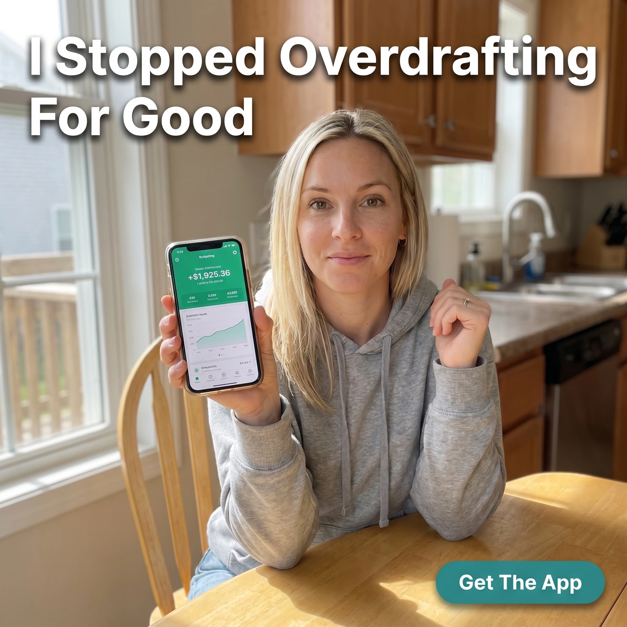
The format & angle. A candid smartphone-style shot of a Pocketford user at her kitchen table, phone turned to camera showing a calm, in-the-green budget screen. Pain-point relief, told as a personal win.
Who it targets. Cold users who live paycheck to paycheck and feel a low hum of anxiety about their balance.
The hook. “I Stopped Overdrafting For Good.” First person, specific, and emotional — it names a concrete pain the app erases.
Why it works. A phone held toward the camera reads as a friend’s recommendation, not a bank’s billboard — and recommendations get the tap. The visible budget screen anchors it as a real tool, and the confessional framing (“I used to overdraft”) makes the outcome believable. Money apps live or die on trust, and a peer’s relief builds it faster than any feature.
Steal it. Stage a candid, natural-light shot of someone holding your app open to its most reassuring screen. Write the headline as the sentence a relieved user would actually say, and carry that same screen onto your store page.
2. The 10-minute sleep hero ad
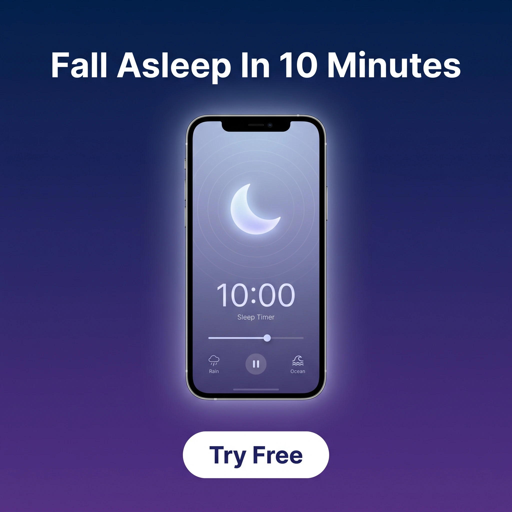
The format & angle. A product hero: Stillwave’s sleep-timer screen floating on a deep indigo gradient, one focal point, calm and premium. Dream outcome, no clutter.
Who it targets. Cold users lying awake at night — the exact moment many of them are actually scrolling.
The hook. “Fall Asleep In 10 Minutes.” A specific, testable promise that invites the skeptical install (“prove it”).
Why it works. Hero ads win when the interface is legible at thumbnail size and the claim is falsifiable. The calm color and single screen make the ad feel like the relief it sells, standing out against the feed’s busy photos. A quantified outcome reads as a real product claim, and the late-night scroller is primed to act on it immediately.
Steal it. Put your single most self-explanatory screen on one saturated, on-brand background and headline the outcome as a specific number you can defend. Keep the store page’s first screenshot identical.
3. The Hola-to-fluent split ad
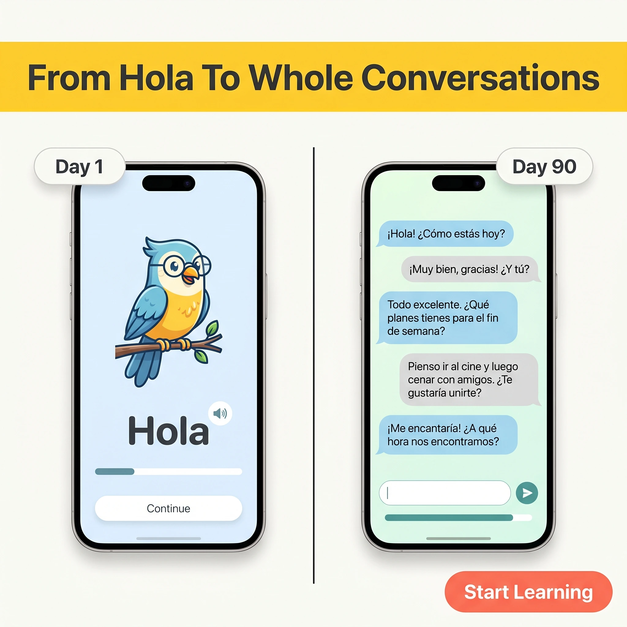
The format & angle. Lingobird’s split: a beginner “Day 1” lesson screen on the left, an advanced “Day 90” conversation screen on the right. Progress shown as two app states — the software-native before/after.
Who it targets. Cold and warm users who’ve always wanted to learn a language but doubt they’ll stick with it.
The hook. “From Hola To Whole Conversations.” It dramatizes the journey from nervous beginner to actual fluency.
Why it works. The before/after here is the app’s screens, not a person, which keeps it firmly compliant — a deliberate choice, since Meta restricts body-and-health transformations and that includes fitness apps tempted to show before-and-after bodies. Showing in-app progress is the safe, persuasive substitute for any app selling self-improvement. The contrast proves the outcome is reachable, and the split lands before a word is read.
Steal it. If your app sells progress, show the progress inside the app — a streak, a level, a transformed screen — never a body. It’s both more on-brand and the policy-safe way to run a before/after for a self-improvement app.
4. The grocery-bill testimonial ad
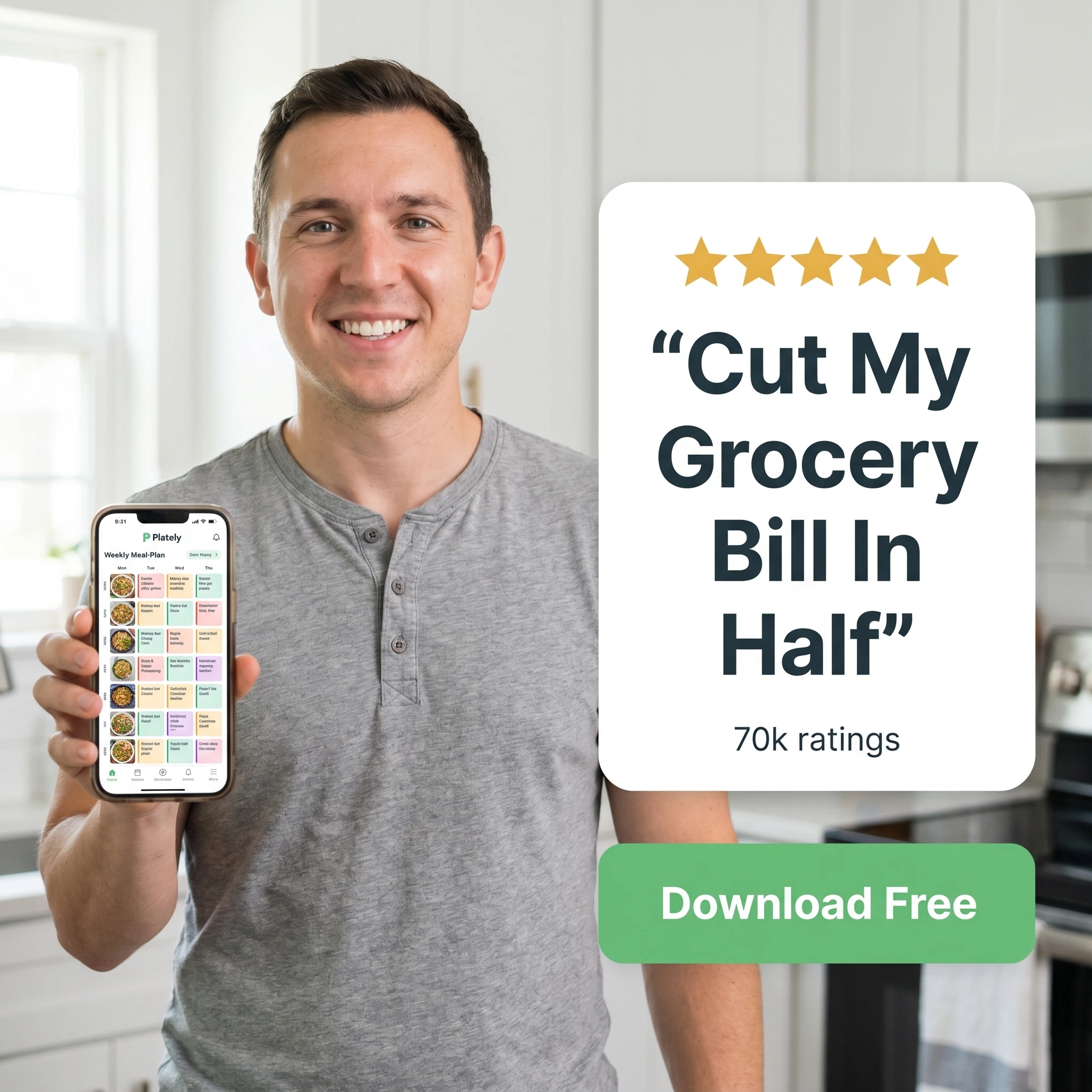
The format & angle. Plately: a happy user holding his phone showing a weekly meal plan, beside a review card — five stars, “70k ratings.” Trust and social proof, with a number attached.
Who it targets. Warm users who’ve seen the app before and need a reason to believe it’s worth the install and the habit.
The hook. “Cut My Grocery Bill In Half.” A user’s words tying the app to money saved — a result anyone understands.
Why it works. Once curiosity exists, the question becomes “does it actually work for someone like me,” and a peer with a quantified result answers it. The rating count compresses thousands of reviews into a half-second trust signal, which matters enormously for a utility app competing with free alternatives. The visible interface keeps the claim grounded in a real product.
Steal it. Pull your most numeric review, frame the app screen the user is praising, and keep the quote under seven words on the image. Put your real rating and review count beside the stars — social proof is your cheapest persuasion.
5. The free-premium offer ad

The format & angle. Focusroom’s freemium push: bold type, the offer as the design, no screenshot. Price and value, aimed at the hesitant.
Who it targets. Warm users and lapsed installers weighing whether the paid tier is worth it — bottom of the funnel.
The hook. “30 Days Of Premium, Free.” No metaphor, just the math that removes the last objection.
Why it works. Offer creative wastes money on cold audiences and prints it on warm ones, so the discipline is showing it to the right pool. For freemium apps, a generous free trial lowers the risk of committing to a paywalled habit, and “no card to start” removes the second hesitation. The typography-led layout reads as an announcement, which is how returning users prefer to be addressed.
Steal it. Reserve an ad set for retargeting installers and engagers, run a typography-led creative with the free offer as the biggest element, and remove the friction users actually fear — a card, a commitment, a catch.
Ship five concepts, not one reskin
Overdraft relief, a sleep promise, language progress, a grocery win, and a free trial — five ads across five apps and five mindsets, none a reskin of another. Cost per install follows creative diversity now: Advantage+ App Campaigns and the Andromeda auction reward distinct inputs, matching each concept to a different sliver of users — so five real ideas beat five reskins, and your CPI drops as a result. Apps that share DNA with software-as-a-service can borrow from the SaaS ad examples breakdown, and education apps will find overlap in the online course ad examples post.
Generating five-plus genuinely different concepts every week — and resizing each for feed, Reels, and Stories — is the production problem behind a low cost per install, and it’s what Zendux solves: it spins up on-brand static variants and bulk-launches them across every ad set and placement at once.