Photography Ad Examples: 5 Ads That Book Sessions
Five photography ad examples that book portrait and branding sessions: a comfort UGC ad, a headshot hero, a phone-vs-studio before/after, and more.
Book more family sessions or more branding clients and the winning ad does the same two things: it shows the exact work you want more of and makes the next step obvious. That’s what sets the photography ad examples below apart from a generic “professional photography” post — a family photographer and a personal-branding photographer sell completely different feelings, and one bland ad books neither. The five fictional ads here cover the angles that convert portrait and branding clients — comfort, status, the upgrade from a phone, a client’s payoff, and a seasonal offer — each in a visibly different format.
Key takeaways
- Show the niche you want to book. Family work attracts family inquiries; headshots attract professionals. The portfolio image is the targeting.
- Sell the feeling, not the file count. “Sessions that don’t feel awkward” books more families than “two hours, 50 edited images.”
- A seasonal mini-session is the lowest-friction offer in photography and the easiest first sale to a cold local audience.
- Five distinct concepts reach the parent, the job-seeker, and the small-business owner separately, instead of one bland ad reaching none of them well.
What makes these photography ad examples work
The buyer changes with the service. For family sessions it’s a parent who dreads wrangling kids into stiff poses. For headshots it’s a professional who knows their current LinkedIn photo is a cropped wedding selfie. For branding work it’s a small-business owner whose website looks amateur next to competitors. Each fears a different thing, which is exactly why one ad can’t carry all three.
Two principles hold across them. First, the image does the qualifying — a warm, candid family frame and a crisp studio headshot pull entirely different inquiries, so match the picture to the booking you want. Second, name the discomfort you remove: awkwardness, a dated photo, an unprofessional brand. Photographers who lead with relief outbook those who lead with megapixels.
Composition is a quiet edge. Portrait work lives in vertical 4:5 and 9:16 placements where faces fill the frame, so crop deliberately and study how layout choices change performance before you boost a square that crops everyone’s forehead off in Stories.
| Ad | Format | Angle | Funnel stage | Best for |
|---|---|---|---|---|
| Comfortable-session UGC | UGC | Trust / comfort | Cold | Family and lifestyle photographers |
| Mean-business headshot hero | Service hero | Status / dream outcome | Cold/warm | Personal-branding and headshots |
| Phone-vs-studio split | Before/after | Us-vs-the-old-way | Cold/warm | Headshot and portrait upgrades |
| Brand-glow-up testimonial | Testimonial | Trust / social proof | Warm | Branding photographers (B2B) |
| Fall mini-session offer | Offer | Price / value | Cold/warm | Filling a seasonal calendar |
1. The comfortable-session UGC ad
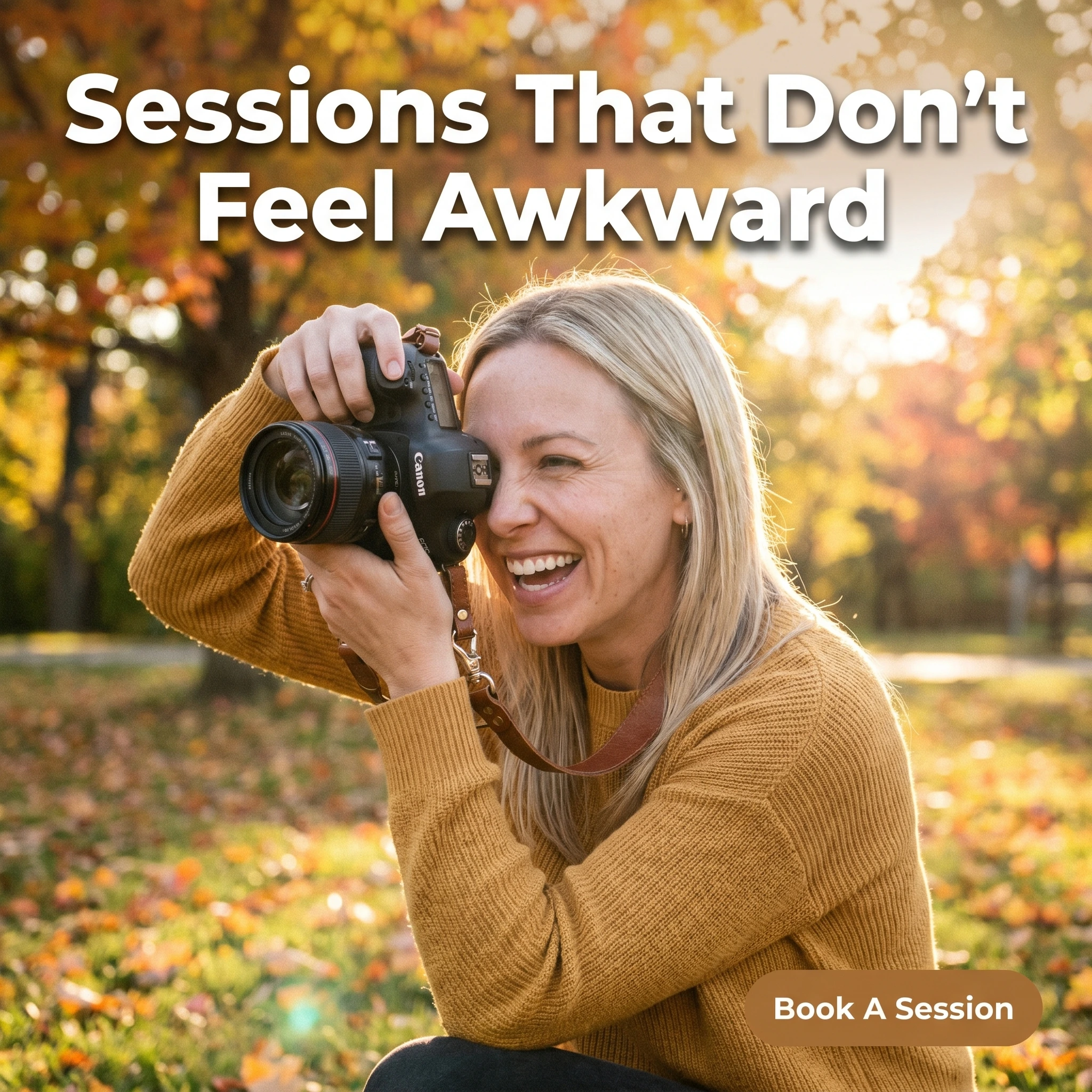
The format & angle. A Maple & Light Studio photographer crouched mid-session, laughing, camera ready, shot like a behind-the-scenes phone grab. Trust and comfort, aimed straight at the dread of a stiff shoot.
Who it targets. Cold parents who want family photos but hate the idea of forced poses and grumpy kids.
The hook. “Sessions That Don’t Feel Awkward.” It answers the actual objection — not “are the photos good,” but “will this be miserable.”
Why it works. A candid, down-at-kid-level frame mid-laugh looks like a friend’s photo, not an ad, so it slips past the scroll filter. The behind-the-scenes shot is proof of the experience, not a promise of it — a relaxed photographer implies a relaxed session. That emotional reassurance books families faster than any portfolio gallery, because the experience is the real purchase.
Steal it. Have an assistant grab a candid of you working — laughing, down at a kid’s level. Headline the feeling parents are scared of missing, then deliver an easy, playful session.
2. The mean-business headshot hero ad
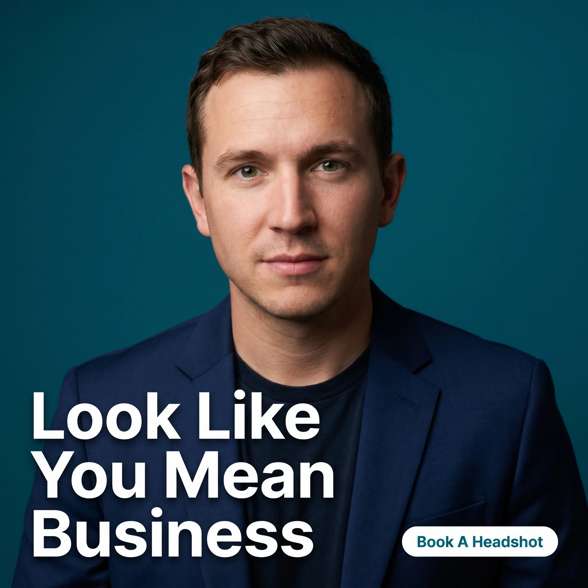
The format & angle. Frame Theory Studio’s hero: a single sharp, confident headshot on a saturated background, studio-clean, one focal point. Status and dream outcome, no clutter.
Who it targets. Cold and warm professionals — job-seekers, founders, realtors, consultants — who know their current photo is letting them down.
The hook. “Look Like You Mean Business.” It sells the outcome the headshot buys: how they’ll be perceived, not the lighting setup.
Why it works. A headshot is bought for status, so the ad should promise status. The single crisp portrait is the proof and the product at once, and a bold background makes it pop against the feed’s photographic noise. Selling perception — “how you come across” — converts the professional who’s been meaning to fix their photo for a year.
Steal it. Use your single best headshot against one saturated color. Headline the perception your client wants — credible, hireable, senior — not the gear or the studio.
3. The phone-vs-studio split ad
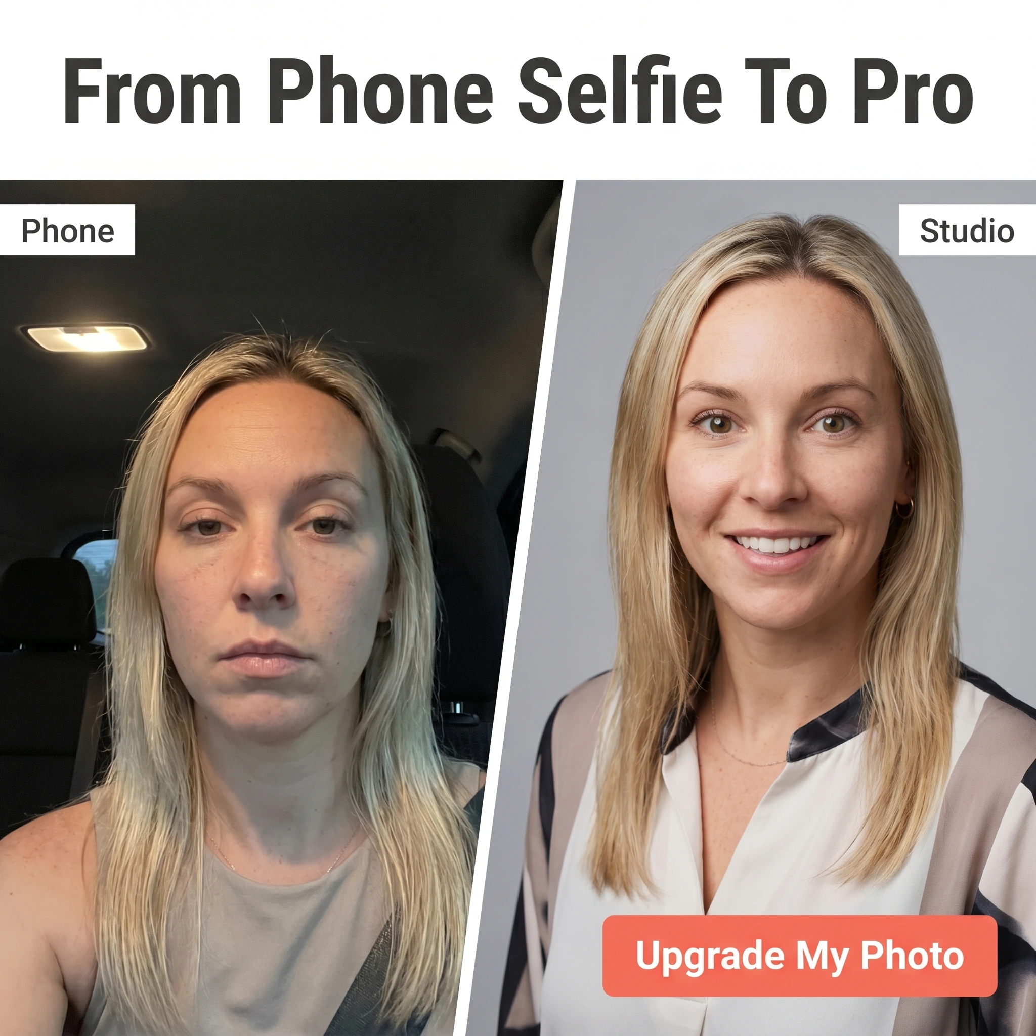
The format & angle. Brightroom Portraits’ split: a dim, unflattering phone selfie on the left, a crisp studio portrait of the same person on the right. Us-vs-the-old-way — a craft transformation, not a body one.
Who it targets. Cold and warm professionals using a cropped selfie as their profile photo and quietly embarrassed by it.
The hook. “From Phone Selfie To Pro.” The contrast is the argument; the headline just labels the upgrade.
Why it works. The before isn’t the person’s appearance — it’s the photo’s quality, which keeps the ad firmly on the right side of Meta’s personal-health rules while still landing the upgrade. Most people don’t know how much lighting and a real lens change a portrait until they see it side by side. The split sells the gap instantly and converts “my photo is fine” into “my photo is embarrassing.”
Steal it. Compare a quick phone selfie to your studio version of the same person, with permission. Keep the framing about light and craft, never about fixing the subject — that distinction is also what keeps the ad compliant.
4. The brand-glow-up testimonial ad
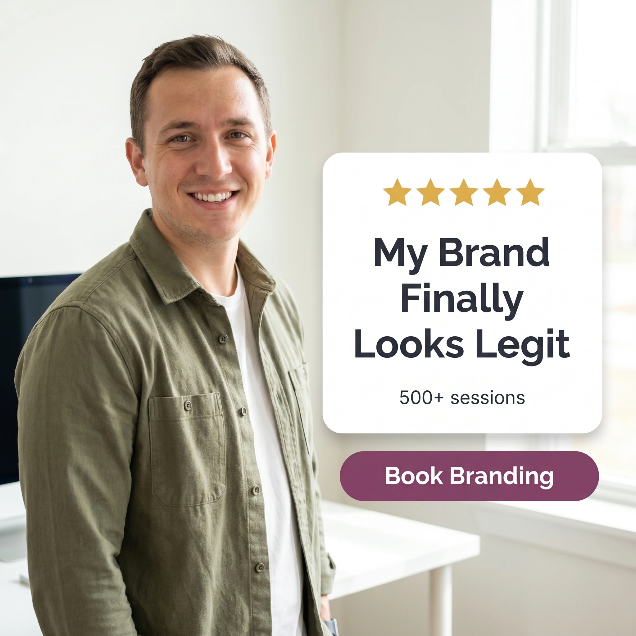
The format & angle. Studio Larkspur: a small-business owner beside a review card — five stars, “500+ sessions.” Trust and social proof, with a business outcome attached.
Who it targets. Warm small-business owners who’ve seen the work and need to believe branding photos are worth the spend.
The hook. “My Brand Finally Looks Legit.” A peer’s words tying photos to credibility — and, by implication, to revenue.
Why it works. Branding clients buy a business result, not art, so a testimonial that frames photos as legitimacy answers their real question. A named-looking peer with a clear before-and-after in their business is more persuasive than any portfolio claim. The session count signals you do this constantly, which lowers the risk of booking you.
Steal it. Find the review that connects your photos to a business outcome — more bookings, a credible site, closed clients — and build the card around it. Add a session count to turn one story into a pattern.
5. The fall mini-session offer ad

The format & angle. Little Lantern Photo Co.’s seasonal push: warm autumn palette, bold price, no portrait. Price and value as the entire message.
Who it targets. Cold and warm local families looking for an affordable, low-commitment way to get holiday-ready photos.
The hook. “Fall Mini Sessions: $149.” The number is the ad — a clear price, a defined scope, an easy yes.
Why it works. The mini-session is photography’s perfect entry offer: short, affordable, and seasonal, so it converts cold local traffic that isn’t ready for a full session. The typography-led layout signals a limited promo rather than a campaign, and the season supplies honest urgency — fall light and holiday-card timing don’t wait. Many of those mini clients rebook for full sessions later.
Steal it. Package a short, fixed-price seasonal session with a clear date range. Make the price the largest element on the canvas, then retarget every booker for full sessions before the creative fatigues.
Shoot the whole set, not one frame
Comfort, status, the phone upgrade, a client’s payoff, and a seasonal price — five ads aimed at the parent, the professional, and the business owner, each at a different point in the decision. Meta’s delivery has changed underneath the creative: Andromeda matches a much wider field of ads to a much finer set of audiences, so the parent, the job-seeker, and the business owner can each be served the ad built for them — something five crops of one portrait can’t do. If weddings are part of your business, the wedding photographer ad examples breakdown angles to engaged couples specifically, and if you add motion, the videography ad examples post covers selling film.
Turning out five-plus genuinely different concepts every season is the production bottleneck, and it’s what Zendux solves: it builds on-brand static variants in your studio’s look and distributes them across your ad sets without the manual upload grind.